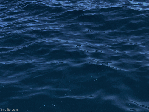
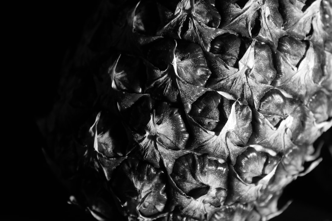
Still Water
Still Water Inspiration

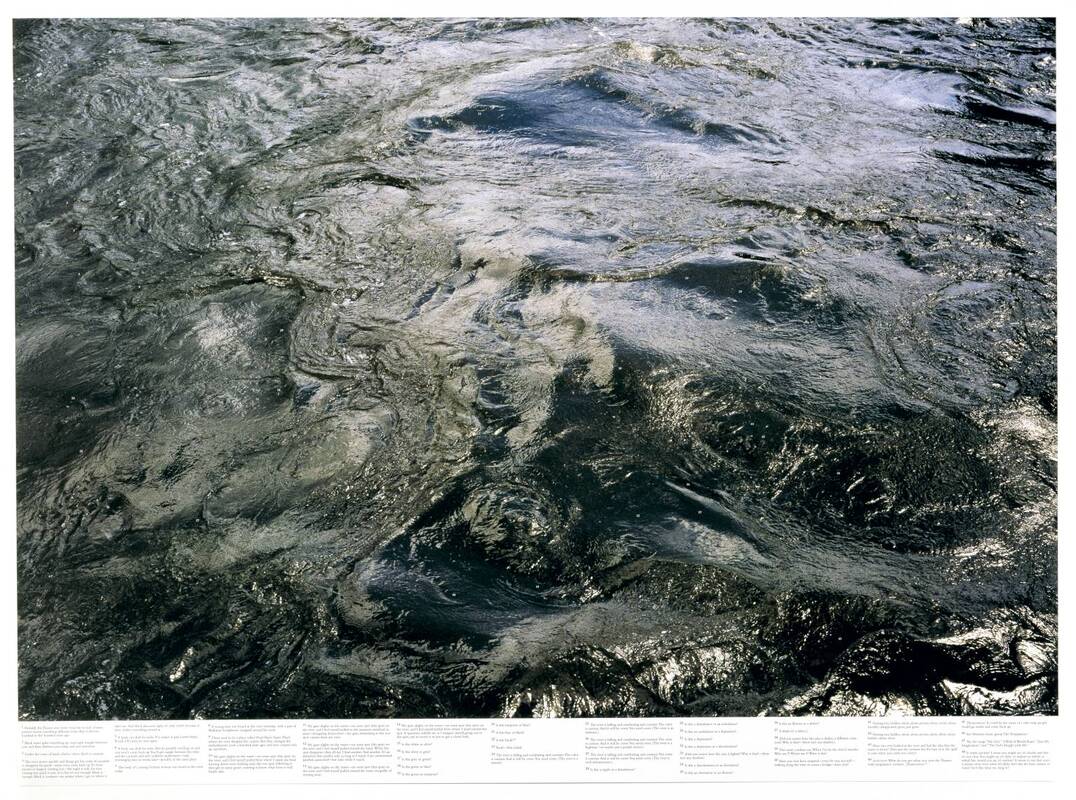
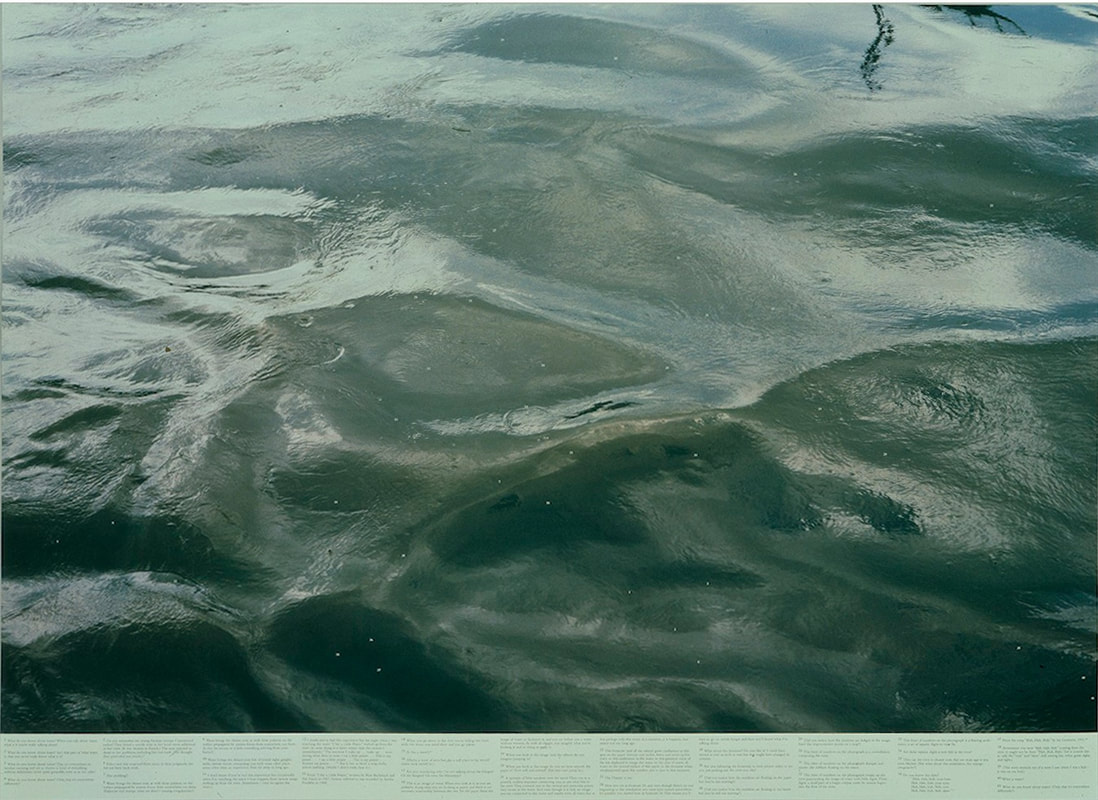
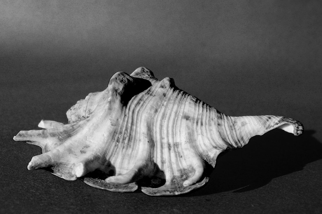
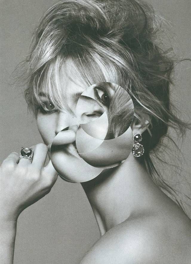
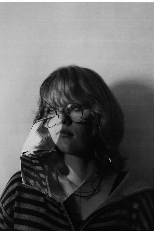
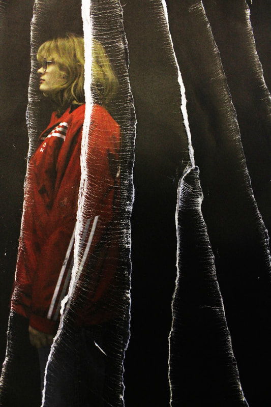
Roni Horn
|
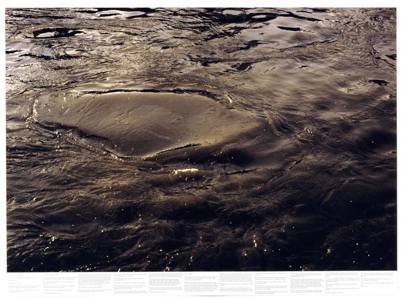
Roni Horn's details of the River Thames, dark and lushly printed as offset lithographs after photographs, are sprinkled with tiny numbers that refer to texts printed like footnotes beneath each image. Usually the texts refer to Horn's private thoughts, although some are quotations from sources as varied as popular song lyrics, poetry, and news stories of suicides in the Thames (a leitmotif of this print, which is part of a series). If one reads the footnotes of the series consecutively, the reiteration of texts and repeated questions and answers evoke the rhythms and surges of waves and tides.
|
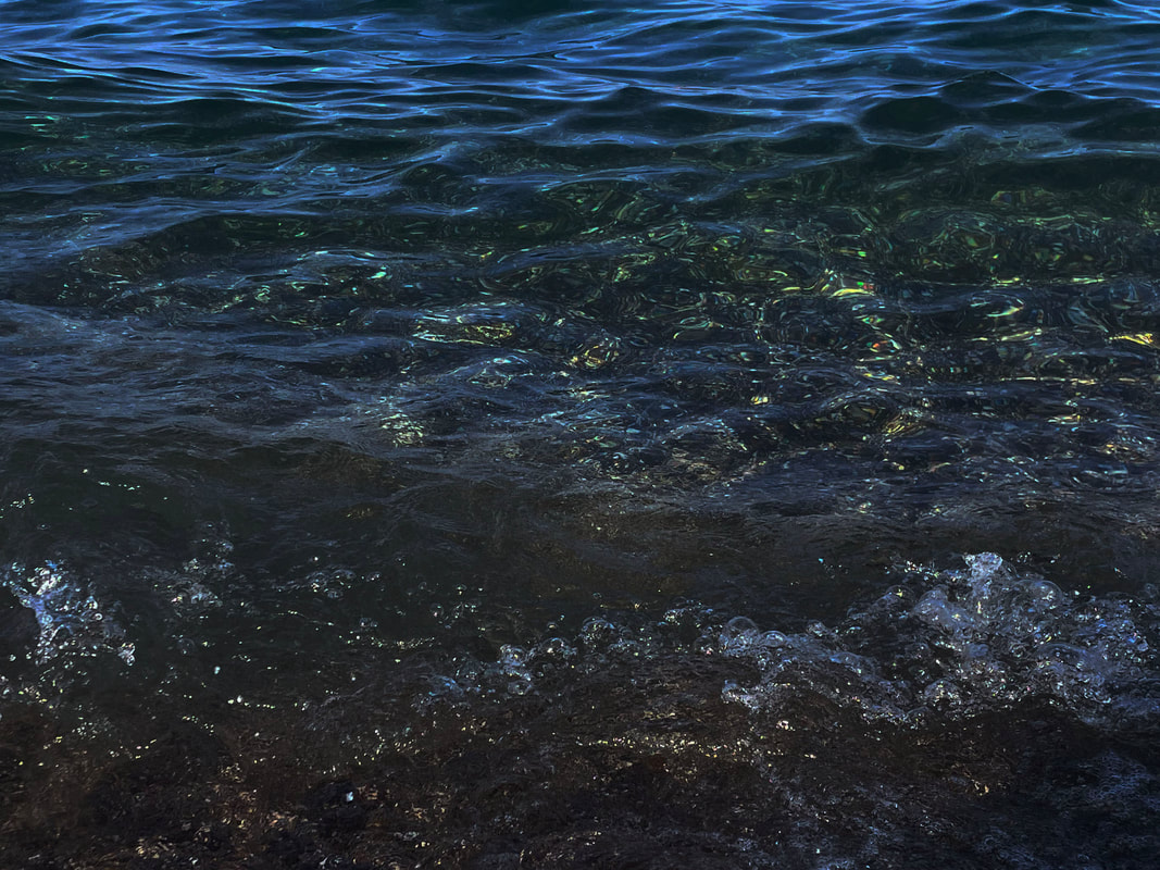
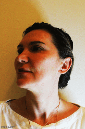
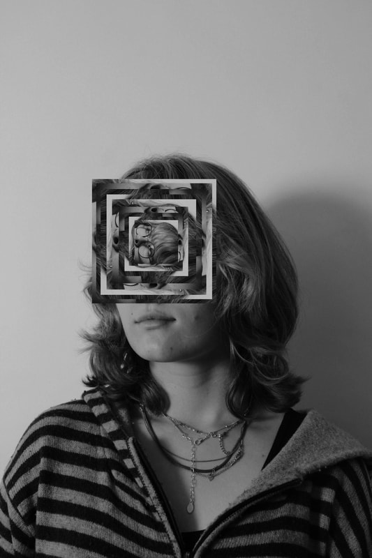
Draft
Representation to Still Water
|

|
|
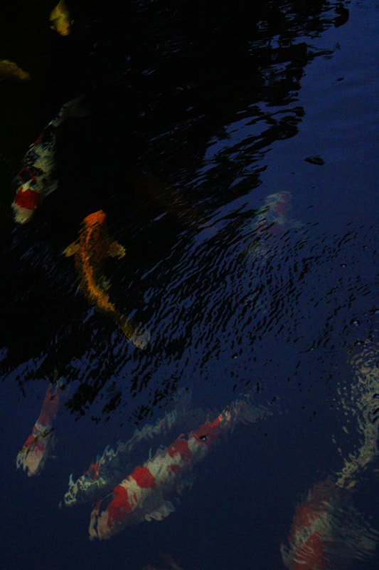
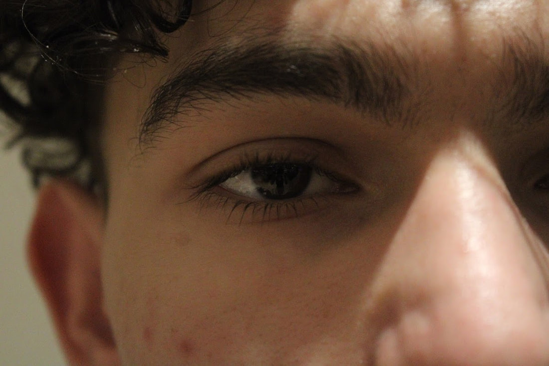
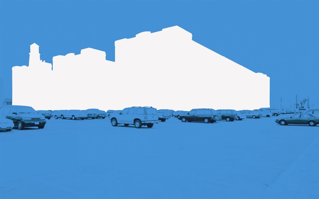
What went well was i increased contrast which made the colours stand out from one of each other. Furthermore, i added texture which brought out the different patterns in the water. Also, the objects (fish) added movement which additionally added further patterns. However, it could be better if focused more closely on the movement. As well as if i focused on composition, the images would be more appealing.
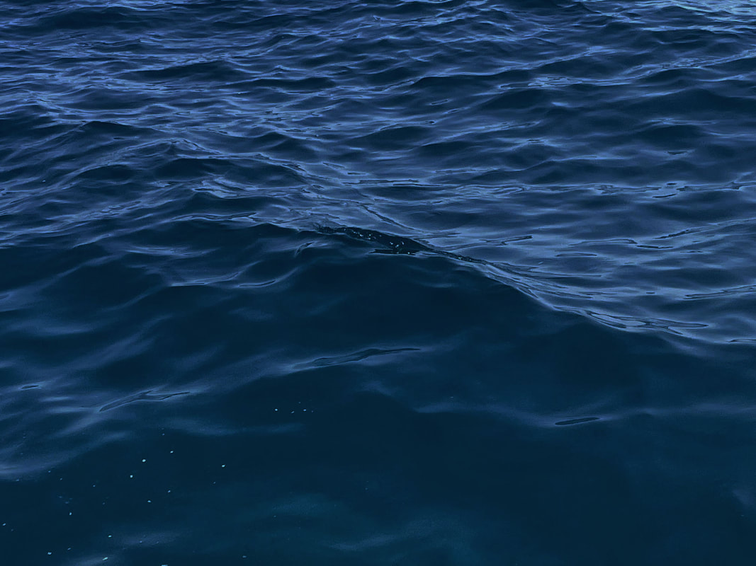
Second draft
Second Representation to Still Water
|
|
|
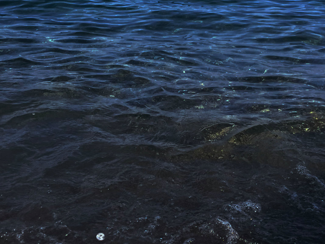
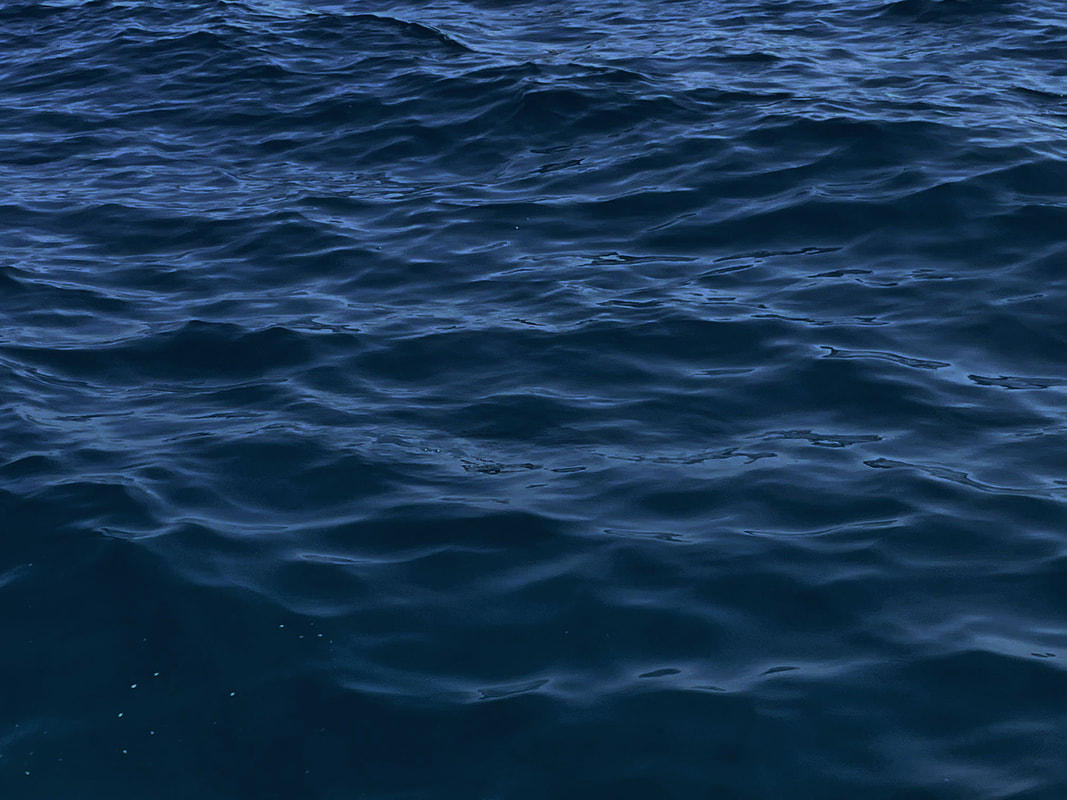
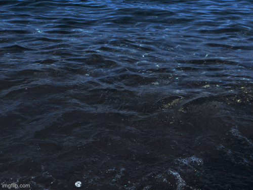
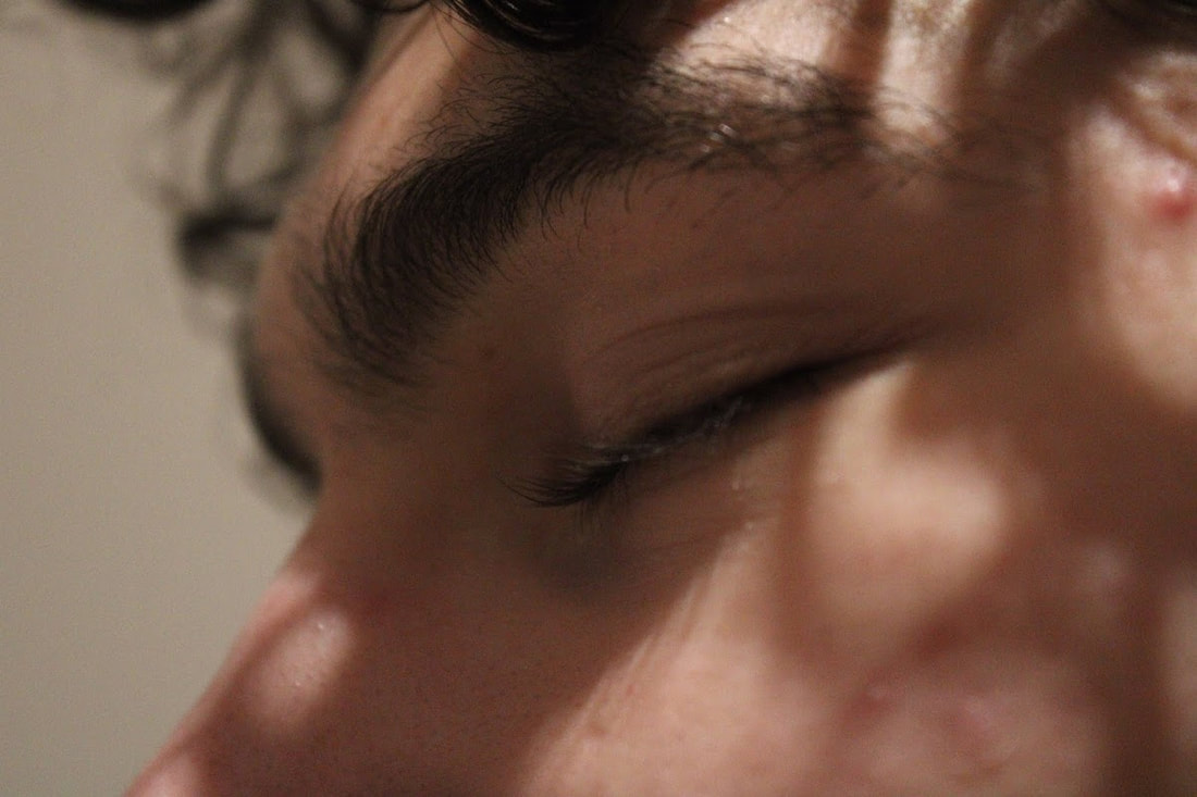
What went well was that i experimented with water outside my house, giving me access to more potential images. Furthermore, i took into consideration the angle as i figured using a lower angle emphasised the texture of the waves. Also that i increased the contrast to further create a depth of field and focus on the individual parts of the waves. However it could of been better if i used a tripod where the images from the GIFs would of flowed better into a video. Additionally, if i had taken more images the GIFs would of been more smooth.
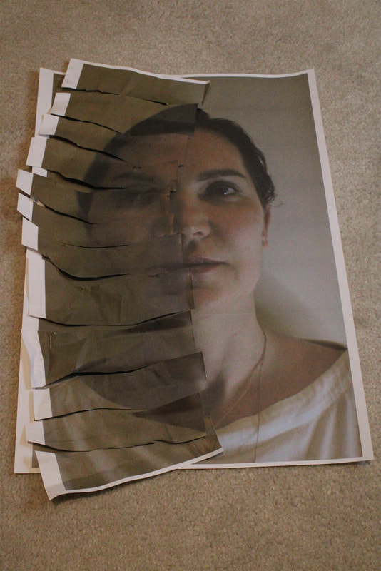
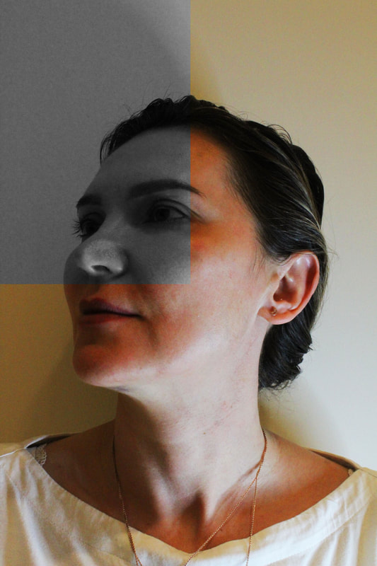
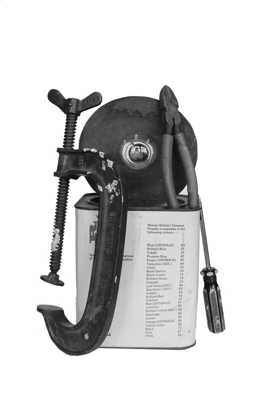
Paper Surgery
Paper Surgery Inspiration
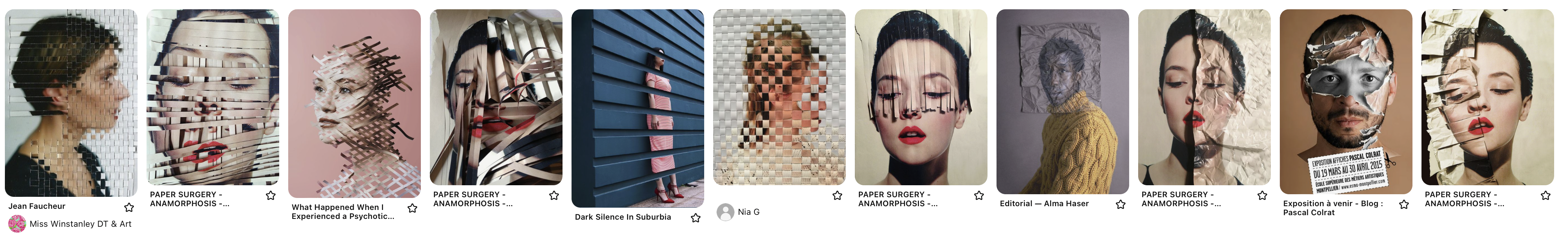
Carlo Muttoni
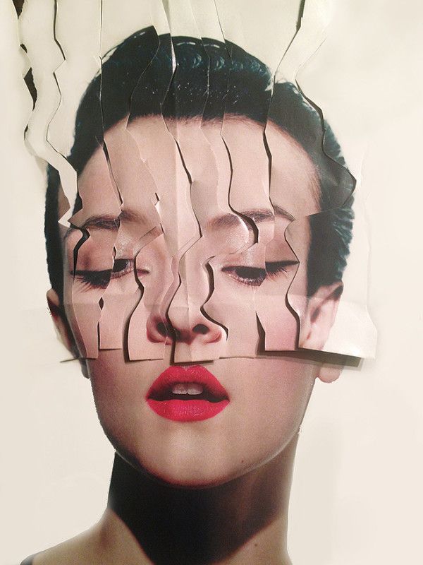
Carlo Muttoni founded Brandpowder, a creative think tank for innovation and experiments in visual communication, and specialized in the creation of branded content which turns products and brands into compelling ideas. Paper Surgery.
'It’s a sort of Media-Origami mixed with Trompe-Collage and a touch of Iconoclastic Voodoo. Tree Pulp Mumbo-Jumbo. Paper seems old-fashioned, today, and dismissed in favor of hypnotic media liquidity.' 'I love paper, and this is another essay to celebrate its unpredictable flexibility.' |
|
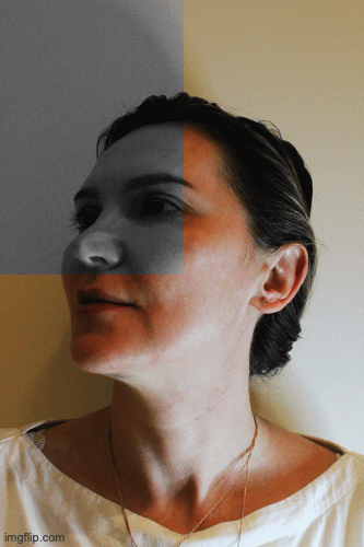
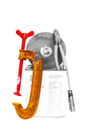
Paper Surgery Draft
|
|
|
Representation on Paper Surgery

|
|
|
|
|
|
What went well was that I used photoshop to create images that would of been difficult to represent on paper. This allows me to enhance my creativity. However, I struggled to use paper where it would of created a better effect (Shadows) which would of introduced contrast. Additionally, to improve my drafts I will take the photographs in blank white areas with better lighting so I can focus more on the object I photograph, without having to worry that the cameras shadow is in the way. Furthermore, it could of been better if I included composition and different colours (example of the woman's red lipstick in Carlo Muttonis photographs) to make the photographs more appealing. I will try and pursue the idea I want to create without relying on photoshop.
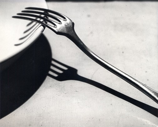
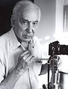
André kertész
André Kertész was a Hungarian-born photographer known for his groundbreaking contributions to photographic composition and the photo essay. In the early years of his career, his then unorthodox camera angles and style (Modern Photography) prevented his work from gaining wider recognition.
|
|
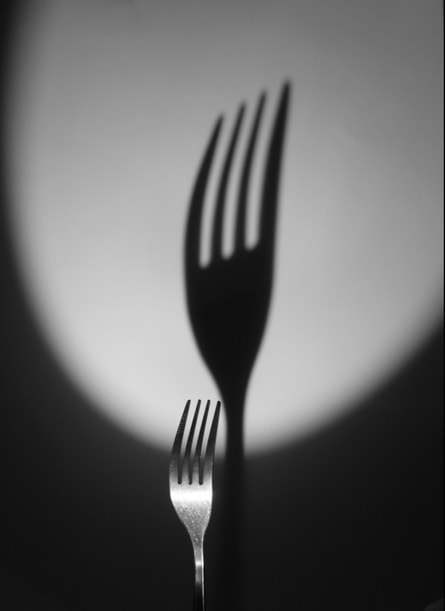
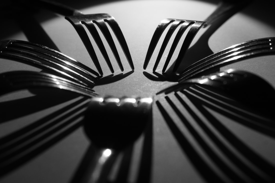
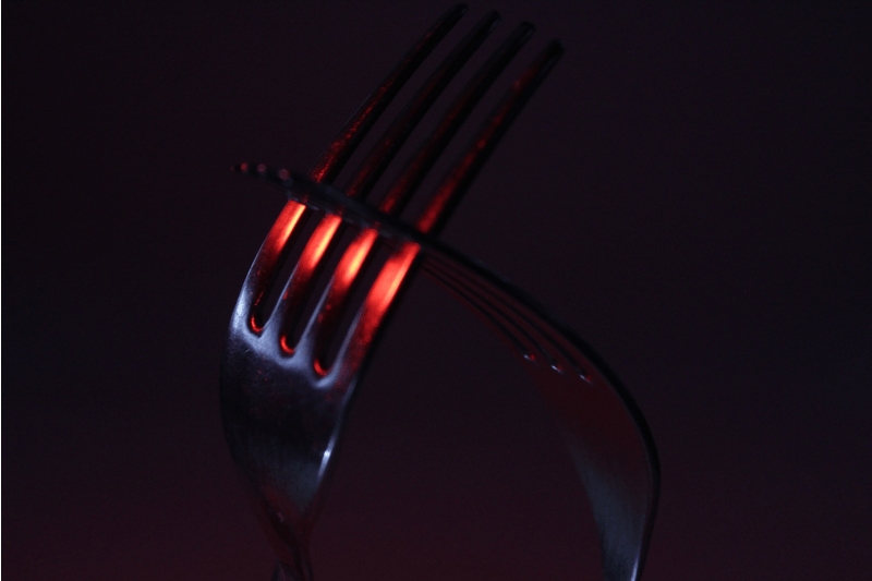
Draft
Creation Process
I took a flashlight, coloured plastic, forks and a white surface. I turned off the lights and positioned the flashlight where it created a massive or a contrasting shadow. I used a coloured plastic to cover in front of the flashlight to give different colours. The white surface is used so the whole background is the same colour. Additionally, in the GIF i moved the flashlight towards the forks at different angles.
Response to Form over Function
|
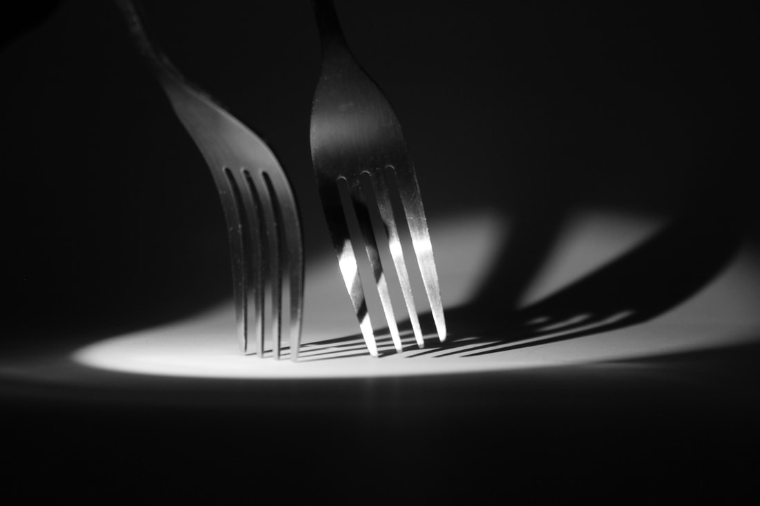
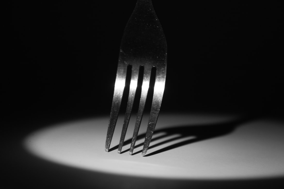
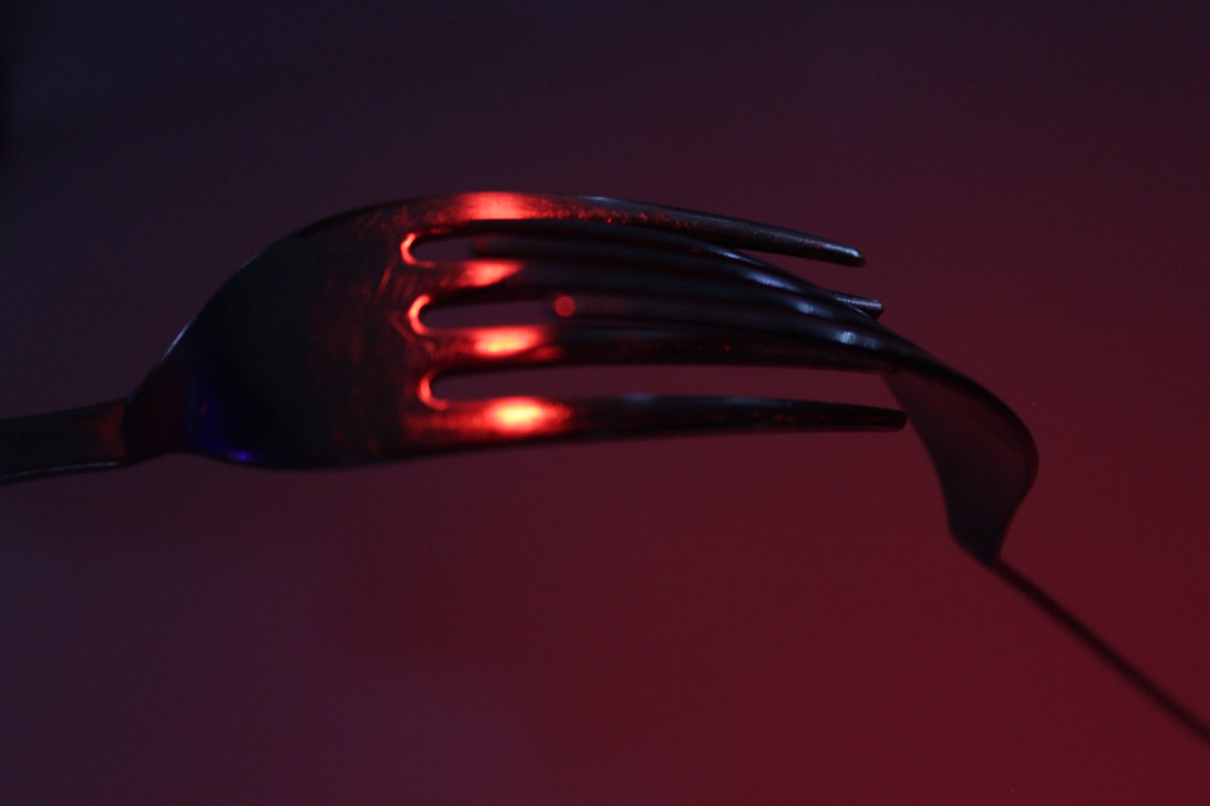
What went well was I successfully changed the picture style to monochrome to add more black and white contrast. In addition, the images can be interpreted with meanings with the use of shadows and position of fork rather than just an object. What went well was I was able to create a mood in the image through using red light which are connotations to passion or danger. Furthermore, I used the light off the fork to reflect movement.
It could be better if it was more in focus to emphasise the depth further. |
Ordinary to Extraordinary
Edward Weston

|
Edward Weston (1886-1958) was a 20th century photographer who has been called one of the most innovative and influential of all American photographers and a master of photography. His career spanned 40 years and he photographed an expansive set of subjects, including landscapes, still-life, portraits, and genre scenes.
Some of Edward Weston’s most famous work was close-up images of vegetables and fruit, photographed in a way that captured the “essence” of the object, taking them out of context. His manipulation of light to highlight shape, texture and form helped bring photography out of the shadow of painting and stand on it’s own as a credible art form. Through these photographs he transformed his subjects into abstractions of shapes and patterns. 
|
Draft
Creation Process
I used different fruit and a black background. I lowered the ISO and used flash to emphasise the details and texture. The fruit gave a range of different shadows through different shapes and angles. The black background helped allow the object to stand out and so the audience focus more on the fruit than the background.
Response to Ordinary to Extraordinary
|
What went well was I was able to take pictures which have potential for many shadows that can be emphasised in photoshop to black and white, by using different angles from the camera and the object. In addition, I were to be closer up to the objects I could get a better depth of field. Furthermore, I used to shape of the object to use to my advantage as I positioned the light so the object which created more shadows.
It could be better if the main objects were in focus but It did help create a depth of field which I originally wanted. |
|
|
|
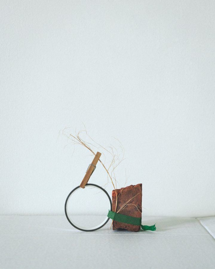
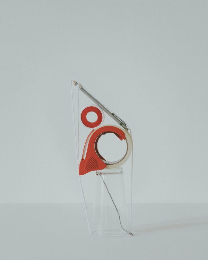
Lockdown Sculpture
Sharon Radisch
Sharon Radisch is a New York based photographer created a series of still lives using found objects around her home and neighbourhood to keep her artistic temperament active during COVID-19 pandemic.
"For many artists, this current time has provided an opportunity for creative reset, and is a reminder of the everyday joys of life, should we find the capacity to look for them.This work is representative of my daily quarantine routine; nothing was created outside of my home.” The abstract forms play with balance and are intriguing in the composition.
"For many artists, this current time has provided an opportunity for creative reset, and is a reminder of the everyday joys of life, should we find the capacity to look for them.This work is representative of my daily quarantine routine; nothing was created outside of my home.” The abstract forms play with balance and are intriguing in the composition.
|

|
|
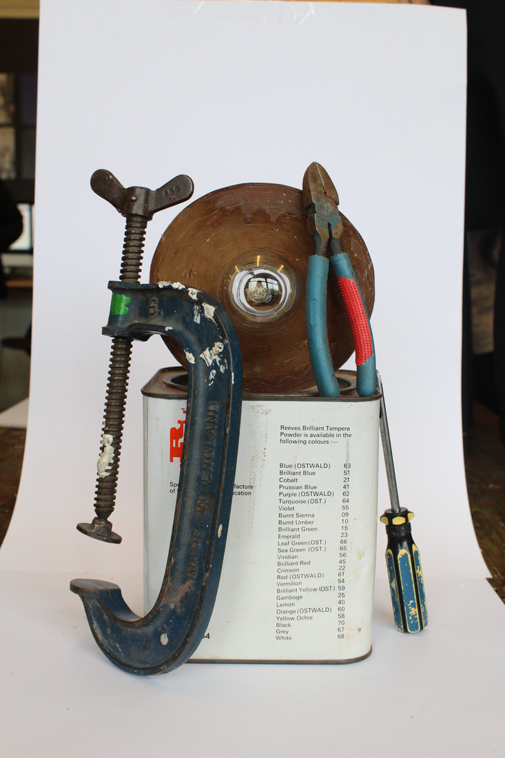
Draft
Creation Process
I took a range of objects in front of a white backdrop. I placed the objects in a position where they all travel upwards. I whited
Response to Lockdown Sculpture
What went well was i positioned the objects in a certain way to create depth and a different perspective. Furthermore, I used composition to keep the objects within the white background. However, it could be if i kept all the objects in the white frame, using composition. In addition, I used colours that pop in contrast to the black and white image. Moreover, it could be better if i was able to finish the image in photoshop to add colour to every object.
|
|
|
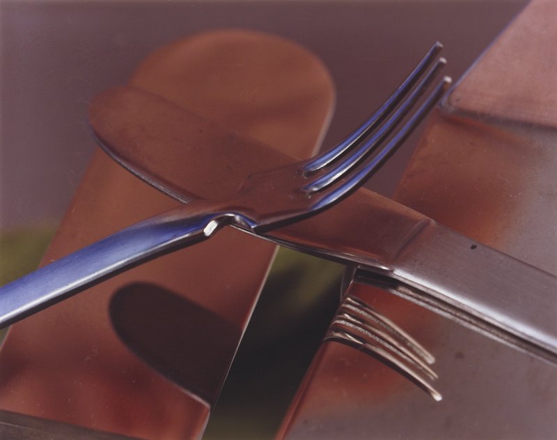
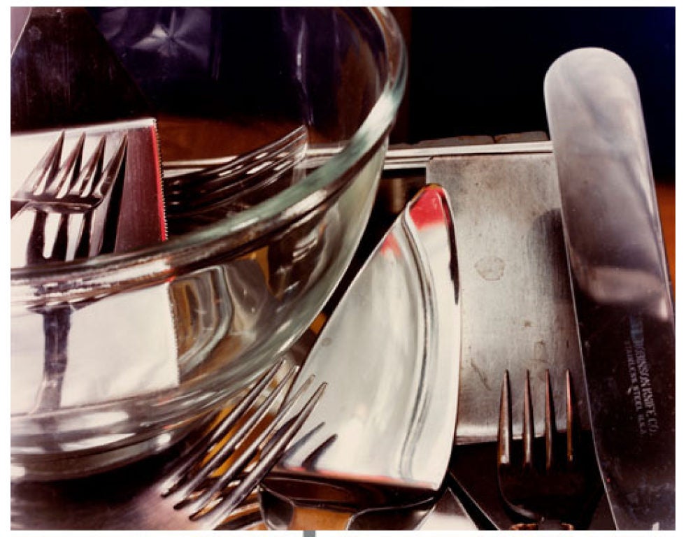
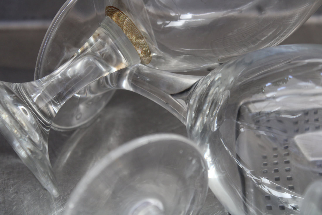
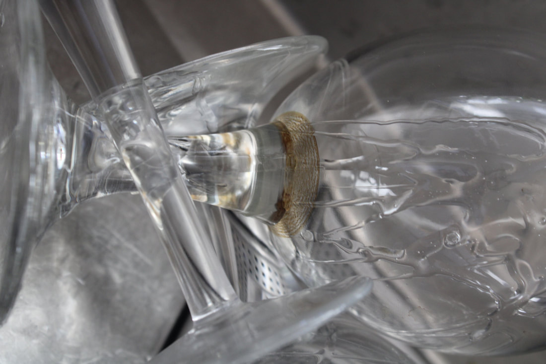
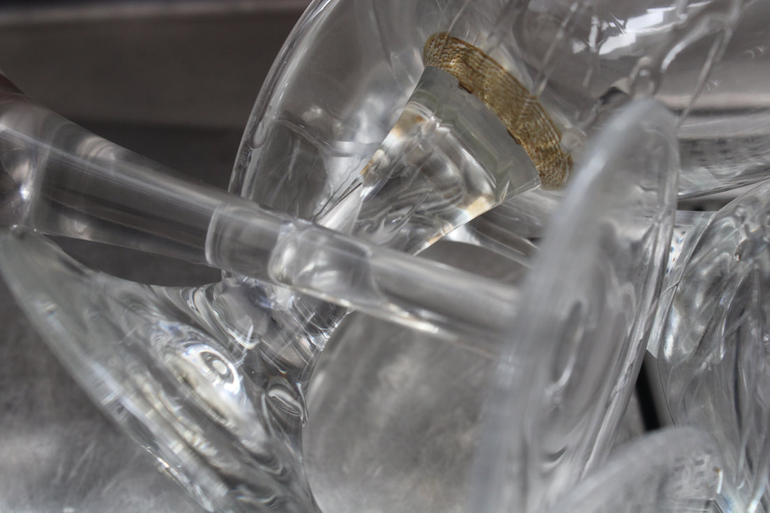
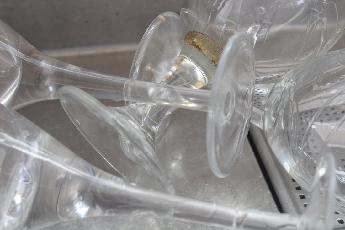
Kitchen Still
Jan Groover
|
Jan Groover born April 24, 1943 and died January 1, 2012 was an American photographer who experimented with space and illusion in large format still-life tableaux that featured everyday objects, particularly kitchen utensils arranged in a sink. "With photography I didn’t have to make things up,” she said, explaining the change of medium from art to photography. “Everything was already there.”
Using a large-format camera, she transformed colanders, knives, spatulas and baking pans into objects of beauty that still hold a visual interest that transcends their common use. Her seductively modern colour palette of greens, pewter, bronze and brown tonalities permeates the space dissected by kitchen paraphernalia. |
|
|
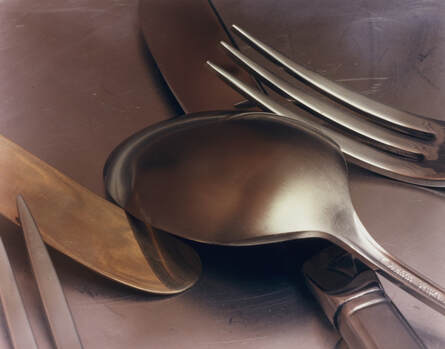
Draft
Creation Process
I used a sink, glass and washing up liquid. I had used a low ISO to emphasise the reflections in light. I zoomed in to focus close to create a contrast.
Response to Kitchen Still
What went well was i was able to take Jan Groovers aesthetic into consideration more. Furthermore, i used objects made of glass to add contrast with reflections, in comparison to the sink to make the objects visually stand out more. However, it could be better if were to go the further step by adding even more bronzier tones to the image to take full inspiration of Jan's work, but i think it would take away the contrast between reflections of the glass.
|
|
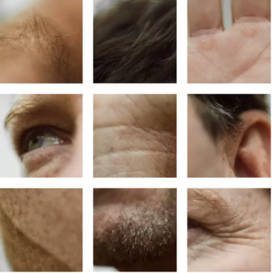
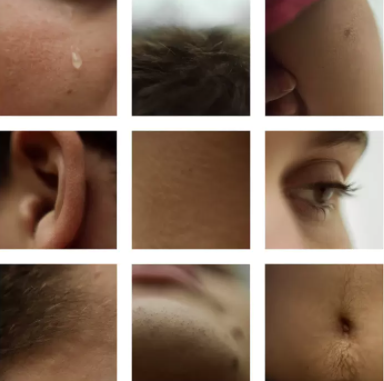
Different Views of a Person
Lauren Marek
Lauren Marek in her series "Pieces" create's similar work but her work focuses even closer to the person and creates an even more abstract representation of the figure. Inspired by Picasso and his cubism portraits she uses 9 images alongside each other to create her abstract representations of a person.
|
|
Draft
Creation Process
I used a model against a white backdrop. I focused on pictures that gave a variety of colours. Furthermore, i collaged them on weebly in contrast to make them pop.
Response to Different Views of a Person
What went well was i was able to experiment with different parts of the body and different angles, allowing me to add texture within the images. In addition, i place the images in a grid according to the tone or shadow of grid, attempting to make the grid flow but also add contrast with shadows in images. However, it could be better if i were of to experimented with different parts of the whole body, rather than just face, i could of added even more texture to the piece.
|
|
|
Distortion
Susanne Saroff

|
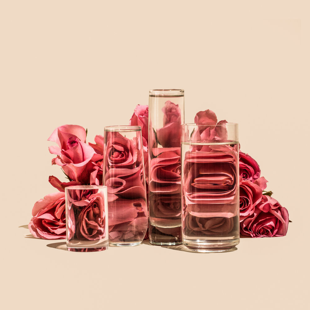
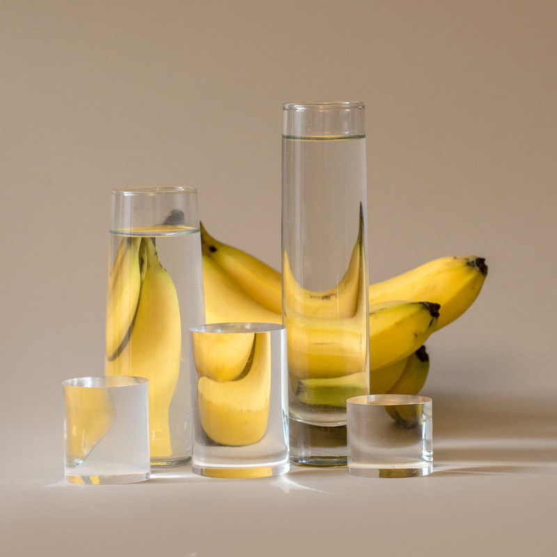
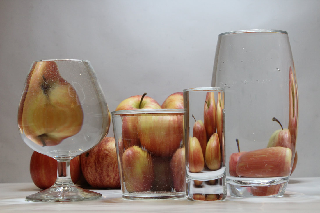
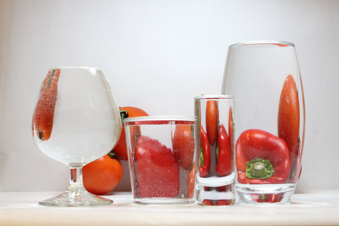
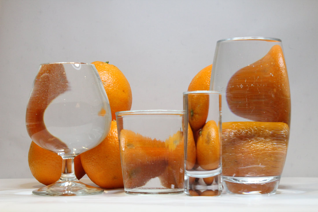
In her ongoing series titled Perspective, photographer Suzanne Saroff creates fractured and skewed images of common foods as seen through vessels filled with water and glass objects. The images play with concepts of light and shadow resulting in distorted still life's that appear almost like digital glitches.
“With tools and techniques such as refraction, directional light, and bold colours, my photographs give everyday items alternate visual avenues of expression,” shares Saroff. “Taking shape via shadows or fragmentations, my subjects often become more than the singular and expected version of themselves.” |
|
|
Creation Process
I used a white backdrop, range of glasses, fruit. I positioned the fruit in which they appeared in every glass. I used a low ISO to emphasise the texture in the apple.
Response to Distortion
|
What went well was i was able to incorporate a reflection of the object into every glass. In addition, i used different shapes of glass to create different shapes in the glass. Furthermore, i also created shapes by using different angles of the object.
However, it could be better if i had the light source from a better angle, it could bring a different perspective. Moreover, if i were to use objects that pop more in colour, it would enable the picture to emphasise shape of the object. |
|
|
|
Collage
Jesse Draxler
Jesse Draxler is a contemporary artist and photographer who works in many different mediums where his brooding style combines collaged photographs and painting, Draxler distorts and overlaps the models bodies to form abstract creature-like being. His work is always in grey scale as he feels 'colour can be a distraction'.

|
|
Draft
Creation Process
1. Make the pictures in black and white.
2. Invert half of them.
3. Cut them out and layered them over.
4. Flip underside down.
2. Invert half of them.
3. Cut them out and layered them over.
4. Flip underside down.
Response to Collage

|
What went well was i was able o emphasise elements Jesse Draxler used that wouldn't of been noticed initially (inverted). However, I did not invert all the photos i used to compile the image to had contrast between the features of the models face. I did this well as i was able to line up the photos well that made it seem realistic. Additionally, I made the image upside down to add more creature-like to the image.
Moreover, it could be better if I lined up the necklace and made cleaner cut lines as when its pen lined you can see it more clearly and does not blend into the other images cut out. |
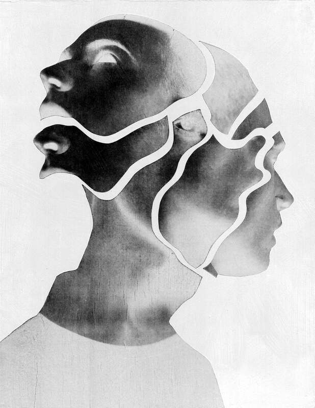
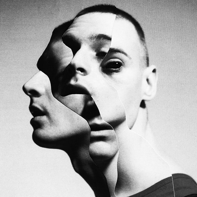
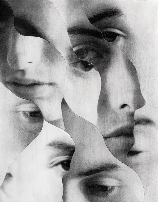
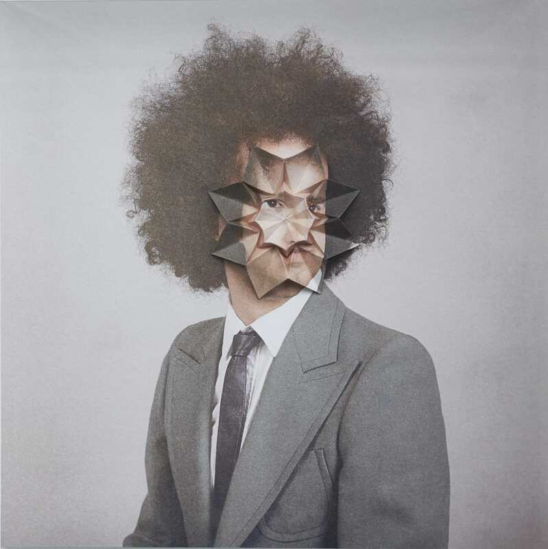
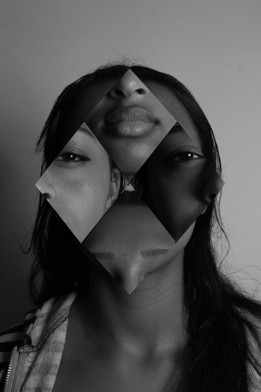
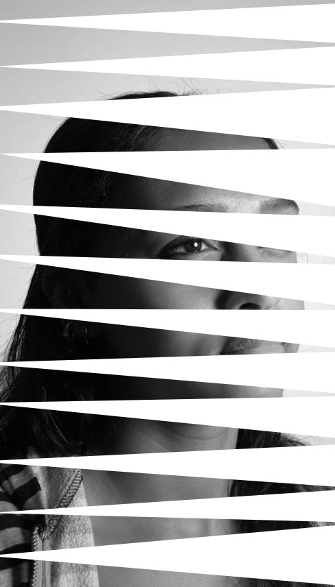
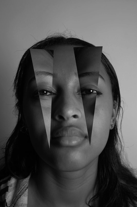
The Geometric Portrait
Geometric Portrait explores the relationships between lines, angles, and surfaces and re-imagining the human form through geometrical patterns and shapes.
Gordon Magnin
|
Gordon Magnin is an LA based artist who uses fashion images and turns them into a unique collage of "altered found images" with his use of geometric patterns.
He describes his work as "precise, intricate, geometric and destruction". His alteration of single images using precise geometric cuts and operations completely re structure the form of the original photos, and due to the majority of his photographs being portraits, the repositioning of geometric shapes cause deceptions at first sight as the eye is not used to features of the face being in strange places, which is what makes his work so unique and individual. His use of black and white colouring accentuates the features of the face even further due to the quality and use of shadow in his photographs. His aim of work is to break down the expectations of perfect looking models and to challenge the industry's perception. |
|
|

|
Draft
Creation Process
Response to Geometric Portrait

|
What went well was that i added contrast to the monochrome images to create more shadows so the rotated shape to further emphasise a dramatic contrast. Furthermore, i increased the lightness to make the images 'soft' and essentially not harsh. Additionally, i experimented with different shapes to convey contrast with the softness of the image. Even better if i experimented with placing the shapes over different parts then the eye to add a sense of unusualness.
|
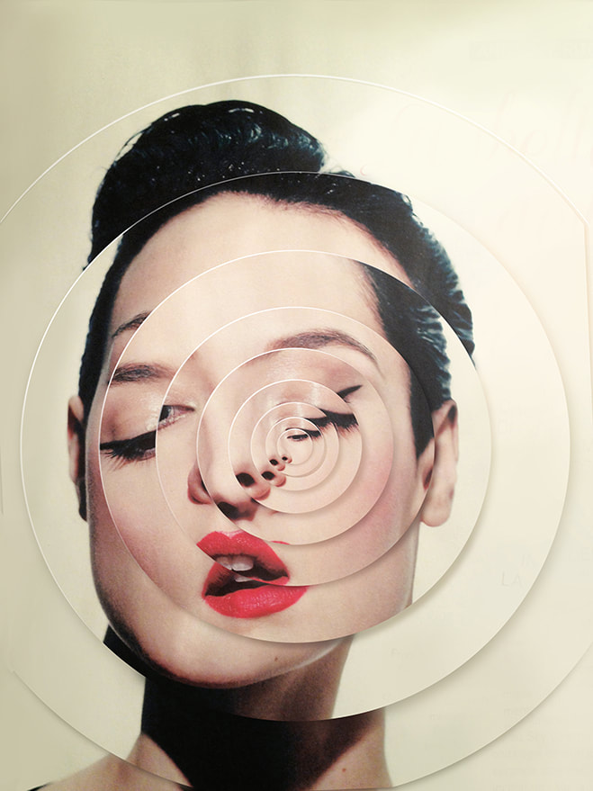
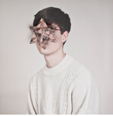
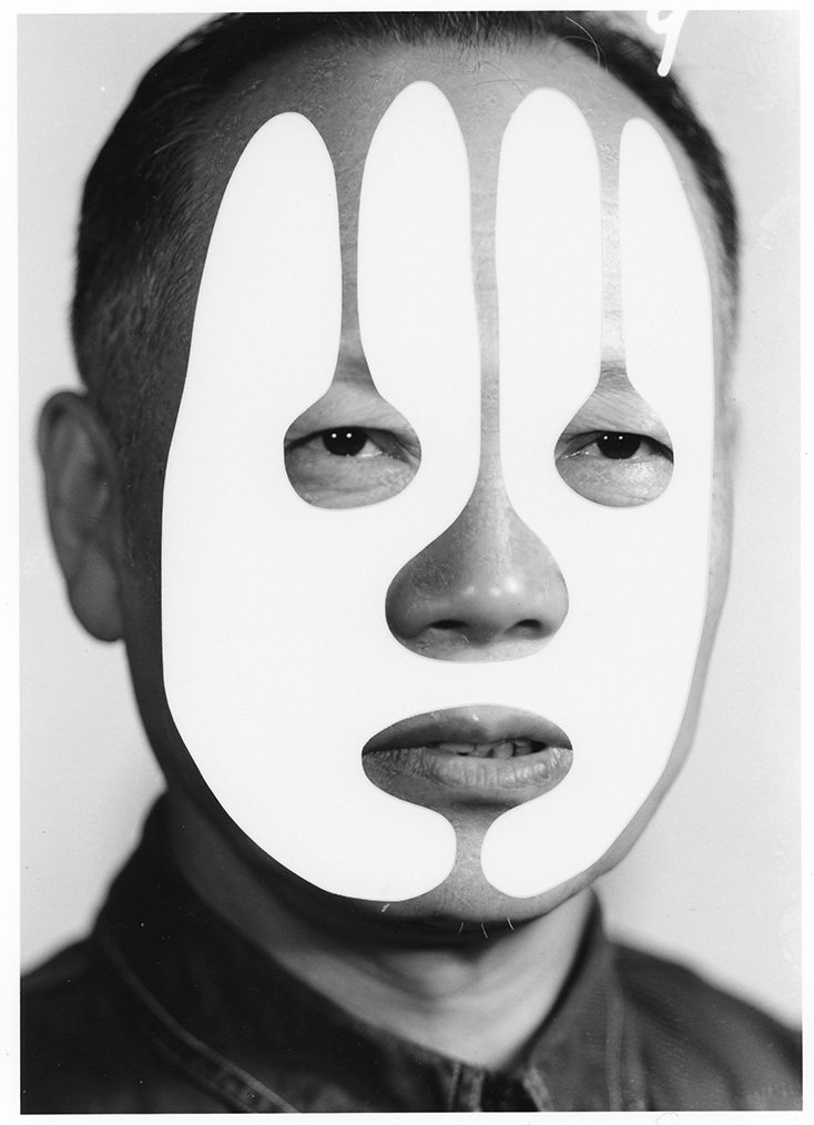
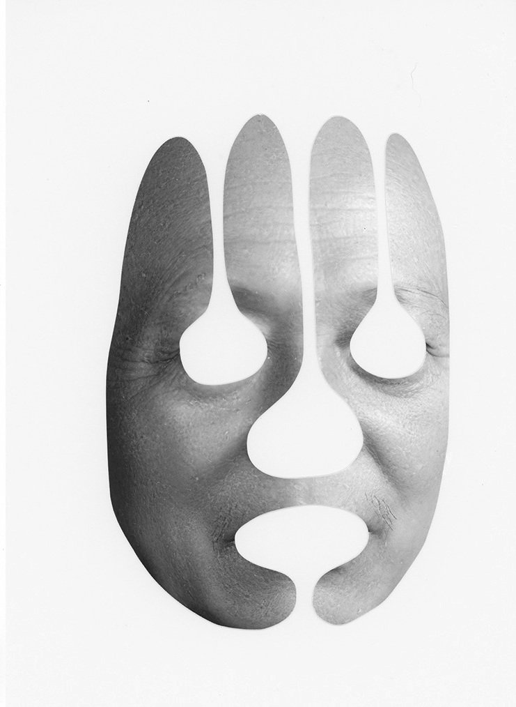
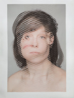
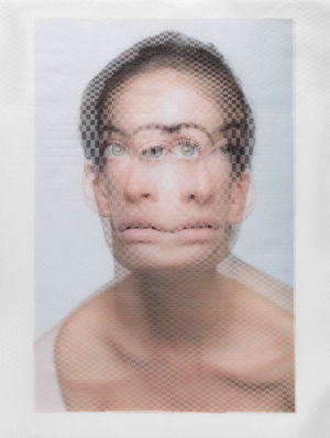
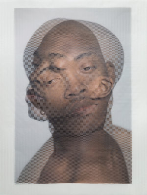
Cosmetic Surgery
Cosmic surgery is imagined as a medical procedure that people can choose in the not so distant future for aesthetic enhancement, mood alteration, and to increase pervasive methods of surveillance.
Alma Haser
|
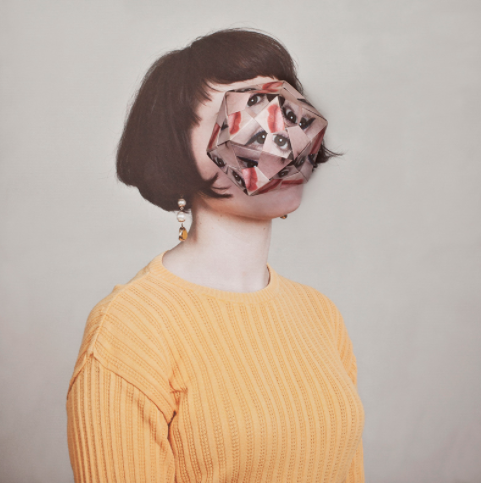
Alma Haser creates kaleidoscopic cubist portraits by folding photos into origami structures and then photographing them again over the original same-size photo portraits.Cosmic surgery is imagined as a medical procedure that people can choose in the not so distant future for aesthetic enhancement, mood alteration, and to thwart increasingly pervasive methods of surveillance. Combining photography with collage and Origami, Haser's playfully odd portraits consider the link between identity and image in a culture of visual bombardment. She suggests a fundamental shift in the way we understand ourselves and the world around us, picturing the possibility of a trans-humanist future.
|
Draft
Creation Process
Representation of Cosmetic Surgery
What went well was that I positioned the origami object in line with the original backdrop image, to make it flow into each other. As well, it doesn't exactly line up, which emphasises a distortion from each other. Additionally, i did not precisely make the origami object to add roughness to the edges and ridges of the object to emphasise a texture. Even better if i experimented with different angles and different sides of the object to add contrast between the object and the image.
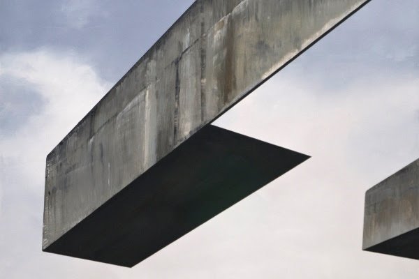
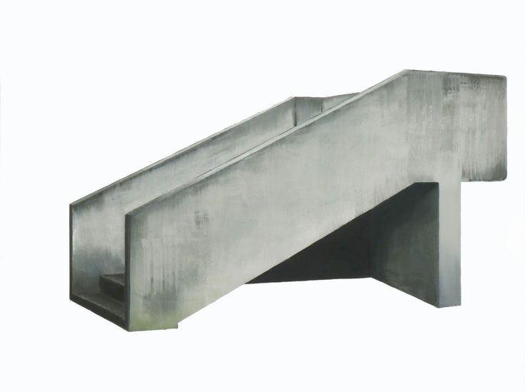
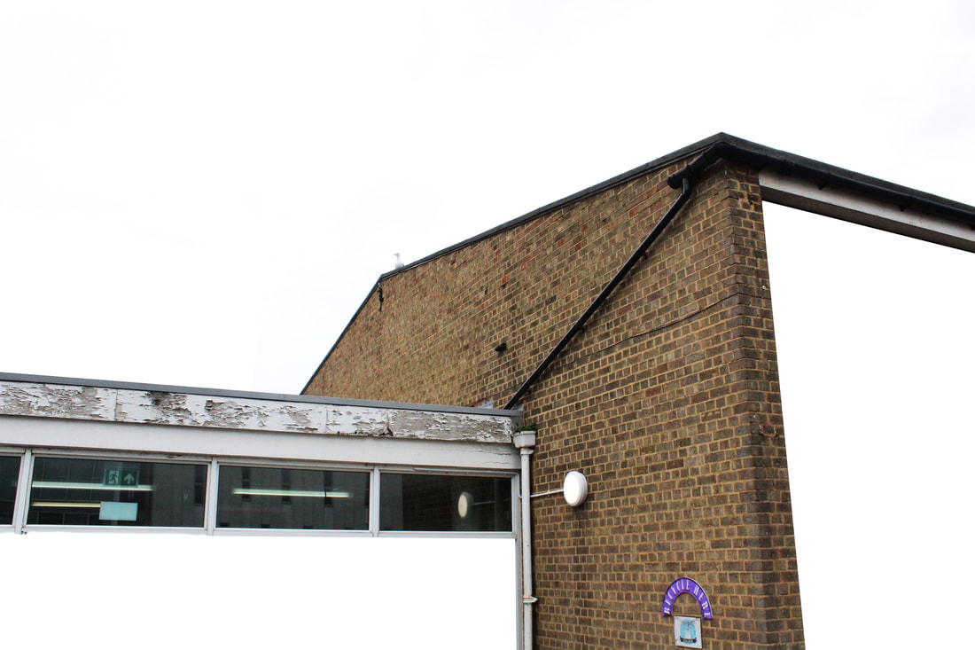
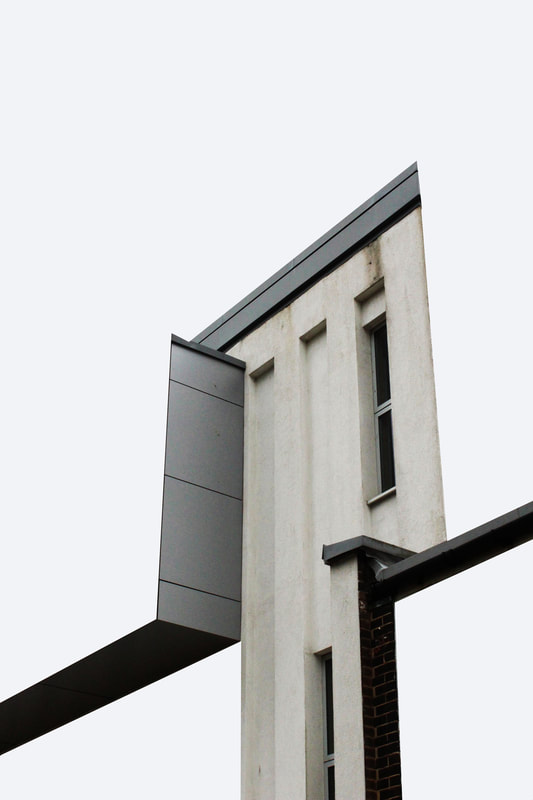
Fragmented Buildings
An object formerly part of a built structure, intended to be part of a built structure, or representing a structural element of a building.
Patrick Cornillet
|
Patrick Cornillet is a French architectural painter born in 1968 in France. Cornillet resides and works in Nantes. His recent work features austere constructions in empty surroundings. Fragments of architecture left in the center of the painting, in suspense by its visitors. His works capture their spectators in an illusory space. Because of this the viewer struggles to give an interpretation to these concrete structures. Unclear is if these structures have ever served a purpose other than confusing its viewers. Cornillet’s more recent work can be viewed as ‘severe’ or ‘naked’. Similar to his previous work a feeling of motion is perceived in these structures. These images evoke the ruins of a fallen society, standing as naked as fragmented.
|

|
|
|
Draft
Creation Process
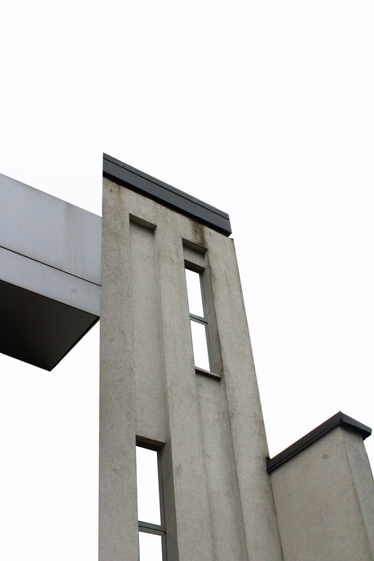
Representation as Fragmented Building
|
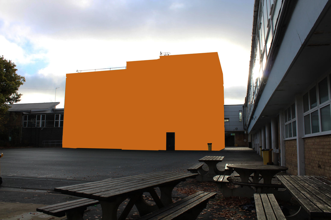
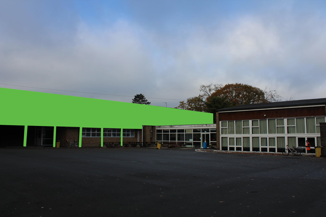
What went well was that my images looked similarly to Cornillet.
Additionally, i photographed buildings that had a odd shapes which allowed me to emphasise Cornillet's idea to an extreme. As well, i kept the background into the unusual background to add a sense of reality to the images as well to confuse the audience. It could be better if i used more plain buildings to photoshop where it could express Cornillets element of 'nakedness'. This is because the images seem crowded and busy, which takes away from the shapes of the building. |
|
|
|
Architecture Erased
Mauren Brodbeck
|
Mauren Brodbeck, a Swiss multisensory artist and singer-songwriter, uses visual and auditory elements to create startling reinterpretations of common objects and experiences. Her multidimensional works invite her audience to step outside their safe and familiar realities and reconsider their relationships with the people and environments around them.
The hue used comes from the location or the season : “I am inspired by the colors of the place and the seasonal colors which can really change the feel of the pictures. I start by using the color palette of the area or the persona. Then I create my own color palette based on the original color. That maintains the authenticity at the base of the work.” |
|
|
Draft
Creation Process
Response
What went well was that i experimented with the colour wheel where i used colours that contrasted from each other from the building or tone in the images. Additionally, i used building with absurd shape to the colour block had extra detail. This gave the buildings better shape and appearance instead of a square. It could be better if i were more precise with the finger details (example railings), it would give the photo more appearance.

|
|
Development
In this development i will be focusing on manipulating images to appear and look different, both physically and on photoshop.
No More No Less
Kensuke Koike
|
Kensuke Koike is a contemporary visual artist. The series, “No More, No Less”, includes new silver prints made from the album’s original negatives. These prints were then submitted to Koike’s sharp imagination, who, with a simple blade and adhesive tape, deconstructs and reinvents the images. However, these purely manual interventions all respect one single formal rule: nothing is removed, nothing is added, “No More, No Less”. In such a context that blends freedom and constraint, Koike meticulously explore the possibilities of an image only made up of itself.
|

|

|
|
|
Draft
Creation Process
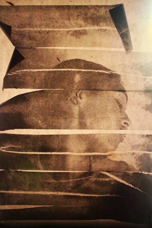
Response to No More No Less
|
|
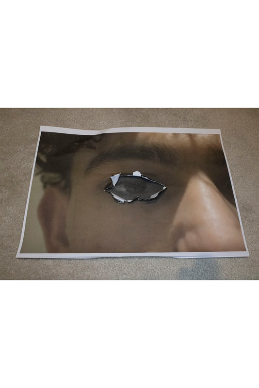
In this task i was required to use photoshop to manipulate images. In this task, as my first development, i wanted to experiment with possible ideas on manipulation with layering and removing part of images. This task links to the theme as it demonstrates manipulation with the same image.
What went well was that my composition helped to support my response to the theme it draws you in to the features of the model. I managed my exposure very well where i used a low ISO, with a ring light. This creates more shadows which thus creates a contrast within the image.
Even better if, in the last images, i somehow merged them together as they are the same image, but it feels very disconnected from each other. Additionally, if i had made the overlays more straight, it would appear more neat and appealing then messy.
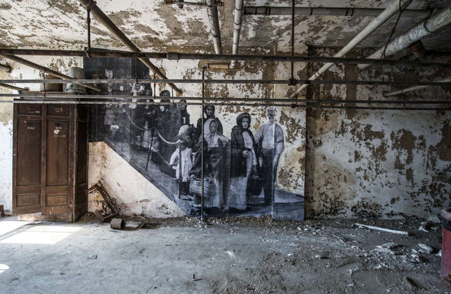
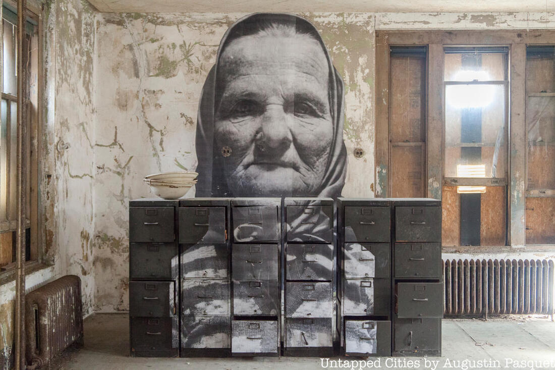
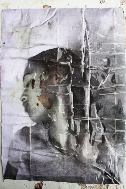
Unframed
|
The UNFRAMED Ellis Island project aims to bring alive the memory of Ellis Island, the entry point to America for millions of immigrants. Coming from all over the world, leaving their belongings, their family and their past behind them, with the fear that they may be sent back to it, the presence of these people who have shaped the modern American identity can still be felt in the buildings, although abandoned for the past 70 years. This is the opportunity to interpret the stories of these people through art.
JR born 22 February 1983 is a French photographer and street artist. He fly posts large black-and-white photographic images in public locations. |

|
|
JR
Draft
Creation Process
Response to Unframed

|
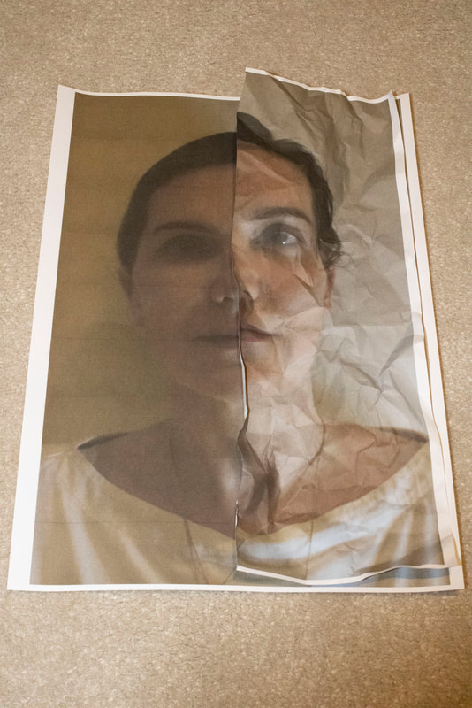
wIn this task i was required to use the transparency of paper in contrast to different surfaces/textures/light. This task links to the theme as it shows the manipulation of paper. As well i used the same image to emphasise the possibilities of paper, than not relying on the image itself.
What went well is that you can clearly see the original image through the transparent image. Additionally, i prioritised the aperture to manipulate depth on field to make the paper stand out from the material. I also kept a lot of the paper still on to increase the contrast. Moreover, i kept gaps in the image to add shadows, further adding a sharper contrast. Furthermore, i distorted the images on photoshop to appear as if they were taken from above, making the images more appealing. Even better if i distorted the images to straighten them to appear less messy. This will allow you to focus more on the paper. Additionally, if i cropped images slightly, it will look neater and appear more closely related to my theme. |
|
|
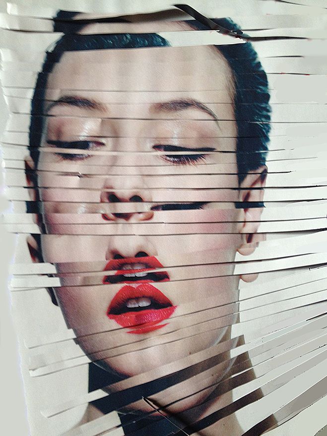
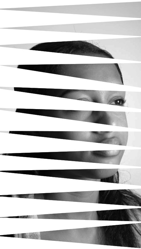
Sliced
Rosanna Jones

Rosanna Jones is a photographer and mixed media image maker based in London. She is a graduate in Fashion Photography from Falmouth University. Her work specialises in an experimental blend of art and photography; celebrating the physical possibilities of an image, rather than simply its two dimensional form. Her trademark aesthetic has been built through years of painting over, ripping up, burning and otherwise distressing her photography to create tactile portraits that defy the flat images they once were.
The subjects of Rosanna Jones’s portraits are often obscured, their faces covered by blotches of color or torn out of the image altogether. The tactile nature of Jones’s images holds personal meaning for the photographer, who uses her work to explore notions of embodiment and visual identity.
The subjects of Rosanna Jones’s portraits are often obscured, their faces covered by blotches of color or torn out of the image altogether. The tactile nature of Jones’s images holds personal meaning for the photographer, who uses her work to explore notions of embodiment and visual identity.
|
|
Draft
Creation Process
Response to Sliced
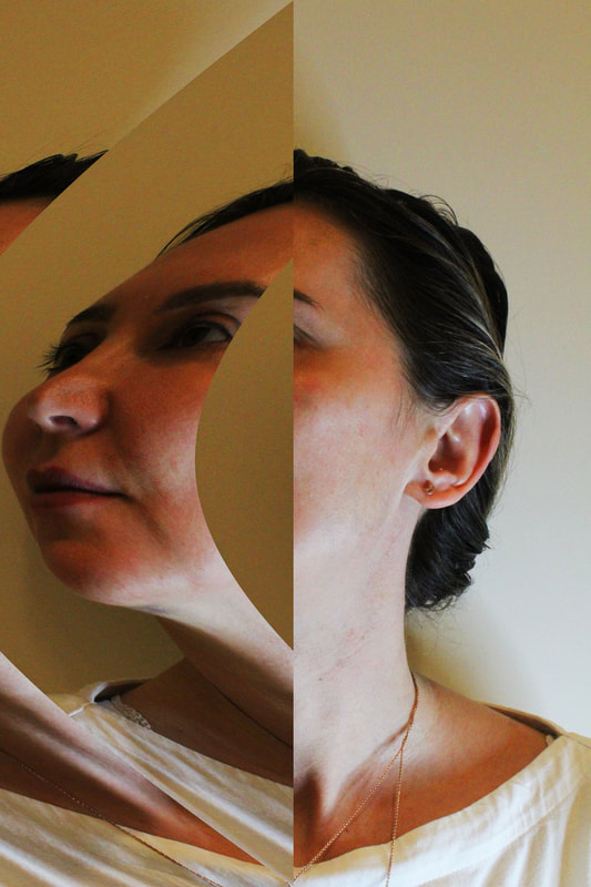
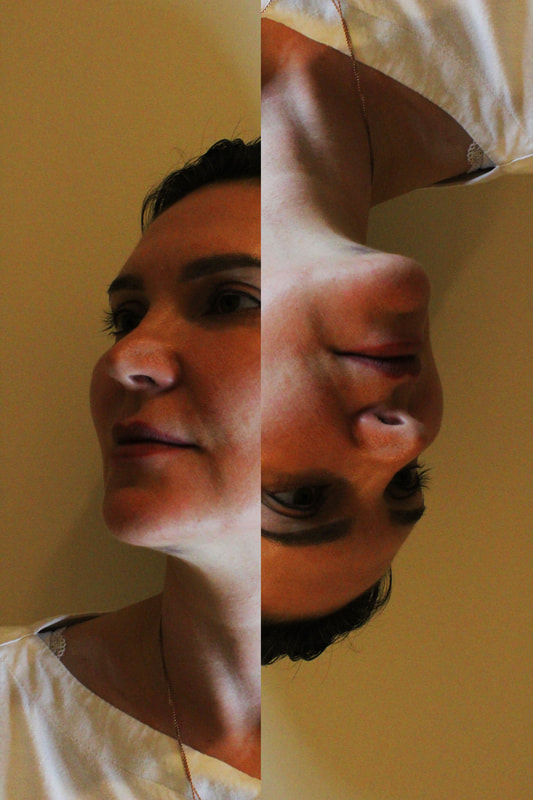
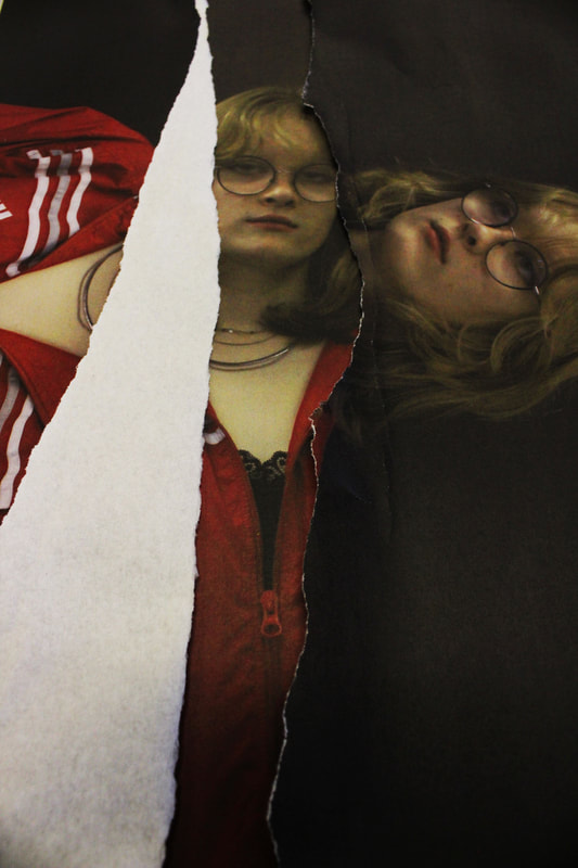
In this task i was required to manipulate paper by cutting, sticking and layering images on each other.
What went well was that the subject i chose to photograph suited the theme as it allows me to explore the physical possibilities of paper. My composition helped to support my response as it allows you to focus on the texture of the paper. I prioritised aperture to manipulate a depth of field to clearly show the individual papers, contrasting from one each other. As well, in photoshop, i distorted the images to make it seem as i took from directly above, this gives it the sense of realism and done physically. Additionally, i increased the contrast to further create a stronger depth of field and for the images to stand out from each other.
Even better if i brightened the images, it could emphasise the details of the paper. Furthermore, it i prioritised my shutter speed high, it images could appear less blury.

|
|
|
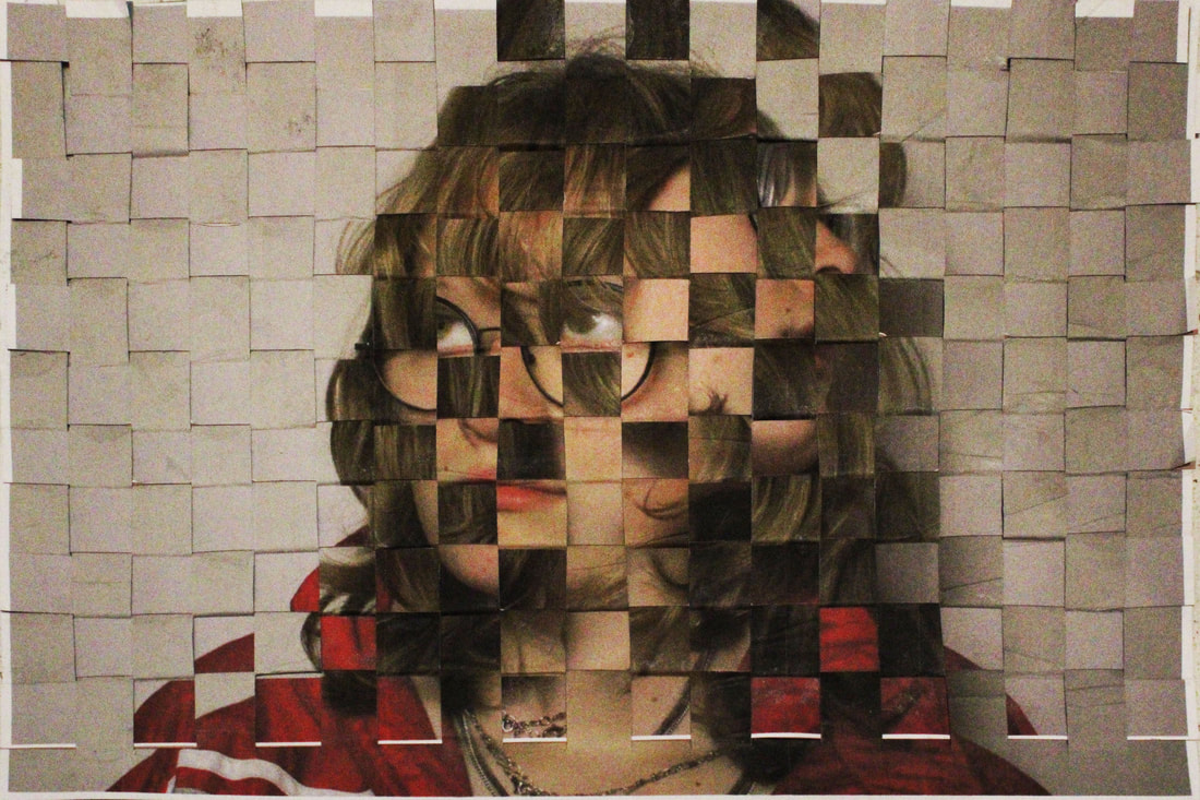
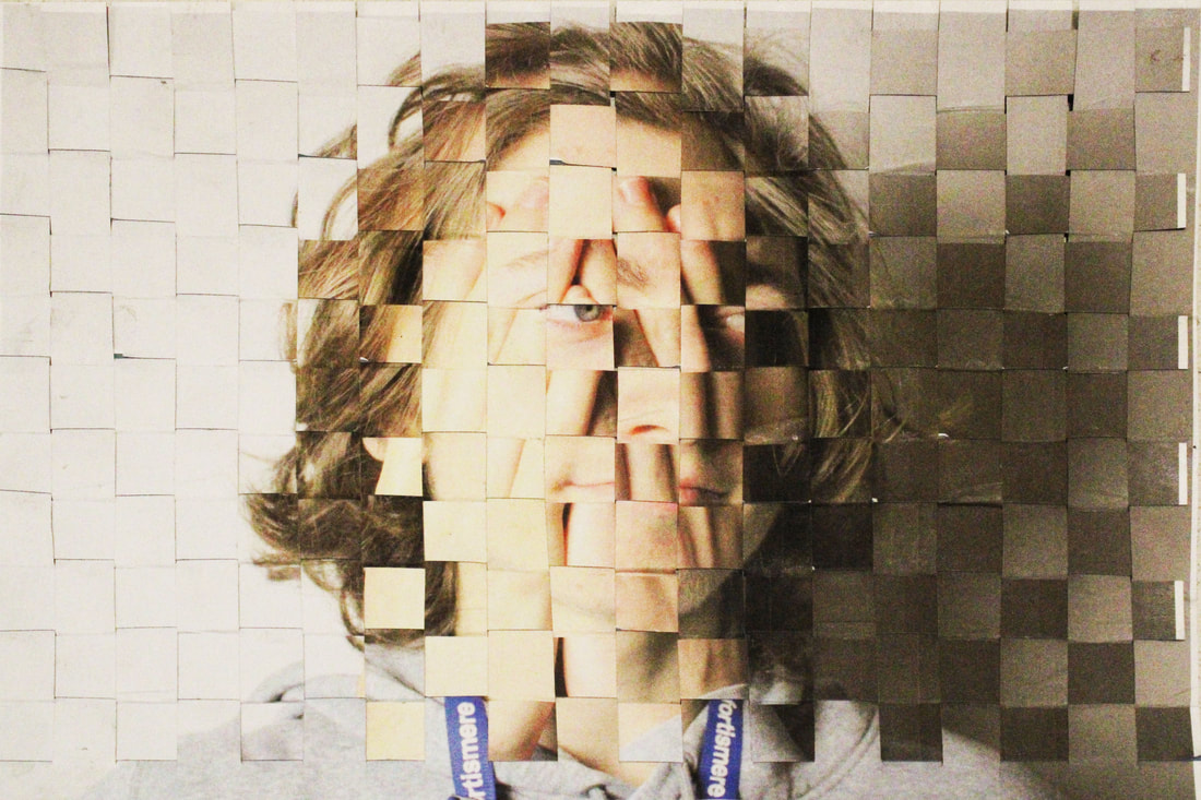
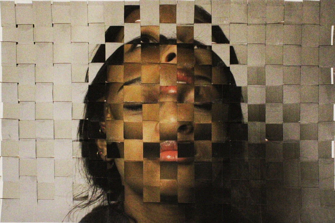
Woven Portrait
David Samuel Stern
David Samuel Stern is a photographer, artist, and teacher now based in NYC. His work attracts huge audiences in the way he translates a photographs and portraits into tangible objects. Through the variety of work produced by the artist, this interview focuses on his Woven Portraits series.
"My Woven Portraits series touches upon portraiture quite a bit, as well as the nature of images, particularly their physicality. As I’ve become more familiar with making this kind of photography, the work also increasingly embraces the theme of craft, and I honestly believe the process of making something is as important as the thing itself."
"My Woven Portraits series touches upon portraiture quite a bit, as well as the nature of images, particularly their physicality. As I’ve become more familiar with making this kind of photography, the work also increasingly embraces the theme of craft, and I honestly believe the process of making something is as important as the thing itself."
|
|
|
Draft
Creation process
Response to Woven Portraits
In this task i was required to manipulate two images into one, where you can clearly see both. This task links to the theme as I physically manipulate paper.
What went well was that the subject i chose to photograph suited the theme as it collaborates craft into paper. I managed my exposure well as i decreased my ISO to emphasise the shadows and detail. Moreover, i used card under the paper to appear more as fabric than paper, as the card raises the structure, further adding more texture. As well, i took pictures at different angles to show more clear depth. I also used small strips so that you can see both images very clearly. This is also increased where i prioritised aperture to further add the depth of field. On photoshop, i distorted the images to appear as it was taken directly above. Furthermore, i added contrast on photoshop, to make the images stand out from each other, to make the two images both clear to see.
Even better if i cut off im photoshop the edge as it takes away from the woven/fabric effect. Additionally, if i used smaller strips, you could see the images more clearly from each other. Lastly if i neatly folded the card back whilst making the woven image, you wouldn't see the dents nor the glue stains. However, it does somewhat go with the high contrast.
|

|
|

|
|

|
Final development
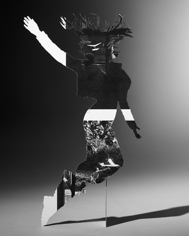
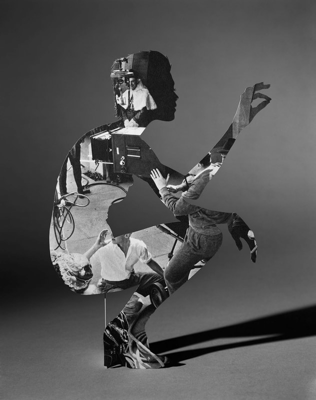
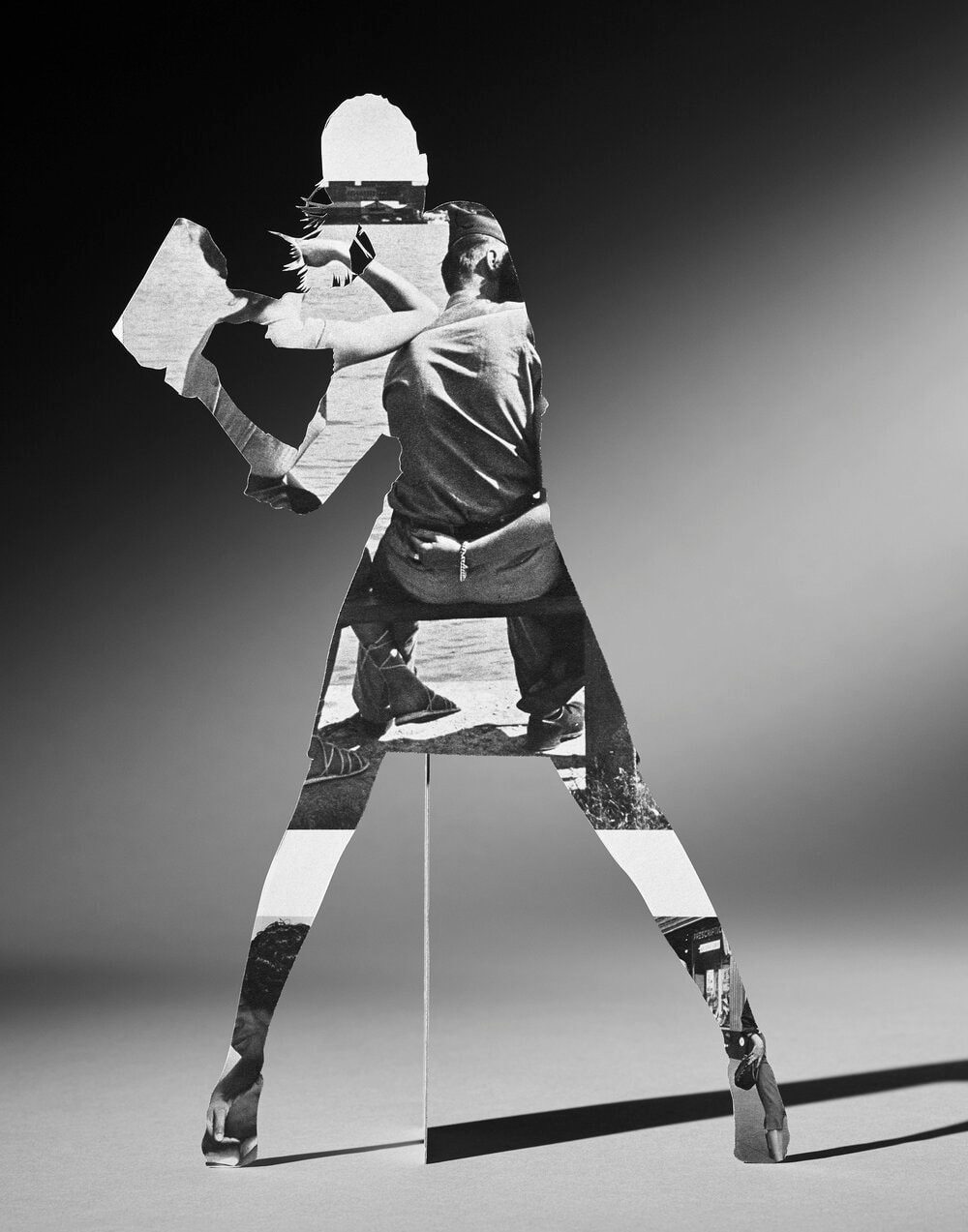
The Body Wants to Live
Matt Lipps
|
The Body Wants to Live sources iconic silhouettes from Richard Avedon’s 1990s campaign for Gianni Versace to frame and reanimate the pages of The Family of Man catalogue that accompanied the eponymous 1955 MoMA exhibition curated by Edward Steichen. Echoing the original exhibition’s layout, the catalogue is filled with small, boxed images that propose a universal narrative from creation to death arranged on white pages. Lipps explores the contrast between the high fashion sensibility of Avedon’s silhouettes and the reconfigured content of their interior photographs, highlighting the wealth and racial disparities that have been in especially sharp focus today. Lipps transforms this printed publication into theatrical tableaux employing collage strategies, sculptural devices, and dramatic staging. Studio lighting combines portrait and product photographic techniques to illuminate the dynamically posed bodies, len ding a film noir aur a to the surreal fashion photoshoot.
|
|
|
|
Draft
Creation Process
|
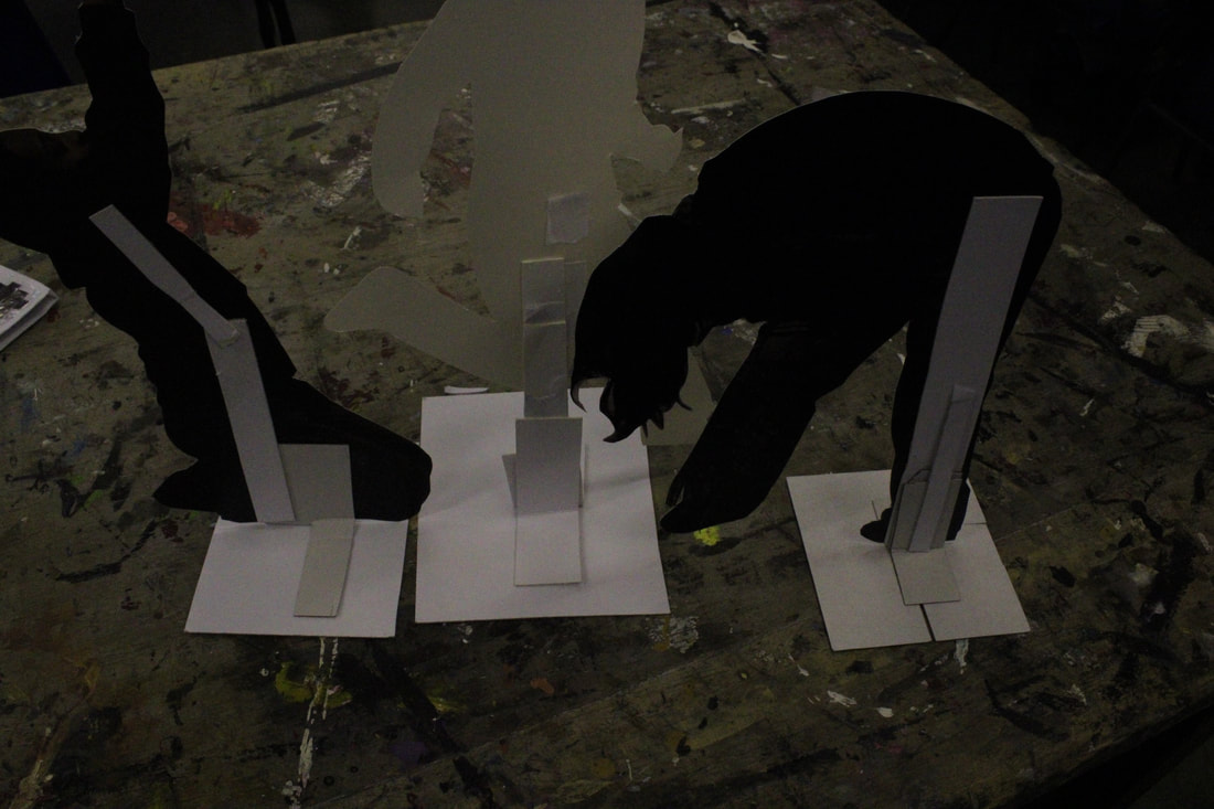
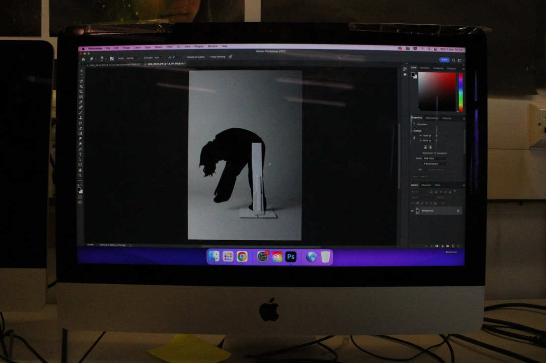
Sculpture:
1. Print the images of the model on A3 and on card. 2. Cut out the silhouettes. 3. Cut out white cardboard into strips. 4. Glue a strip onto each model and the bottom middle, overlapping. 5. Cut out a square base with the white cardboard. 6. Bend the strips and glue it to a cardboard square base. 7. Glue further strips to maximise support. |
|
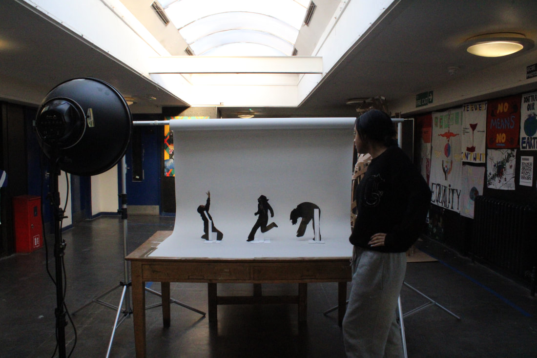
Photograph:
1. Set up a small white backdrop. 2. Place the light on the side on the object to create shadow. 3. Use a tripod to hold good angles and focus. 4. Take pictures on a low ISO. |
|
|
Photoshop:
1. Open the image taken with the white backdrop. 2. Adjustments-black and white + lightness and contrast. 3. Place the image of people over, then hide. 4. Using the magnetic lasso tool, trace over the silhouette. 5. Un hide the image of people. 6. Copy and paste image. 7. Cut the original image of people. |
Response to the Body Wants to Live
|
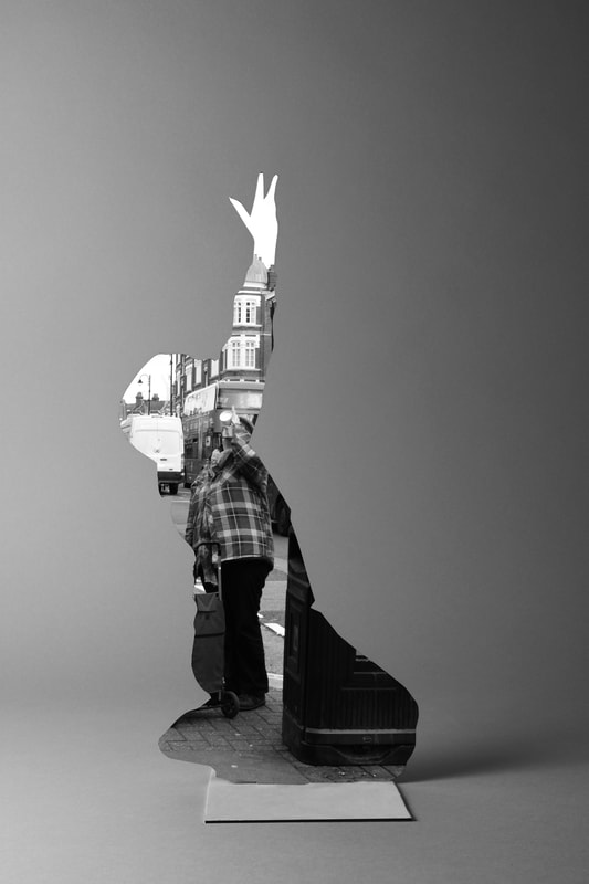
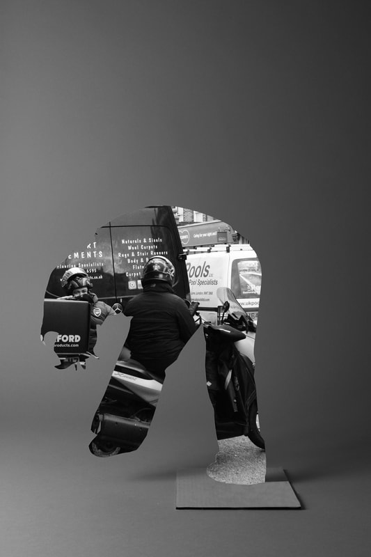
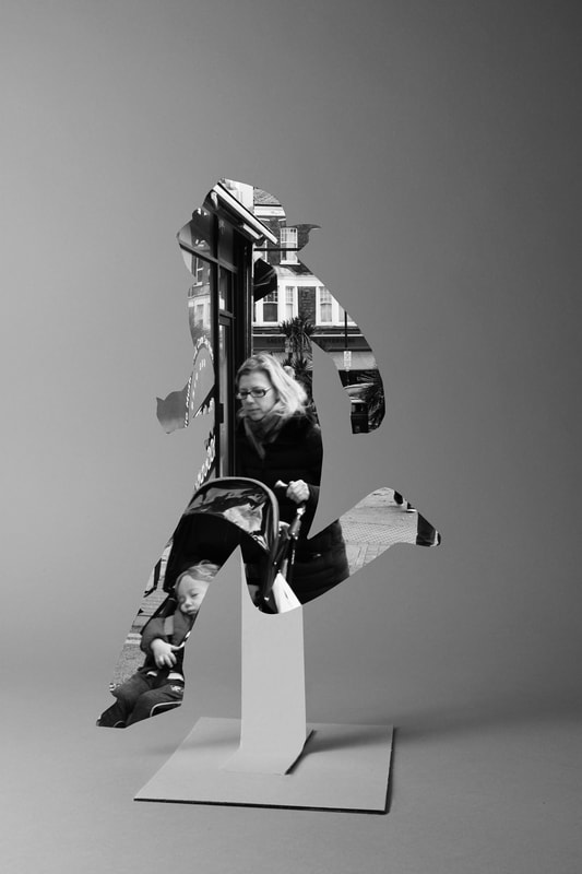
In this final development i was required to incorporate both photoshop and physical work, and collaborate all my previous developments into one. This task links to the theme of paper and manipulation where you cannot tell if it's physically real or not. I took a variety on images of random people in Muswell Hill, to show the diversity and culture of the place through contemporary poses of the silhouettes, to emphasise the peoples individualism and the London location.
What went well was that I chose elaborate poses that would show more of the images of people, showing more of the location as well, adding a sense of realism. My composition helped to support my response to the theme by keeping the poses minimalistic and more appealing so the you focus more on the images of people within. I managed my exposure very well using a low ISO. This makes the images of people pop from the stand and backdrop. I prioritised my shutter speed high to reduce blur when taking picture of the people and to create a sense of stillness, further making you focus more on the people. I used a tripod ti avoid camera shake. Even better if i took pictures of people in Central London as it is more crowded and more diverse, it could fit the theme more and it would show more of an interesting image. Additionally, it may of been better to use a low shutter speed, to add a sense of movement, in contrast to the silhouette which is still as well. Lastly, it could of been better if i incorporated more of my other developments into my final, or made it flow, this helps me convey my theme more. |
|
|
