David Hockney
|
In the early 1980’s, English painter David Hockney began creating intricate photo collages that he called “joiners”. His earlier collages consisted of grid-like compositions made up of polaroid photographs. He then switched to photo lab processed 35mm photographs and created collages that took on a shape of their own, creating abstract representations of the scenes he had photographed. The varied exposures of the individual photographs that make up each collage give each work a fluidity and movement that otherwise might not be found.
|

|

|

|
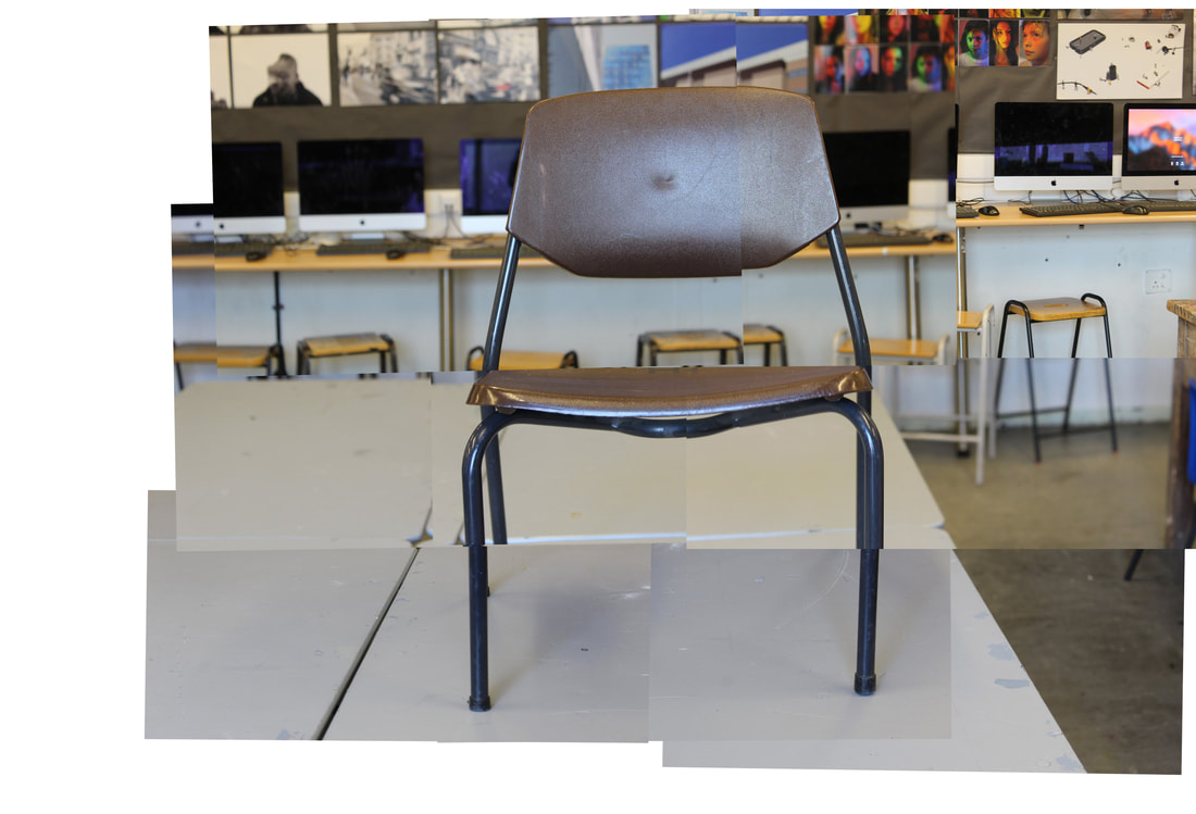
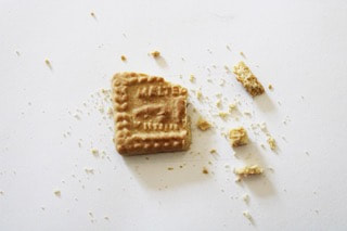
First response to Photo Joiners
|
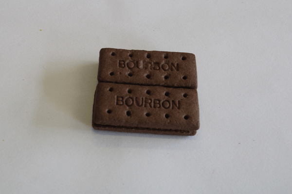
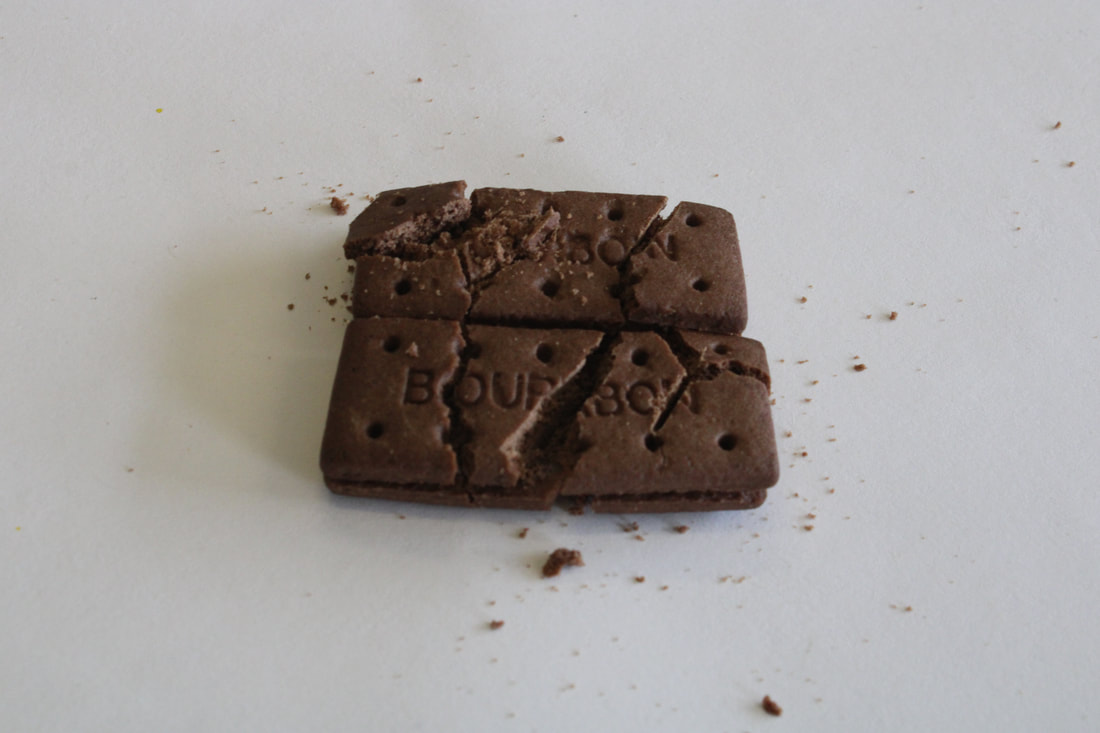
What went well was I was able to put together the images to look very realistic. However, it could be better if I added some artistic value and thought out of the box somehow. Therefore, if I tried photo joiners at a different perspective.
|
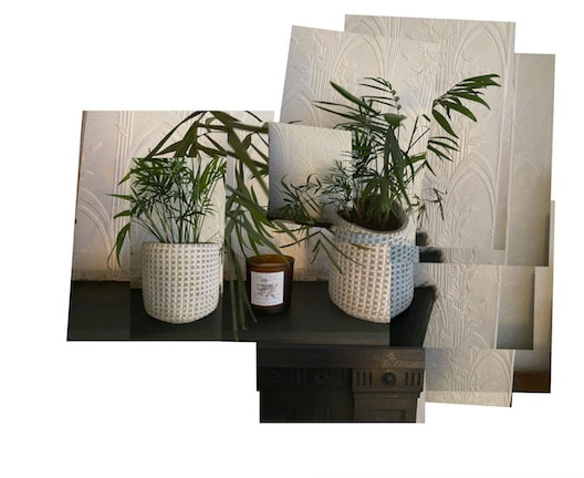
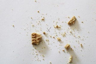
Second response to Photo Joiners
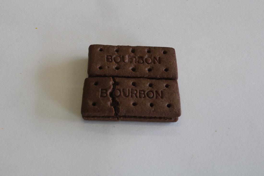
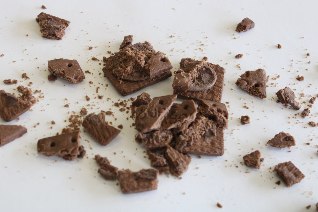
What went well was I was able to use each images and create an image that adds on to the first initial image (two plants instead of one). It could be better if I made the image look more realistic, to add more movement and fluidity.
|

|
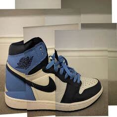
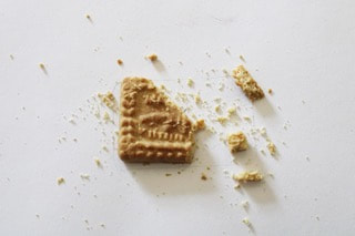
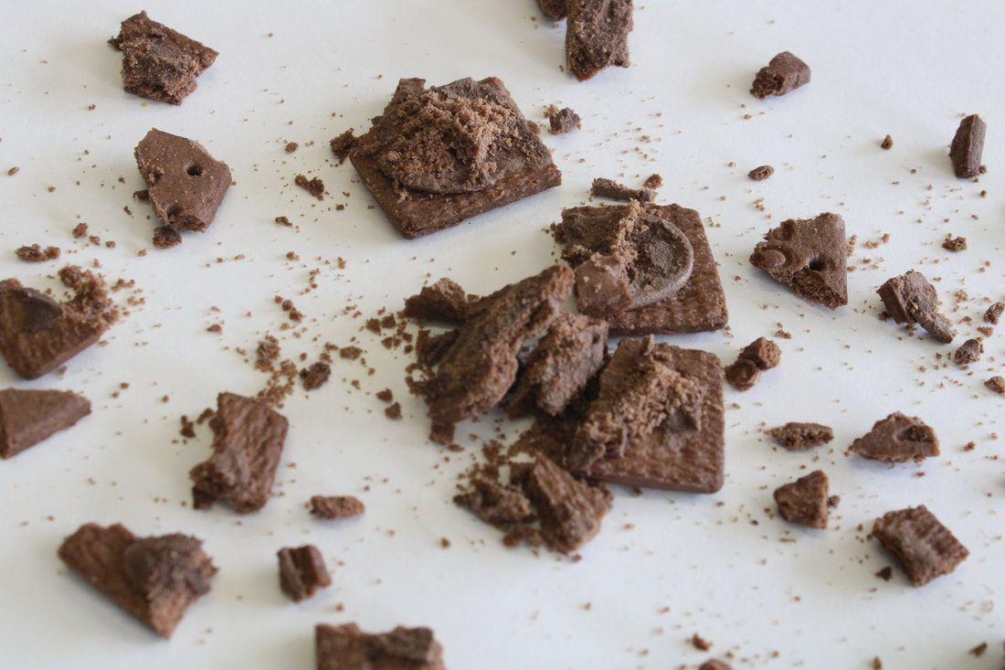
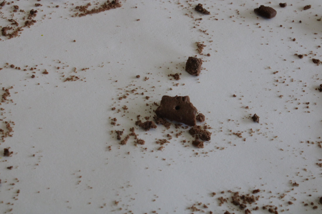
Home response to Photo Joiners
|
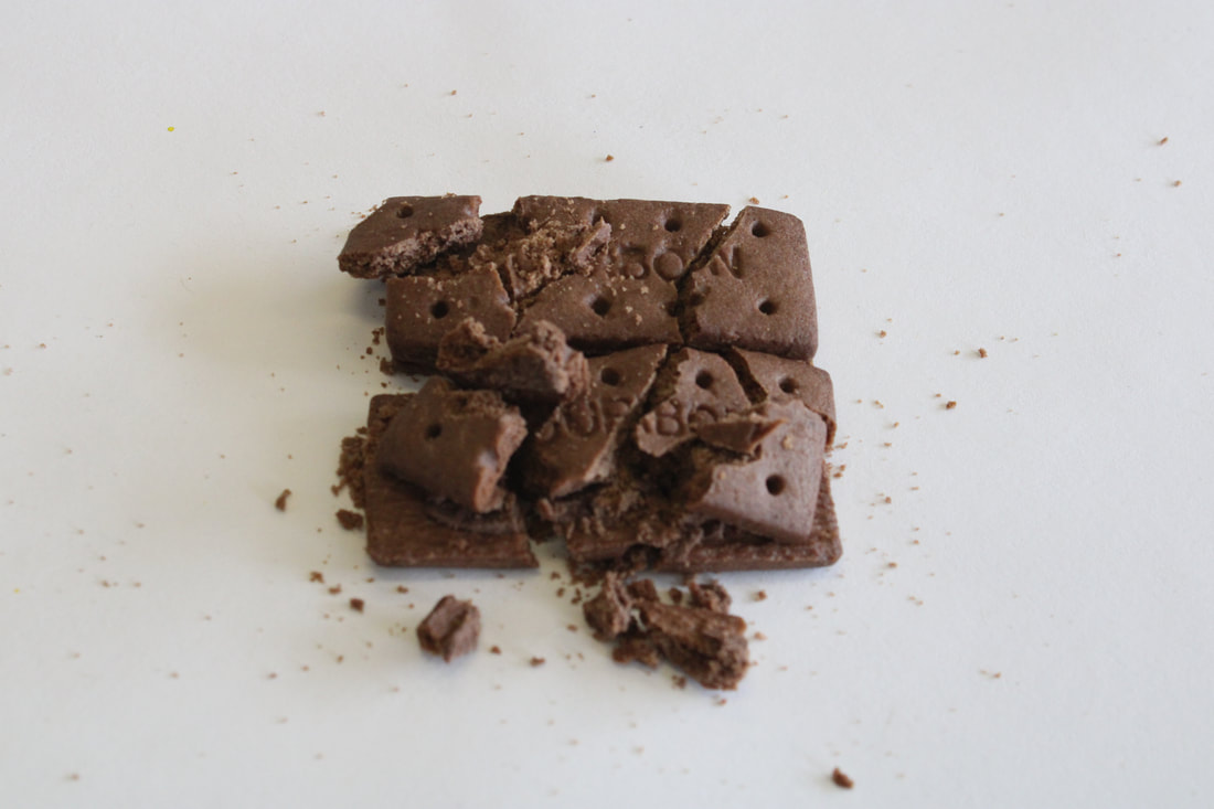
What went well was I was able to implement my at home objects into photo joiners. It could be better if I matched for realistically each image together.
|
|
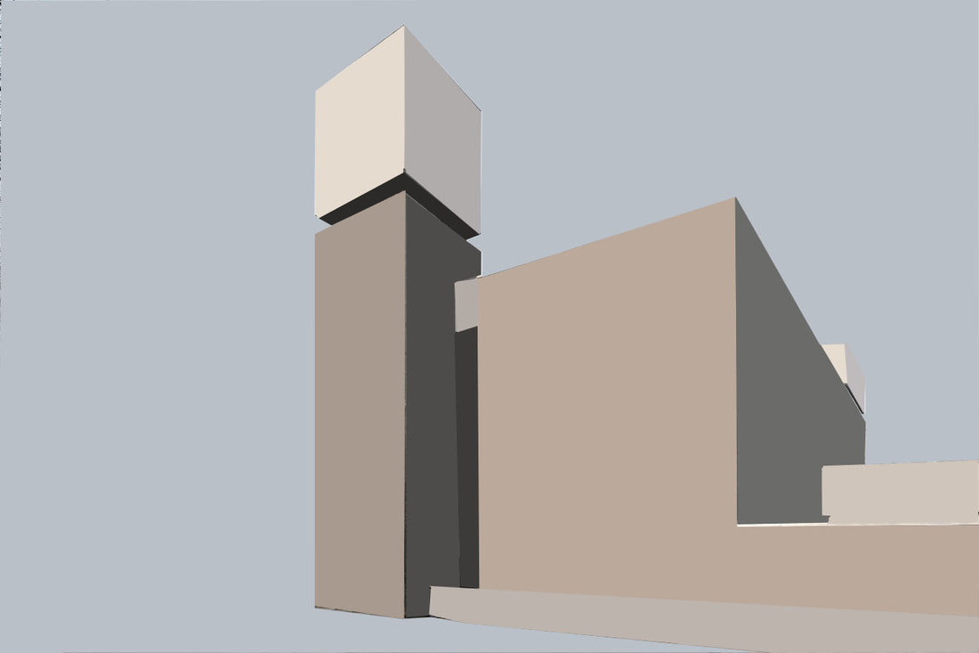
How to do Photo Joiners:
First response to Simplified Images
|
What went well was i was able to successfully simplify the image in photoshop. However, it could be better if I did it more neatly and precise. Furthermore, it I simplified more detail in the image it could be more realistic.
|

|
|
|
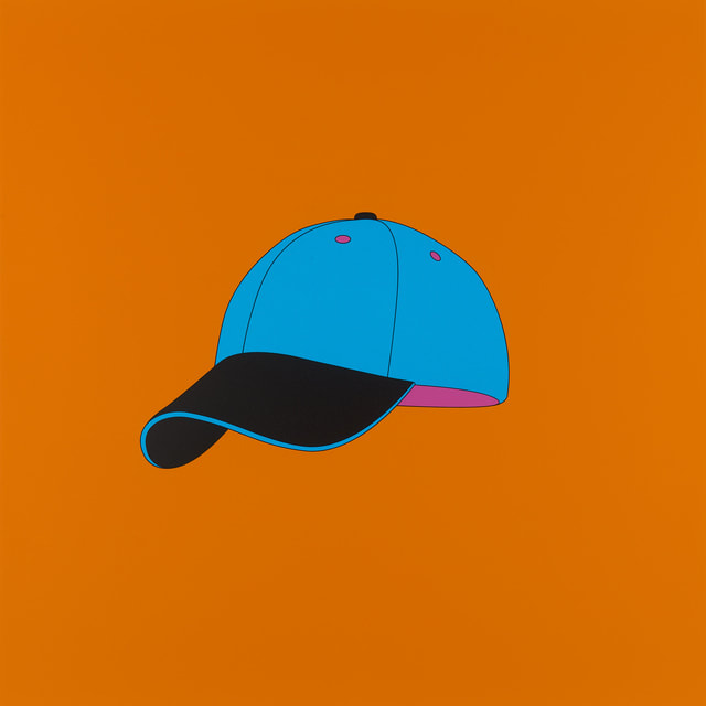
How to simplify images:
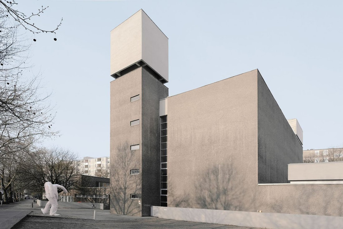
Paul Eis
|
|
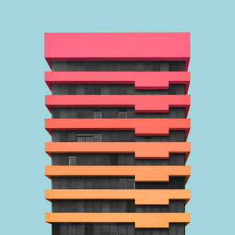
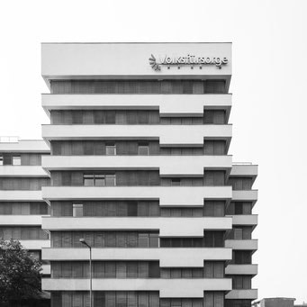
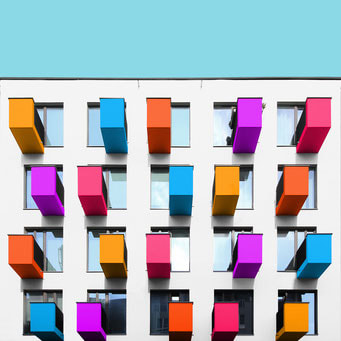
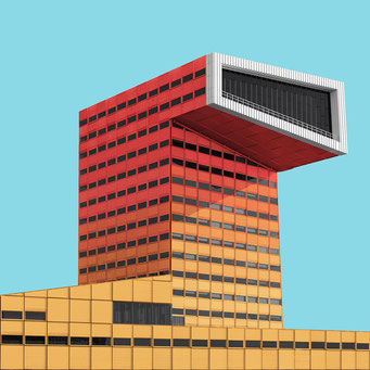
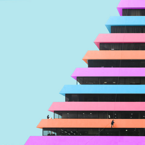
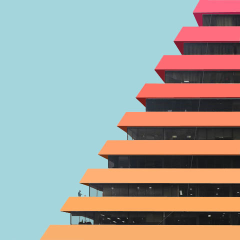
Paul Eis is a German architectural student and photographer who reimagines dull grey cityscapes to be filled with whimsical, colourful buildings with his Formalismus series. He wants to portray how also "normal“ buildings can be interesting and varied with the use of colours. They demonstrate how the use of color effects on 'rational' buildings can elicit joyful Architecture.
|
|
|
Response on Colourful Architecture
|
What went well was i added added darker colour than initial to shadows to make it look more realistic. Furthermore, i made sure to add colour to areas which most likely would be ignored (windows). However, it could be better if i were to be more precise to where i want colour as they are few missing areas that are still in black and white. So you would feel the image as complete and flowing.
|
|
Second response to Colourful Architecture
|
What went well I made it look realistic with using darker colour in places of shadows. Furthermore, the gradient is done effectively with the colour combination. It could be better if I added colours to the windows, a colour which would of made the frame pop more in vibrancy. However, I was able to add colour more precisely to the black and white image.
|
|
How to do Colourful Architecture:
André kertész
André Kertész was a Hungarian-born photographer known for his groundbreaking contributions to photographic composition and the photo essay. In the early years of his career, his then unorthodox camera angles and style (Modern Photography) prevented his work from gaining wider recognition.

|
|
First Response to Form over Function
|
|
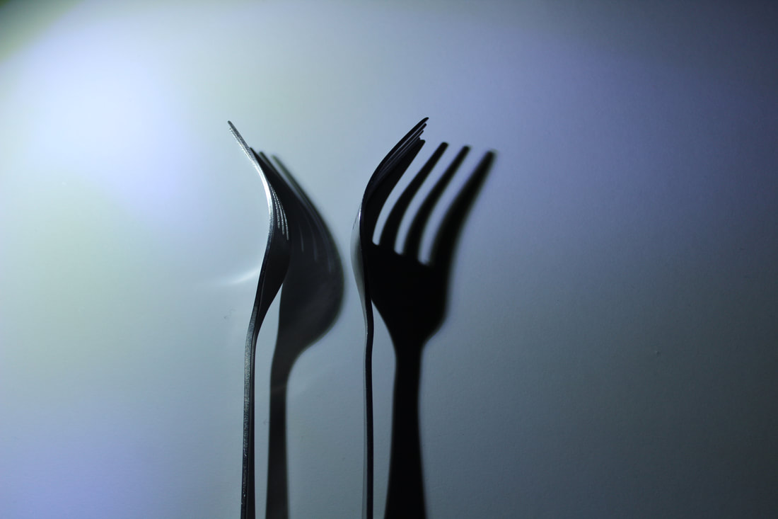
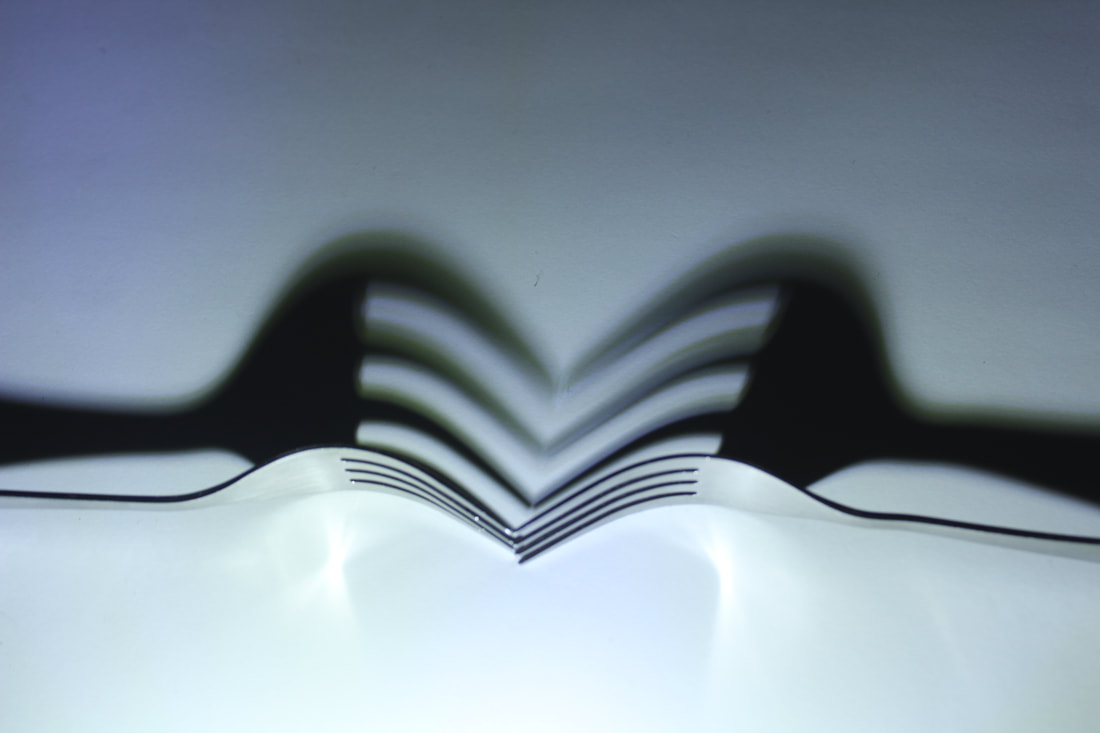
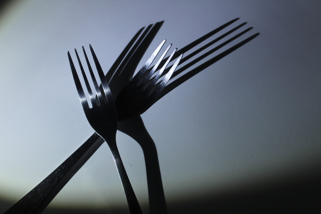
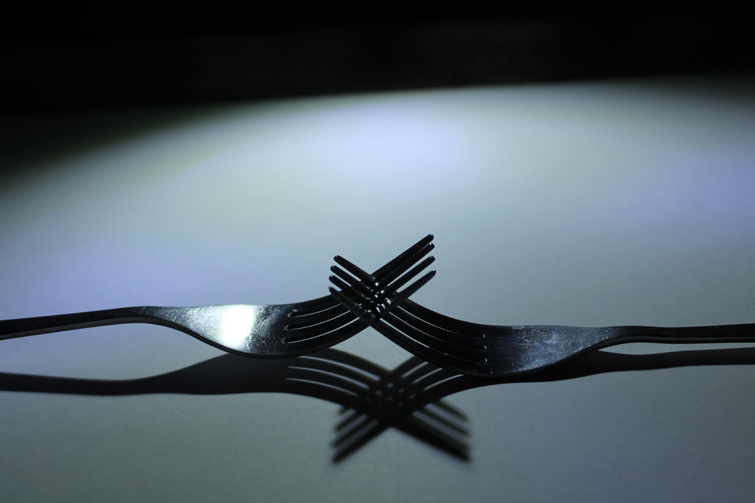
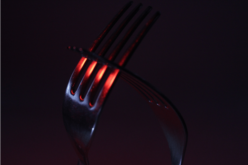
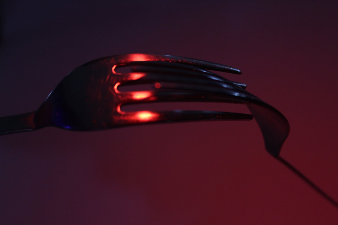
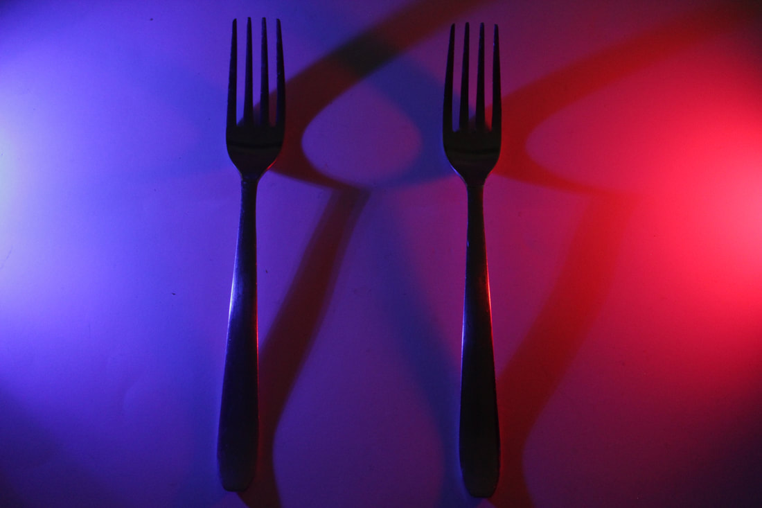
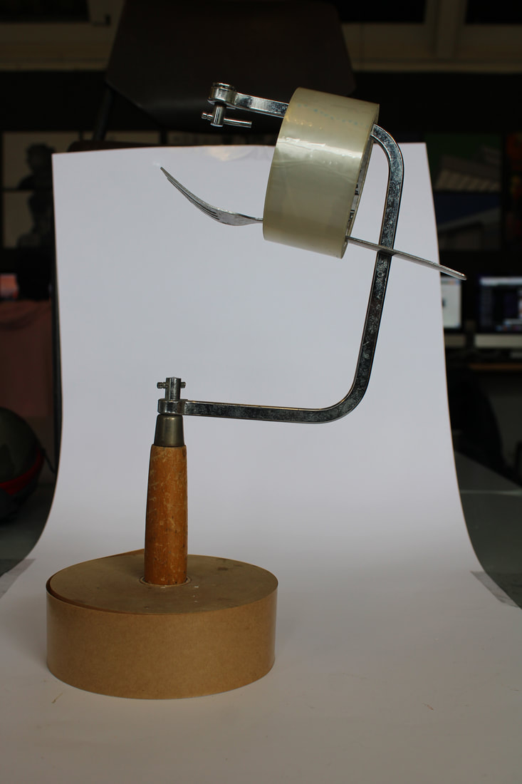
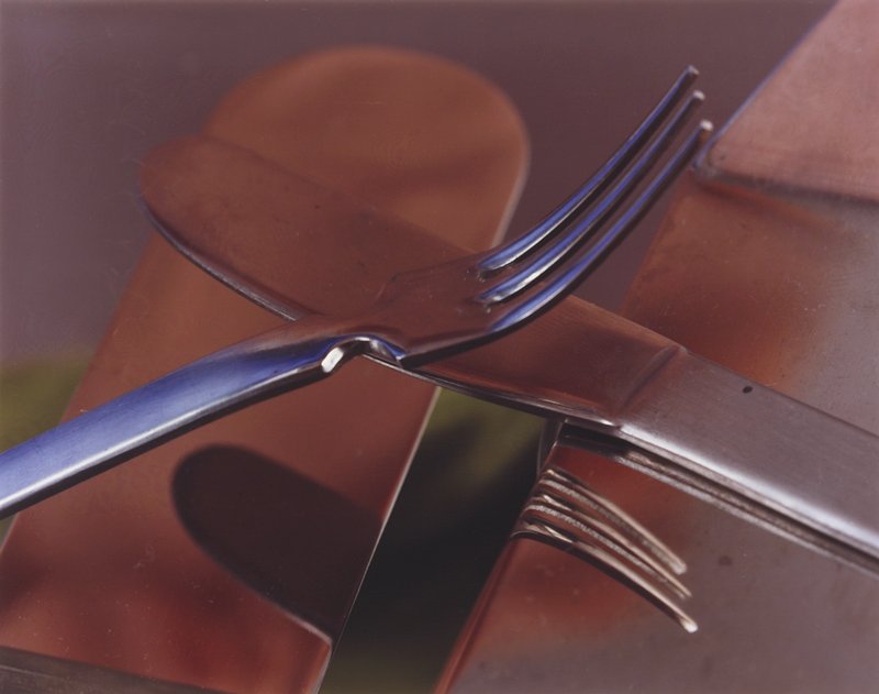
What went well was I was able to take photos that can be interpreted to a story (a couple). Furthermore, I was able to use a contrast between black and white which adds emphasis to the forks shadows. It could be better if I had added it to photoshop to make it black and white. Moreover, if put the forks in a more precise position, the images could appear cleaner.
Second response to Form over Function
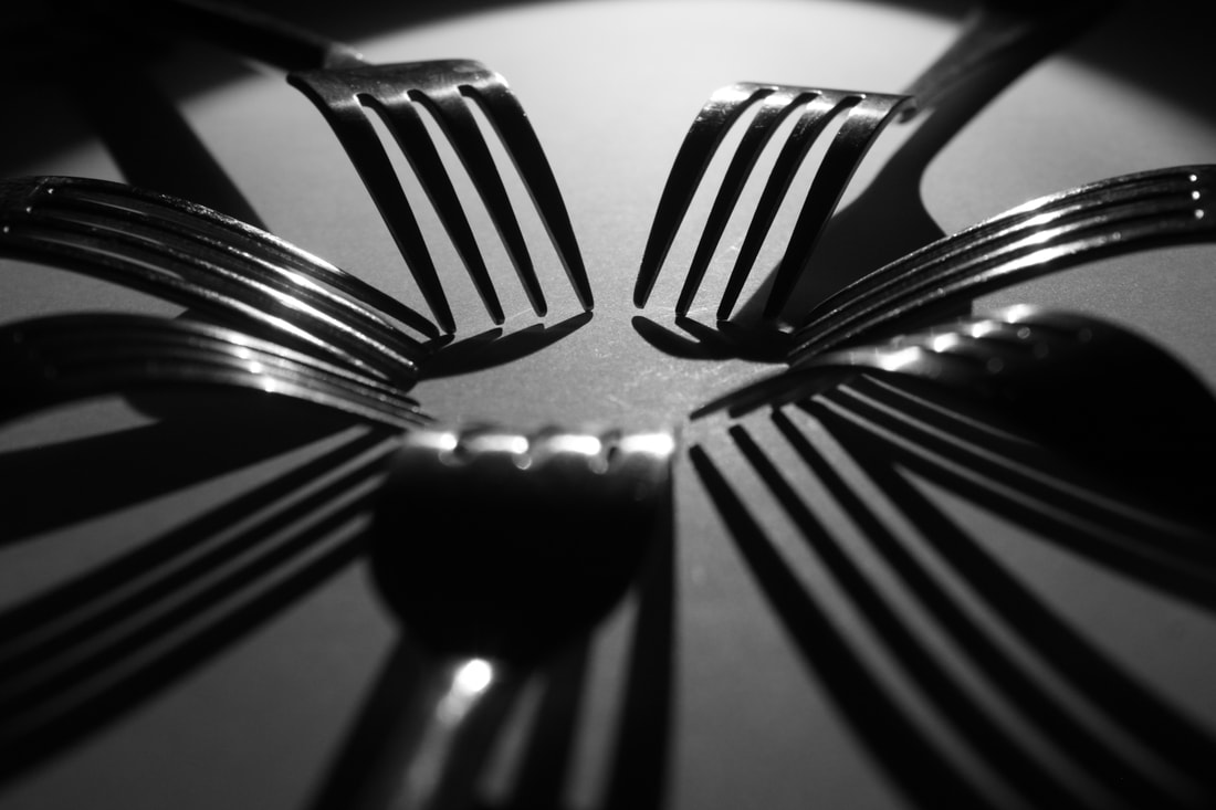

What went well was I successfully changed the picture style to monochrome to add more black and white contrast. In addition, the images can be interpreted with meanings with the use of shadows and position of fork rather than just an object. However, it could be better if I did a GIF and used the shadows to tell a story, maybe including colour.
|

|
Third response to Form over Function
|
|
|
|
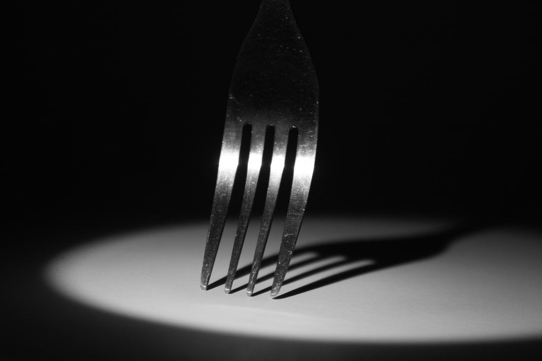
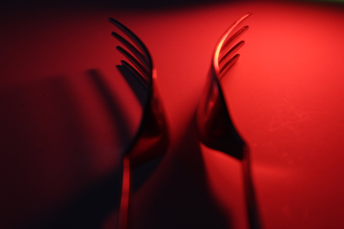
What went well was I was able to create a mood in the image through using red light which are connotations to passion or danger. Furthermore, I used the light off the fork to reflect movement. It could be better if it was more in focus.
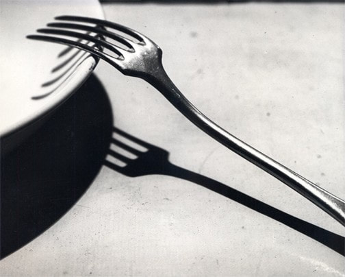
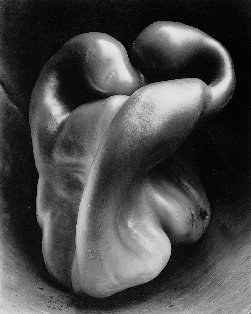
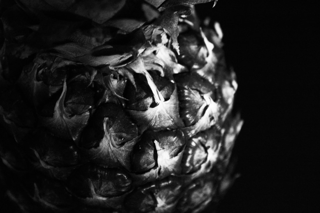
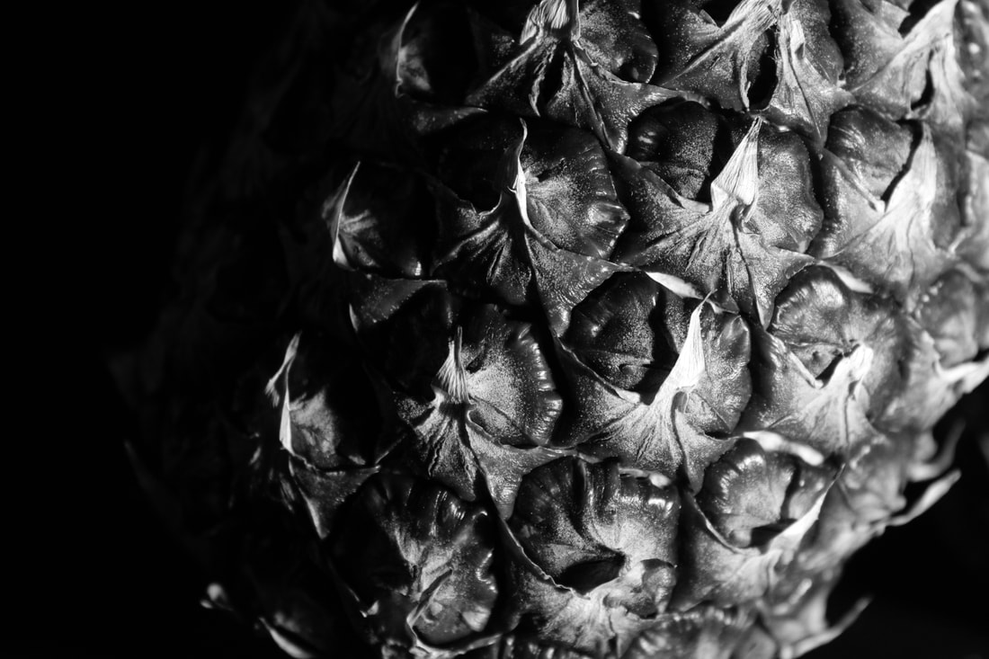
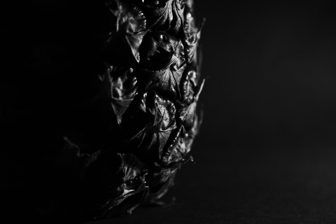
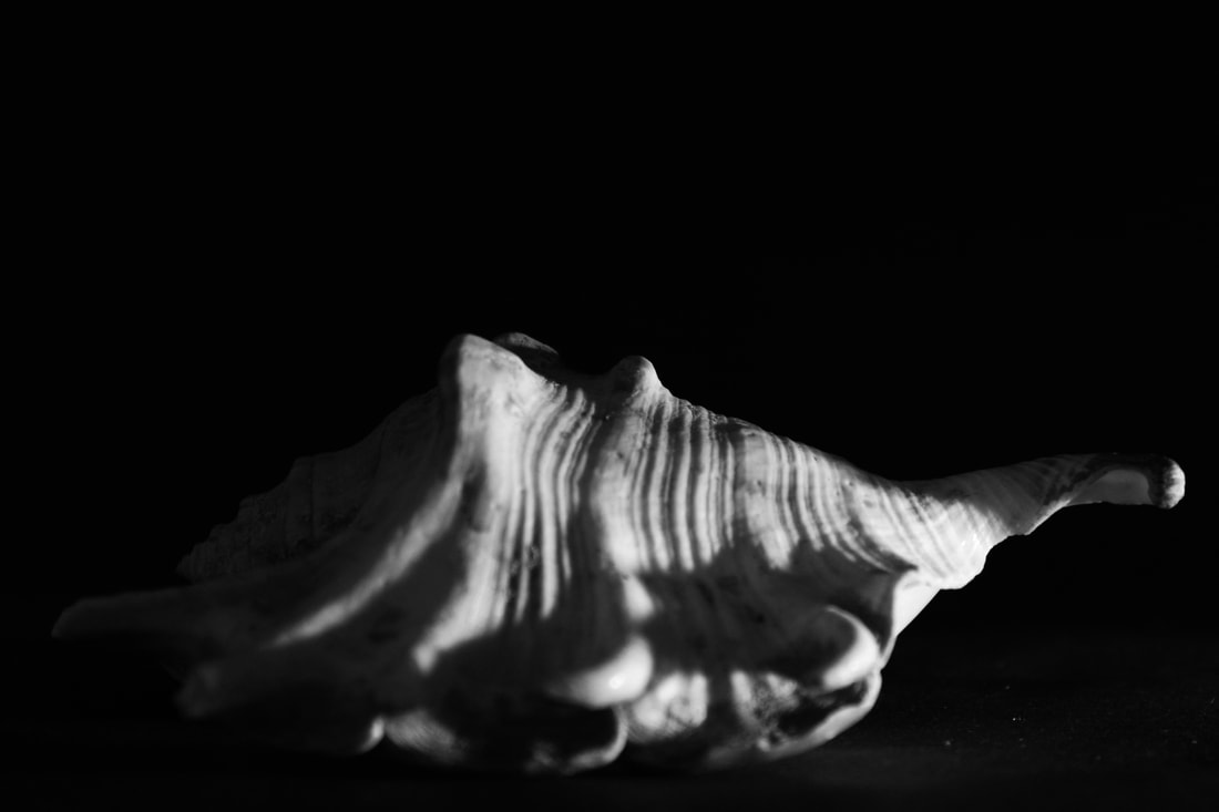
Edward Weston
|
Edward Weston (1886-1958) was a 20th century photographer who has been called one of the most innovative and influential of all American photographers and a master of photography. His career spanned 40 years and he photographed an expansive set of subjects, including landscapes, still-life, portraits, and genre scenes.
Some of Edward Weston’s most famous work was close-up images of vegetables and fruit, photographed in a way that captured the “essence” of the object, taking them out of context. His manipulation of light to highlight shape, texture and form helped bring photography out of the shadow of painting and stand on it’s own as a credible art form. Through these photographs he transformed his subjects into abstractions of shapes and patterns. |

|

|
First response to Ordinary to Extraordinary using natural lighting
|
|

|

|
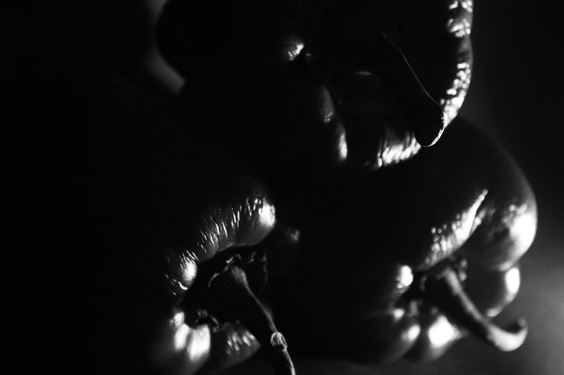
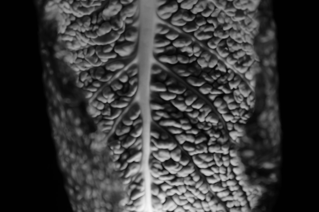
What went well was I was able to take pictures which have potential for many shadows that can be emphasised in photoshop to black and white, by using different angles from the camera and the object. Furthermore, it could be better if the peppers image had more contrast in shadows it could capture more 'essence' instead and stand out more. In addition, I were to be closer up to the objects I could get a better depth of field.
Second response to Ordinary to Extraordinary
|
|
|
|
|
|
What went well was I was able to improve the peppers image by initiating a bigger increase in shadows to emphasise contrast between the light and shadows. Furthermore, I used to shape of the object to use to my advantage as I positioned the light so the object which created more shadows. It could be better if the main objects were in focus but It did help create a depth of field which I originally wanted.
Sharon Radisch
|
Sharon Radisch is a New York based photographer created a series of still lives using found objects around her home and neighbourhood to keep her artistic temperament active during COVID-19 pandemic.
"For many artists, this current time has provided an opportunity for creative reset, and is a reminder of the everyday joys of life, should we find the capacity to look for them.This work is representative of my daily quarantine routine; nothing was created outside of my home.” The abstract forms play with balance and are intriguing in the composition. |
|
|
|
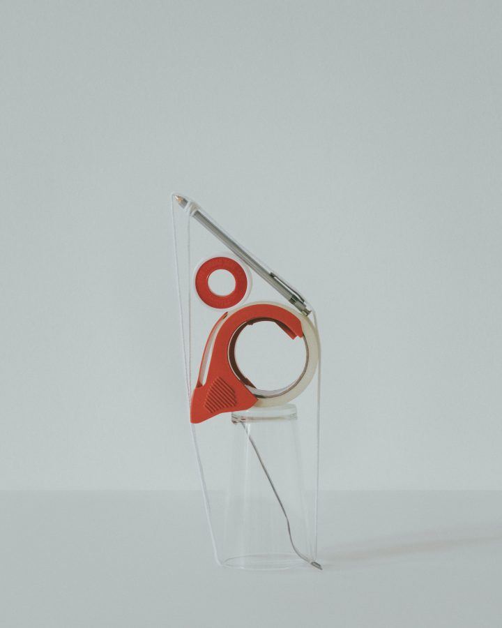
First response to Lockdown Sculpture
What went well was i experimented with object close up and from a distance. However, it could be better if the objects were in better composition where it could appear more abstract and object could stand out, rather than blend into the background, unpleasing to the eye.

|
|
Second response to Lockdown Sculpture
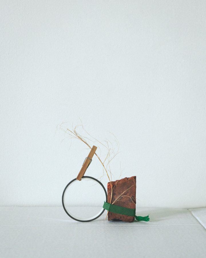
What went well was i positioned the objects in a certain way to create depth and a different perspective. Furthermore, I used composition to keep the objects within the white background. However, it could be if i kept all the objects in the white frame, using composition.
|
|

|
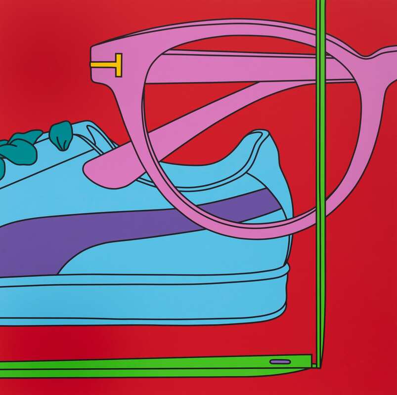
Micheal Craig Martin
|

Michael Craig-Martin probes the relationship between objects and images, harnessing the human capacity to imagine absent forms through symbols and pictures. The perceptual tension between object, representation, and language has been his central concern over the past four decades. In his early work Craig-Martin often incorporated readymades into sculpture and made knowing reference to American Minimalism.
|
Response to Micheal Craig Martin Simplified Images

|
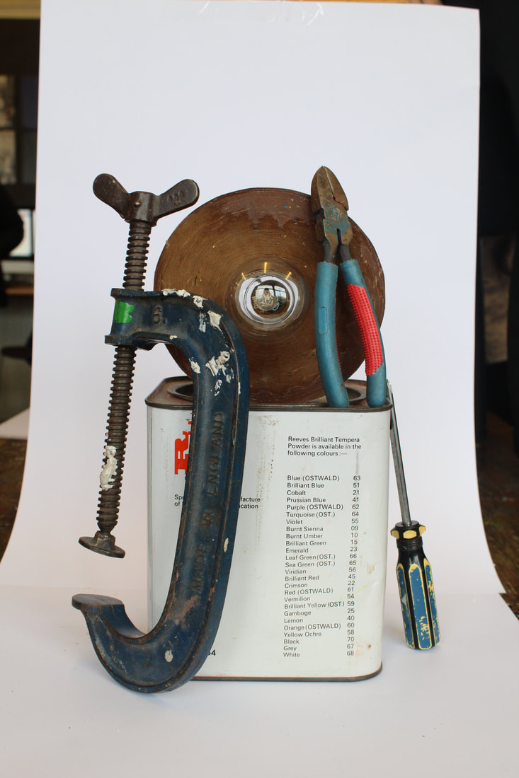
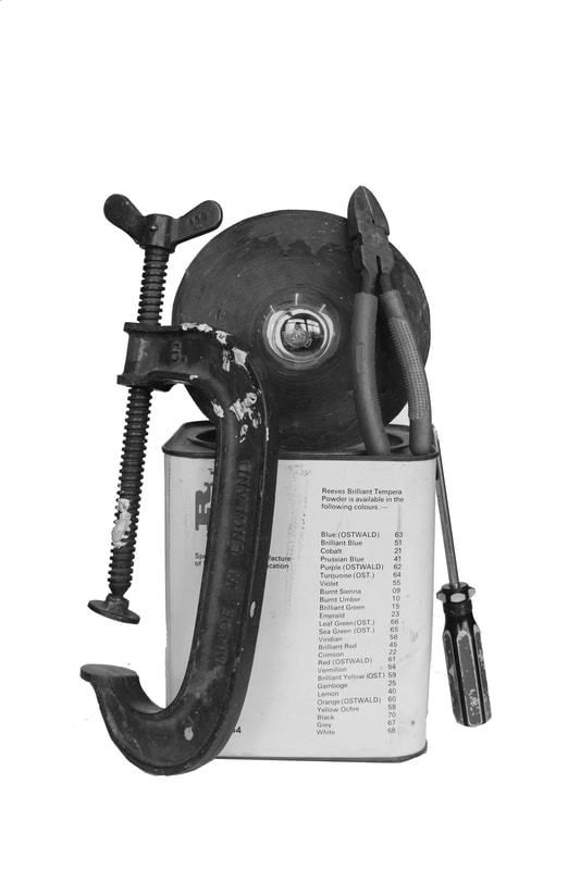
What went well was i was successfully able to use photoshop to convey Micheal's envision. In addition, I used colours that pop in contrast to the black and white image. Moreover, it could be better if i was able to finish the image in photoshop to add colour to every object.
|
Jan Groover
|
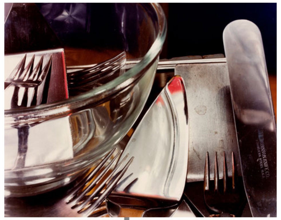
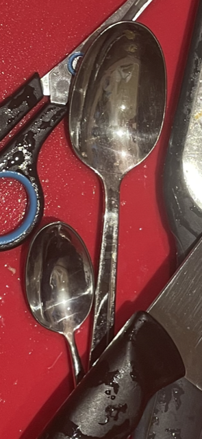
Jan Groover born April 24, 1943 and died January 1, 2012 was an American photographer who experimented with space and illusion in large format still-life tableaux that featured everyday objects, particularly kitchen utensils arranged in a sink. "With photography I didn’t have to make things up,” she said, explaining the change of medium from art to photography. “Everything was already there.”
Using a large-format camera, she transformed colanders, knives, spatulas and baking pans into objects of beauty that still hold a visual interest that transcends their common use. Her seductively modern colour palette of greens, pewter, bronze and brown tonalities permeates the space dissected by kitchen paraphernalia. |

|
|
|
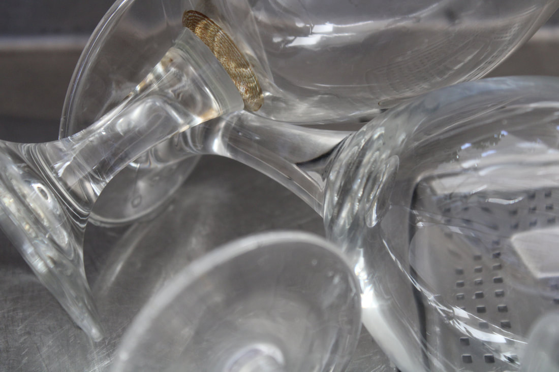
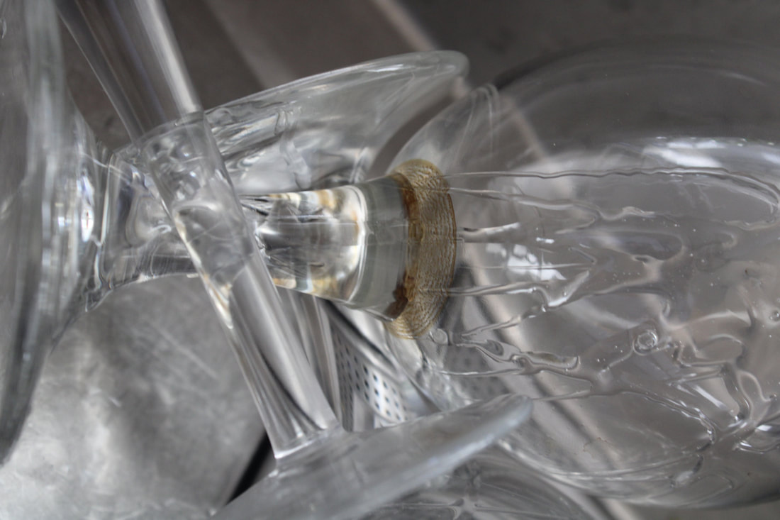
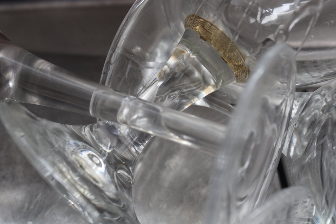
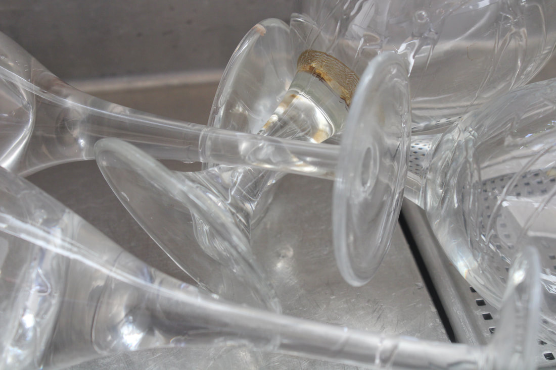
First response at home on Kitchen Still

|

|

|
|
What went well was i was able to take into consideration the vision for kitchen utensils. However, it could be better if i add bronze tones to the images like Jan Groovers work. However if i add more contrast in colours, it could a visual interest more.
Second response at home on Kitchen Still
|
|
What went well was i was able to take Jan Groovers aesthetic into consideration more. Furthermore, i used objects made of glass to add contrast with reflections, in comparison to the sink to make the objects visually stand out more. However, it could be better if were to go the further step by adding even more bronzier tones to the image to take full inspiration of Jan's work, but i think it would take away the contrast between reflections of the glass.
Chad Pitman
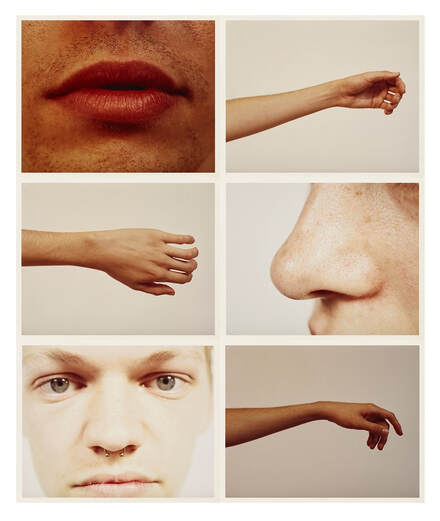
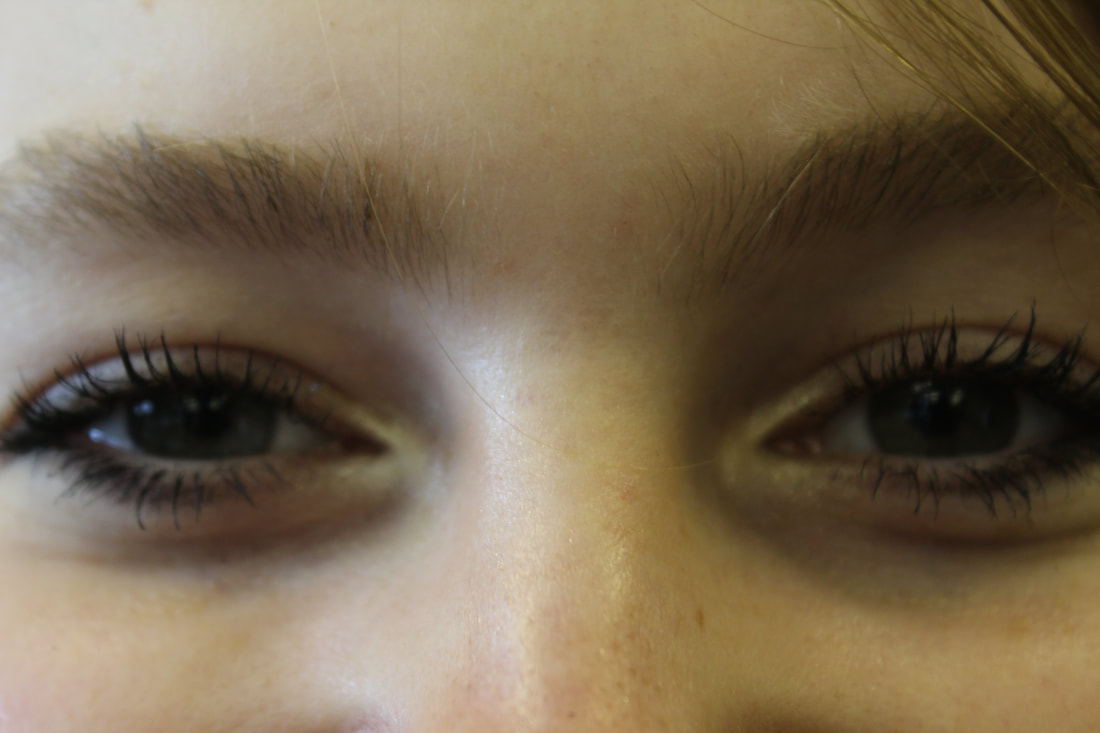
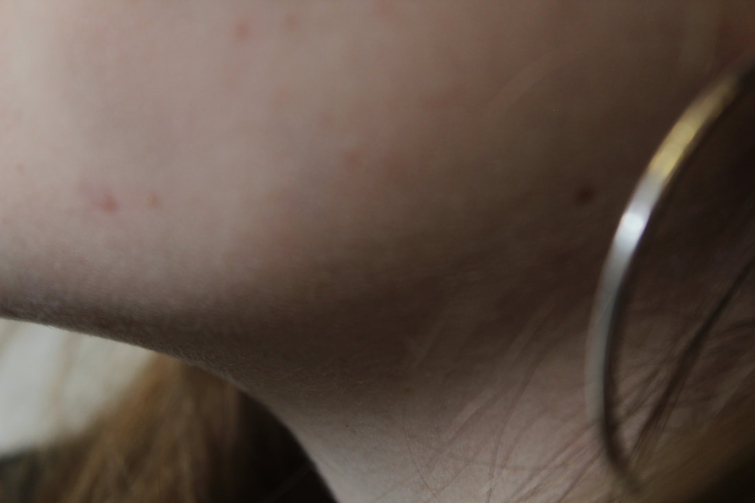
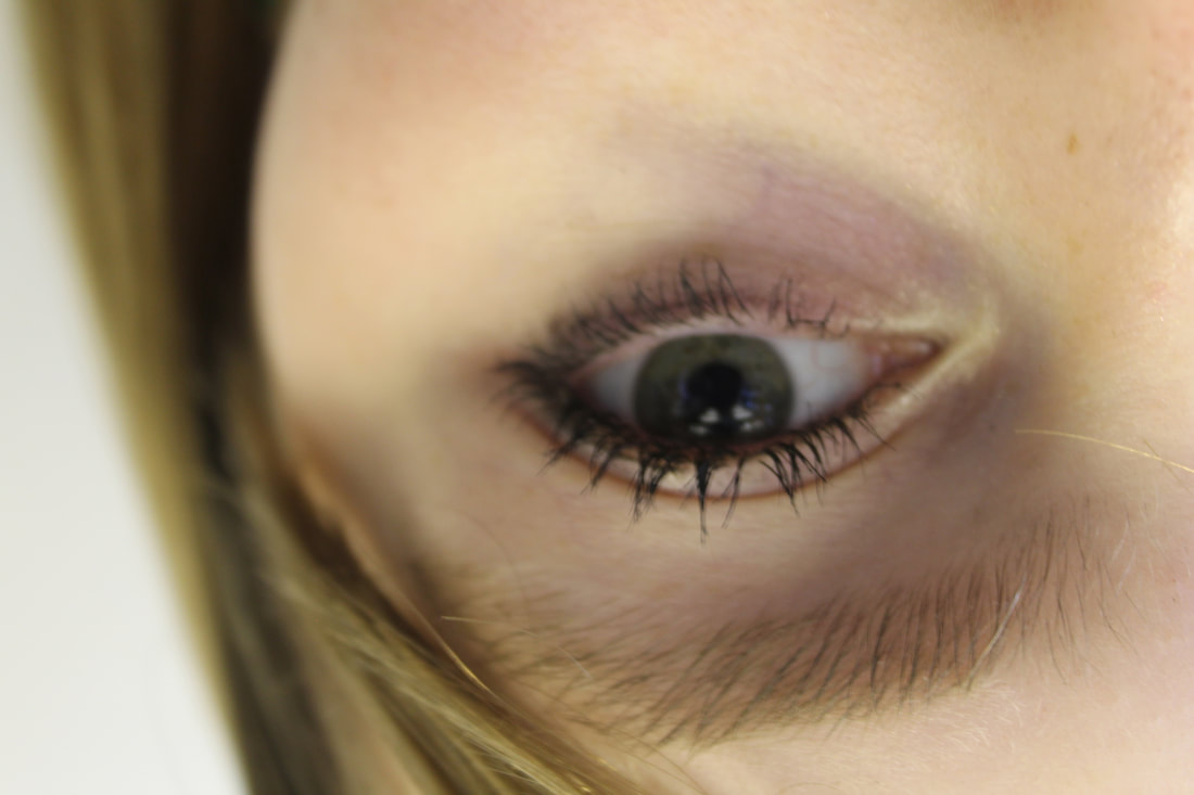
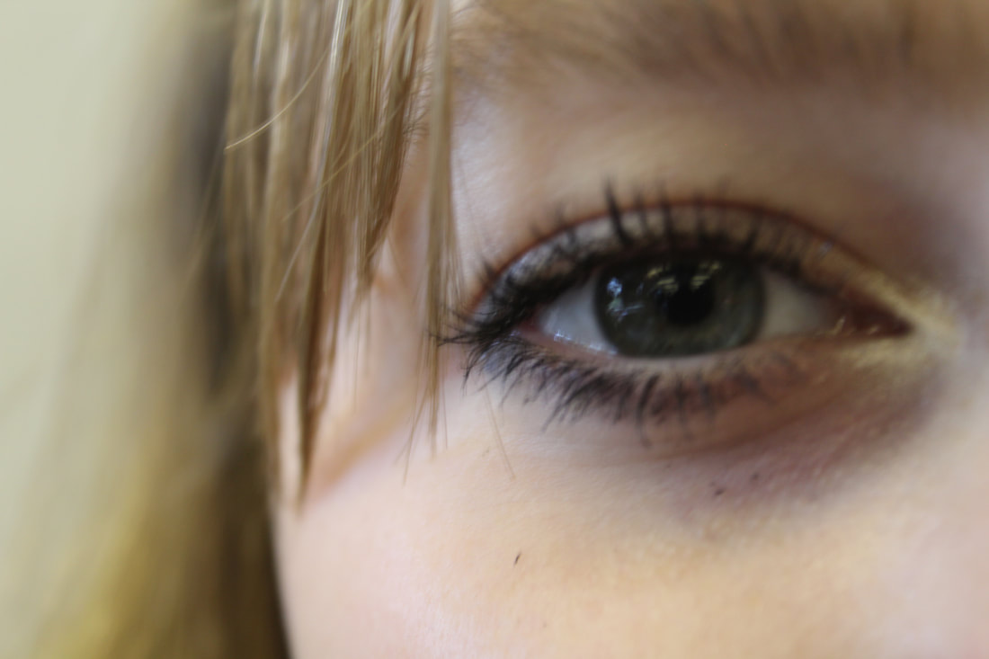
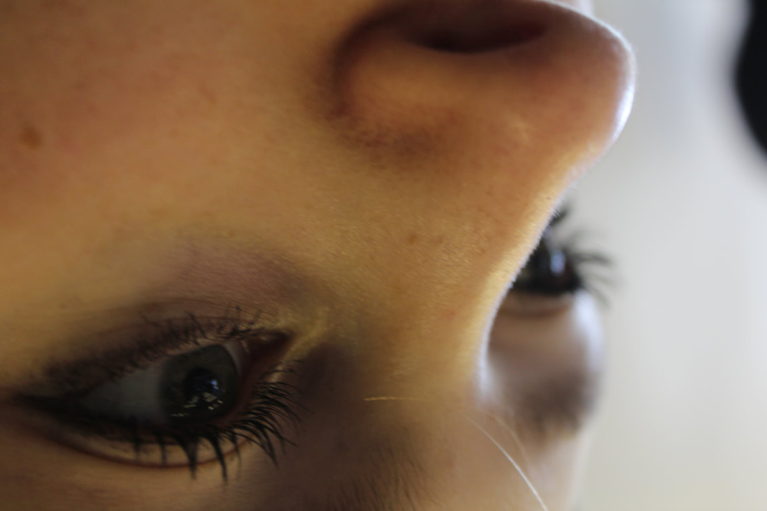
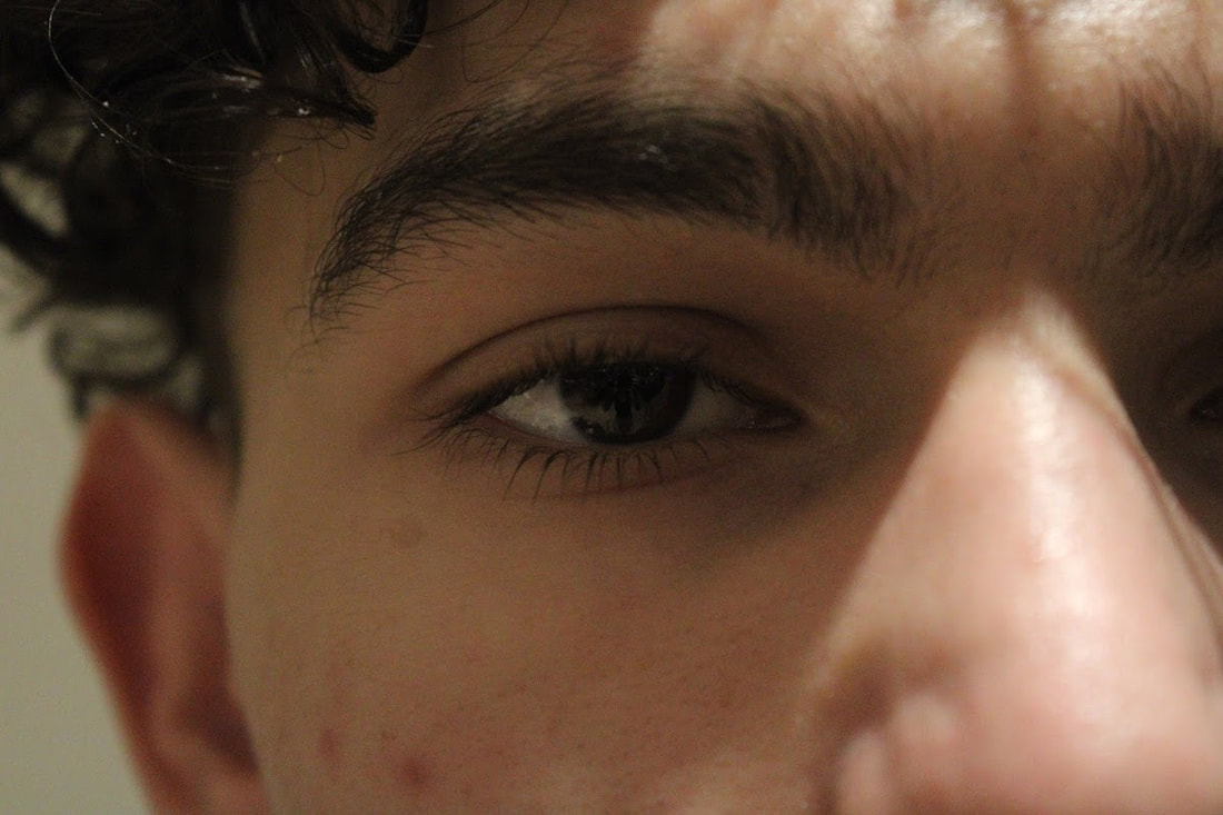
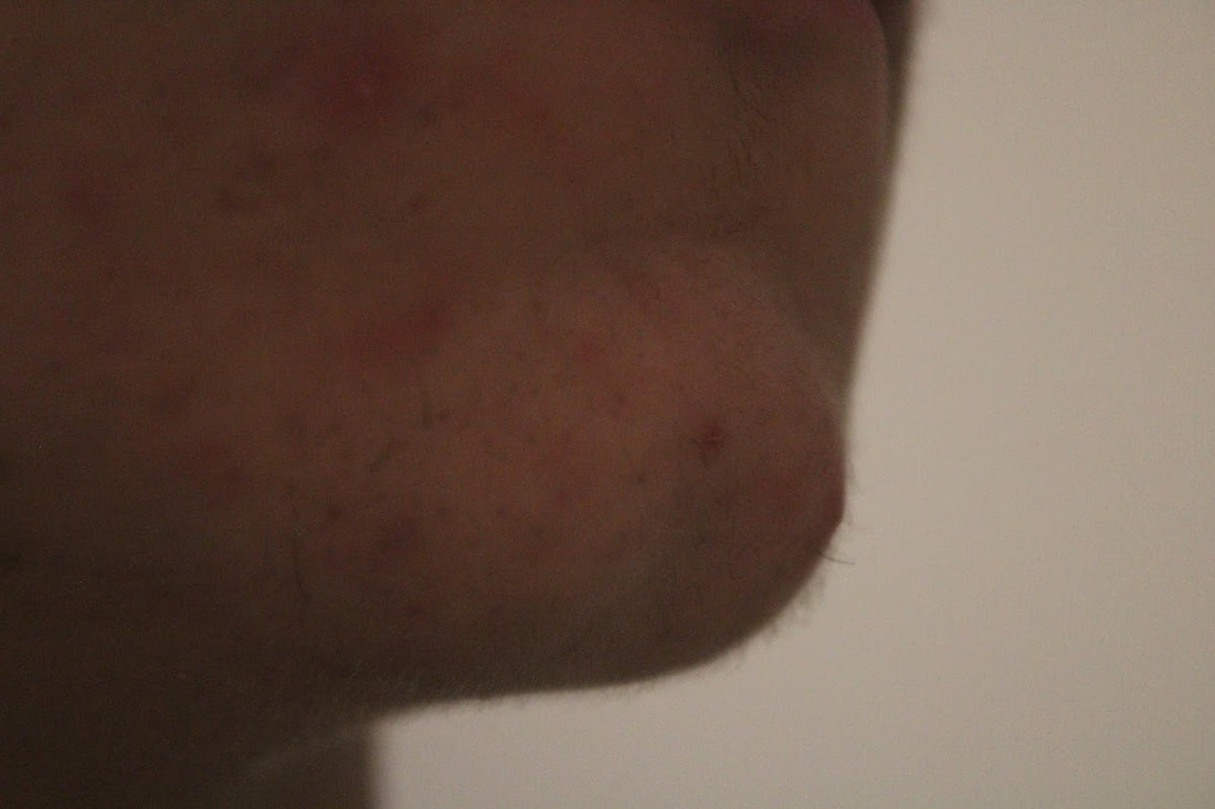
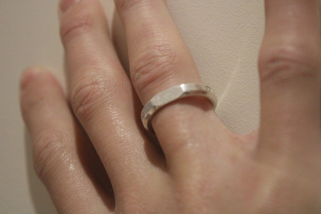
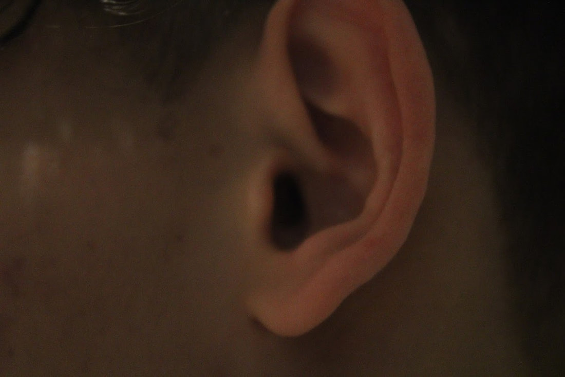
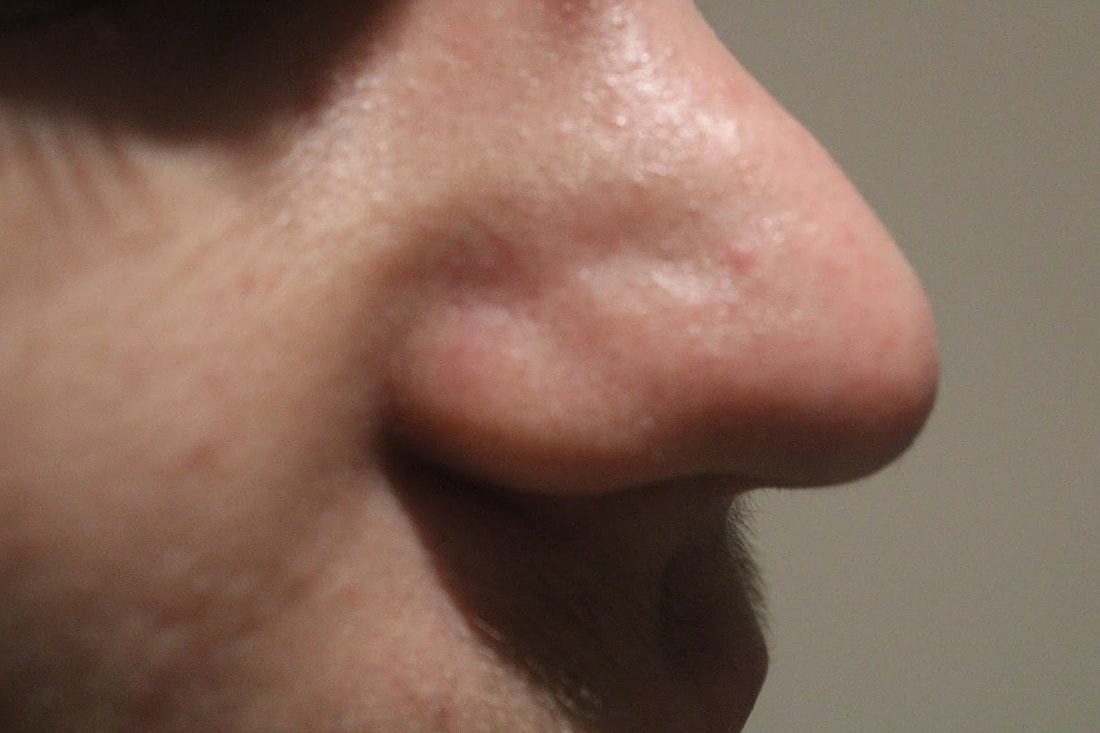
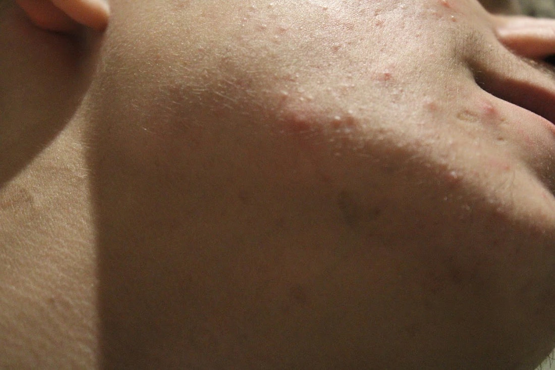
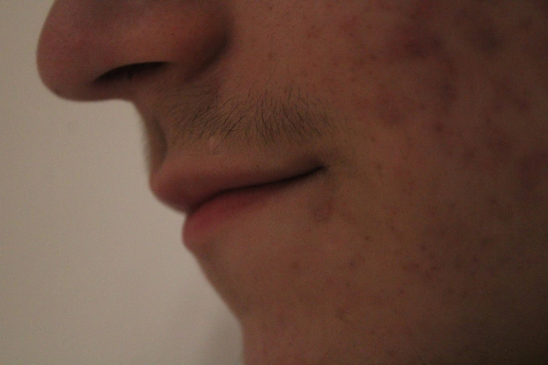
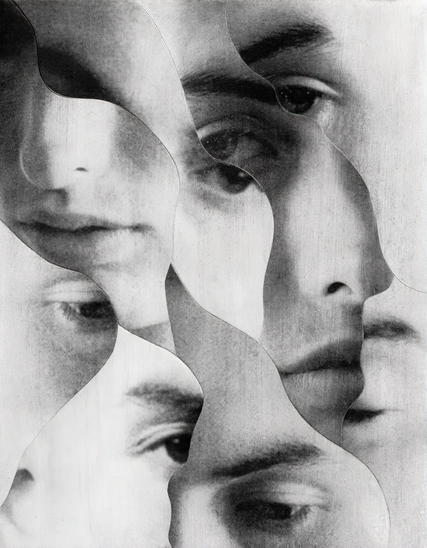
Chad Pitman takes images that show different parts of a person. In this work he breaks up a person into different parts and focuses on different sections of a persons face and body. By taking the images individually the parts are given new meaning and encourage the viewer to look more closely at the textures shapes and colours that make up a person.
|
|
Lauren Marek
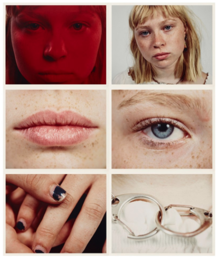
Lauren Marek in her series "Pieces" create's similar work but her work focuses even closer to the person and creates an even more abstract representation of the figure. Inspired by Picasso and his cubism portraits she uses 9 images alongside each other to create her abstract representations of a person.
|
|
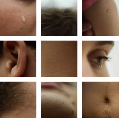
First response on Different Views of a Person
|
|
|
What went well was i was able to take a variation of parts of the face for my pictures. However, it could be better if i used more creativity as the models eye is seen 5 times in the sequence. Furthermore, i used photoshop to turn some of the images upside down to add some abstract to the 9 pieces. In addition, i placed the images in the grid, determined by their tone in the image, which adds a sense of flow and rhythm to the piece. Moreover, it could be better if i experimented with more angles, to emphasise contrast with more shadows and light.
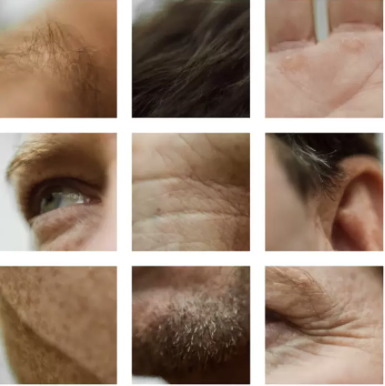
Second response at home on Different Views of a Person
|

|
|
What went well was i was able to experiment with different parts of the body and different angles, allowing me to add texture within the images. In addition, i place the images in a grid according to the tone or shadow of grid, attempting to make the grid flow but also add contrast with shadows in images. However, it could be better if i were of to experimented with different parts of the whole body, rather than just face, i could of added even more texture to the piece.
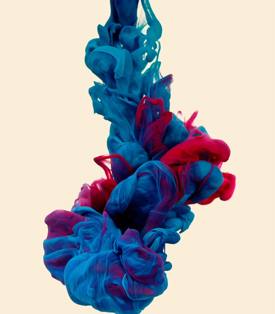
Alberto Seveso
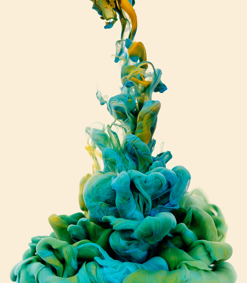
Alberto was born in Milan, Italy in 1976, but has spent most of his life on the island of Sardinia where he became interested in computer graphics, digital art, and photography. Photos were made by taking high-speed photographs of ink mixing with water, but unlike the previous times, the artist mixed two colours
|

|
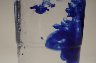
First response to Fireworks In a Jar

|

What went well was i was able to capture the essence of the dye and the fluidity it had in the water from the oil. However, it could be better if it was more in focus to see the individual movement more. In addition, if i had a stronger light source, it will emphasise the dyes movement more.
|
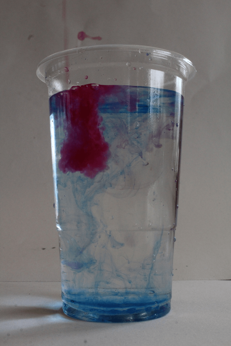
Second response to Fireworks in a Jar
What went well was i added a stronger light source (natural light) which helped visualise the dye more. In addition, i set my camera on a tripod to keep the camera still for the gif. However, it could be better if the background was cleaner and i was able to brighten the picture to emphasise the fluids of the dye.
|

|
|
How to do Fireworks in a Jar:
Luke Stephenson
One morning while eating a bowl of cornflakes Luke noticed that every cornflake within his bowl was unique some what like a snow flake. Stephenson decided to photograph every cornflake within a 500g box to show off their individuality and also answer a nagging question in our minds “ how many cornflakes are in a box of cornflakes?
Kevin B Parry
He places his objects on short glasses while he photographs them to keep them in the same place and to give the illusion that the objects are floating.
Sam Taylor Wood
Artist, Sam Taylor Wood photographed a still life everyday for over three months. She then created a stop frame animation from her images.
Lockdown Sequences
Make a sequence of images in which a fruit gets eaten or cut away until there's nothing left. Present your images in a line or a grid. You must be strict with the visual conventions of the shot. The object must always occupy the same place within the frame. Shoot in either bright white lighting conditions (no shadow) or dark lighting (single source light).

|

|
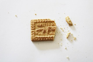
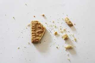
First response to Lockdown Sequences
|
What went well was i was able to keep the camera still enough to make the GIF look somewhat real. However, if i used a tripod, it could look even more realistic. In addition, i was able to keep the object fairly still for the sequence but it could be better if you weren't to be able to see the outline of the cookie on the paper.
|
|
|
|

|
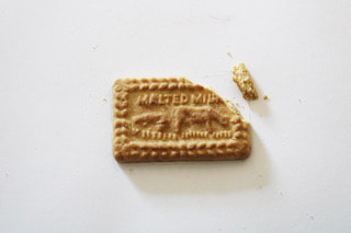
Second response to Lockdown Sequences
|
What went well was i was able to keep the objects in the same place without having a place mark for the object. In addition, i used a tripod to keep the camera in a still position which also helped capturing a clear composition of the GIF and sequence. However, it could be better if i experimented with different angles to achieve better composition, making it more appealing to the eye.
|
|
|
|
How to do Sequences:
Development
Distortion
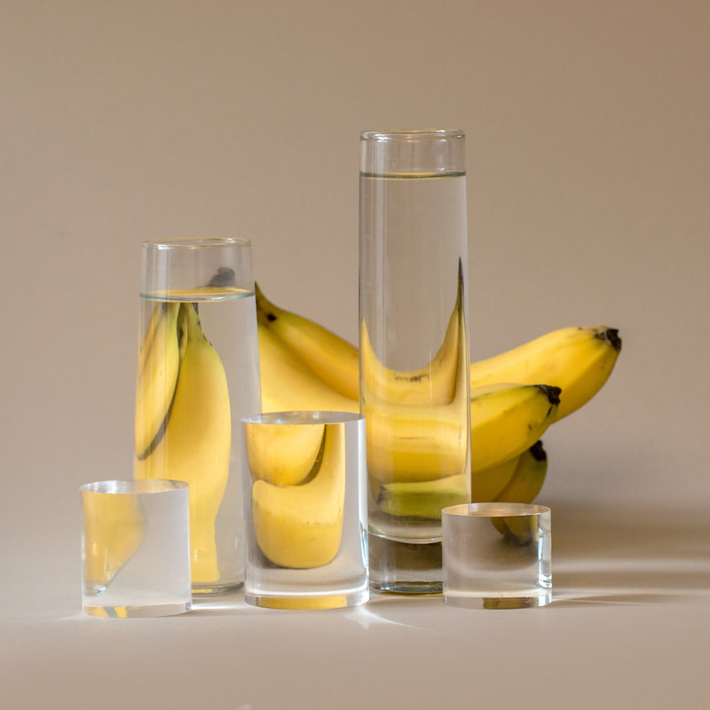
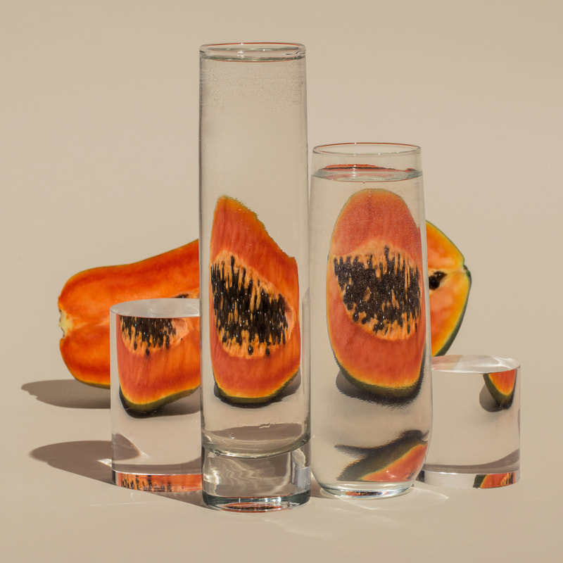
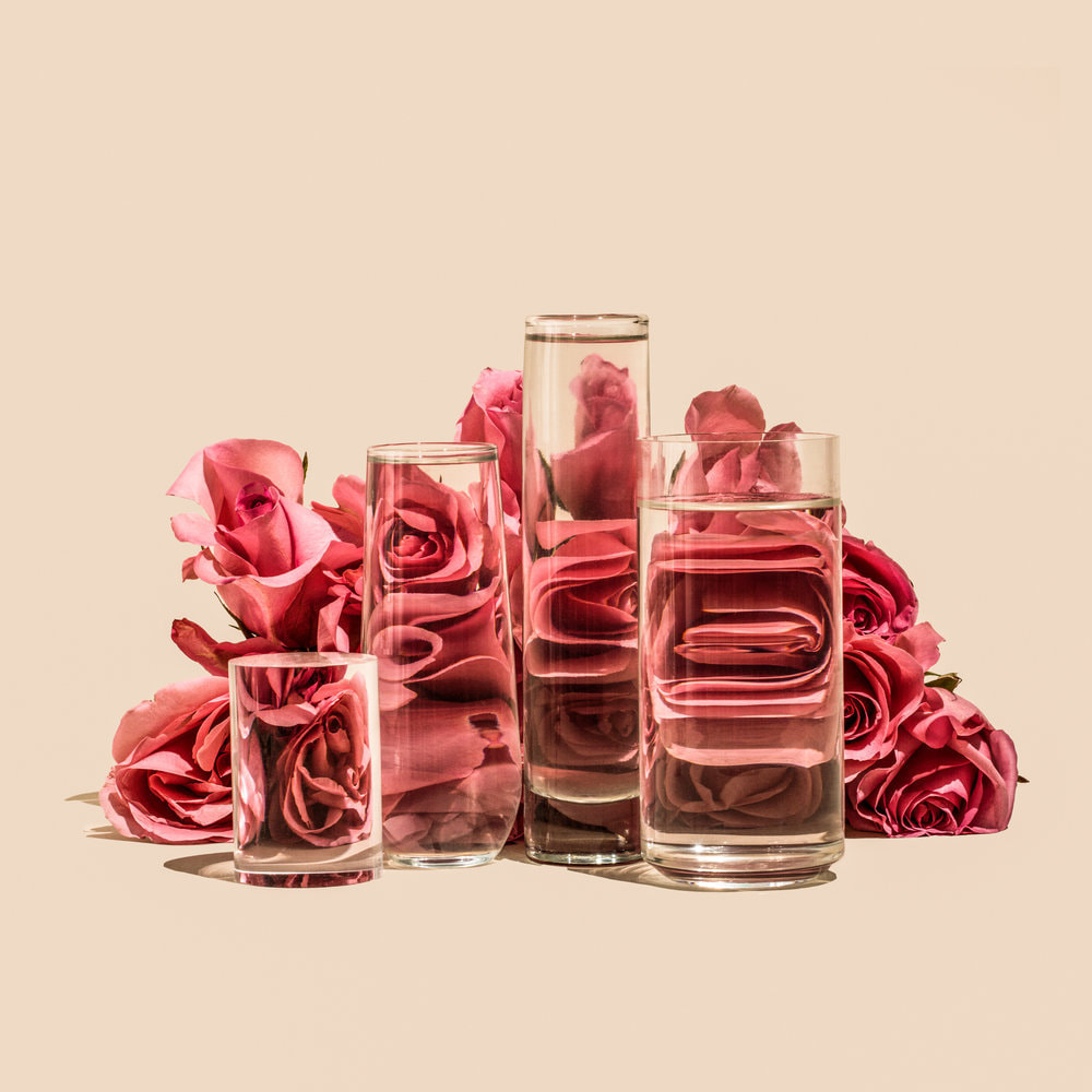
Susanne Saroff
|
In her ongoing series titled Perspective, photographer Suzanne Saroff creates fractured and skewed images of common foods as seen through vessels filled with water and glass objects. The images play with concepts of light and shadow resulting in distorted still life's that appear almost like digital glitches.
“With tools and techniques such as refraction, directional light, and bold colours, my photographs give everyday items alternate visual avenues of expression,” shares Saroff. “Taking shape via shadows or fragmentations, my subjects often become more than the singular and expected version of themselves.” |
|
|
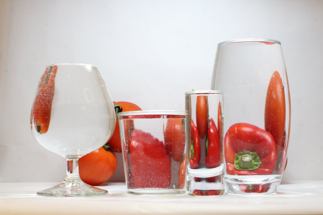
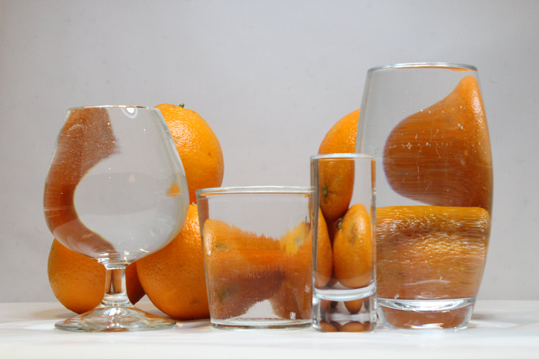
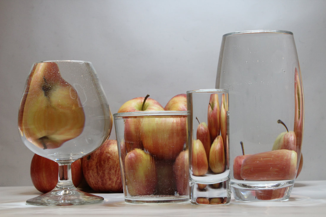
Response to Distortion
|
What went well was i was able to incorporate a reflection of the object into every glass. In addition, i used different shapes of glass to create different shapes in the glass. Furthermore, i also created shapes by using different angles of the object. However, it could be better if i had the light source from a better angle, it could bring a different perspective. Moreover, if i were to use objects that pop more in colour, it would enable the picture to emphasise shape of the object.
|
|
|
|
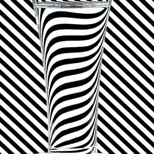
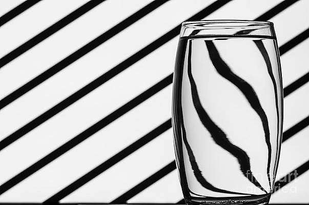
Steve Purnell
|

Steve Purnell work is inspired by Op art, a movement of visual art that makes use of optical illusions. Major exponents of this type of art were Victor Vasarely and Bridget Riley. In these images he uses striped backgrounds and projected images that then distorted through water, placed in bottles and glasses.
|
Jesse Draxler
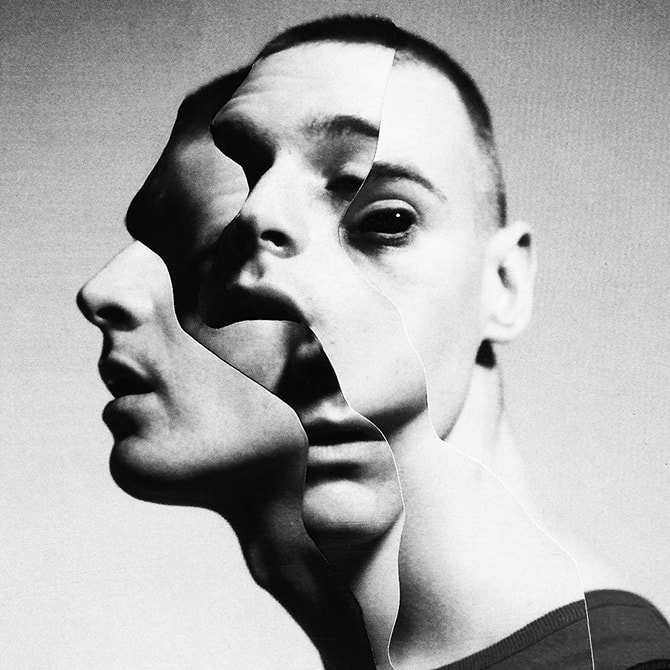
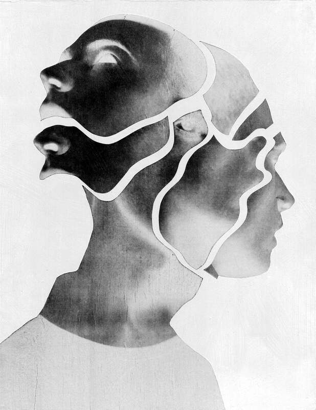
Jesse Draxler is a contemporary artist and photographer who works in many different mediums where his brooding style combines collaged photographs and painting, Draxler distorts and overlaps the models bodies to form abstract creature-like being. His work is always in grey scale as he feels 'colour can be a distraction'.

|
|
|
|
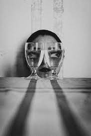
Response to Jesse Draxler

|
What went well was i was able o emphasise elements Jesse Draxler used that wouldn't of been noticed initially (inverted). However, I did not invert all the photos i used to compile the image to had contrast between the features of the models face. I did this well as i was able to line up the photos well that made it seem realistic. Additionally, I made the image upside down to add more creature-like to the image. Moreover, it could be better if I lined up the necklace and made cleaner cut lines as when its pen lined you can see it more clearly and does not blend into the other images cut out.
|
