Reflection
Strand 1 - Water Reflection
Antonio Gutierrez Pereira
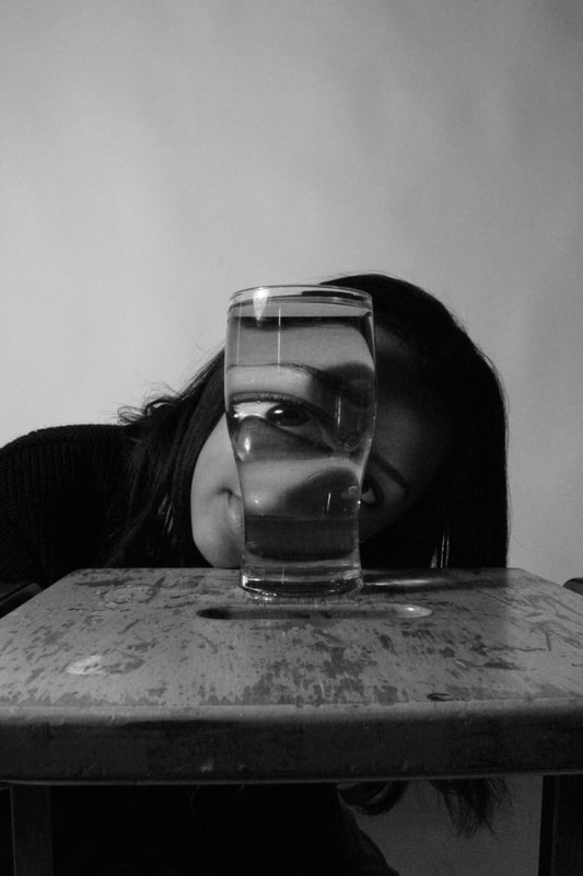
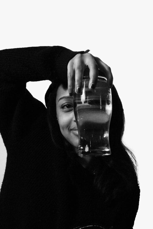
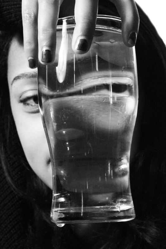
Antonio Gutiérrez Pereira a photographer from Vigo, Spain. This artist uses distortion in a clever and original way, by positioning two rounded drinking glasses in front of a model's eyes so that they appear bug-like. The effect of this is that her eyes are magnified and inverted, however are still kept to the width of the face. This results in an almost fantasy like image of a person with exaggerated features, which is almost disconcerting, as it is a recognisable face which viewers would recognise, but the extreme manipulation makes it seem much less life-like.
Additionally, it is evident that the images are well thought through, the glasses have been filled to the same level with water and placed without any distance from one another, so they they are touching. This creates a symmetrical effect, and places the magnetisation of the eyes at perfect distance from one another, as much as natural eyes would. This brings up the wider idea that images are often manipulated in our society and often the image which consumers/everyday people receive is fake and exaggerated from the original, much like not that of Gutiérrez Pereira. However, this artist manages to do this earnestly by using physical objects and natural elements(water) to directly manipulate and reform the original.
Additionally, it is evident that the images are well thought through, the glasses have been filled to the same level with water and placed without any distance from one another, so they they are touching. This creates a symmetrical effect, and places the magnetisation of the eyes at perfect distance from one another, as much as natural eyes would. This brings up the wider idea that images are often manipulated in our society and often the image which consumers/everyday people receive is fake and exaggerated from the original, much like not that of Gutiérrez Pereira. However, this artist manages to do this earnestly by using physical objects and natural elements(water) to directly manipulate and reform the original.

|

|
Draft
Creation Process
Response to Water Reflection
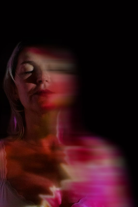
This task links to Reflection as it demonstrates the manipulation of water which can reflect light.
What went well was my composition as it dread the audience more into the reflection. I also had a low ISO with a bright light to emphasise shadows to create a further contrast. I also prioritised my shutter speed as i struggled at first to take clear photographs as most were a blur. I could as well of used a tripod to i can focus more on the theme rather than the quality to avoid dealing with a shaking camera. Moreover, i used angles to exaggerate features.
However, it could be better if i experimented with more angles from above or below to further emphasises the models features.
|
|
Strand 2 - Playground of Tomorrow
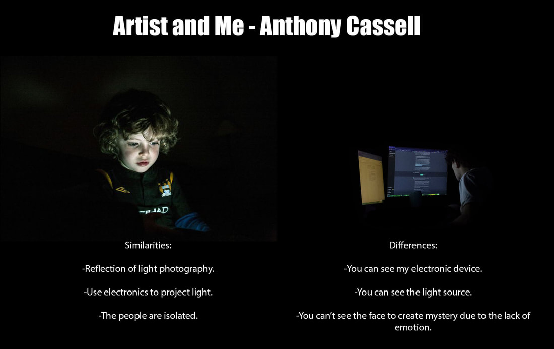
Anthony Cassell
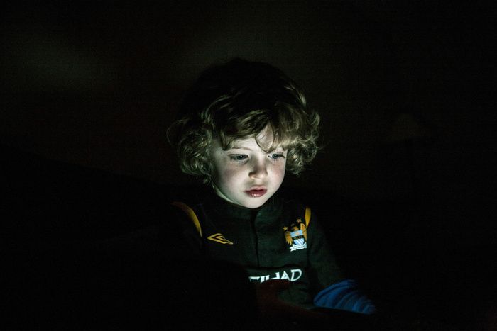
Less than 1 in 10 children play outside in today’s society and these images show children sitting in the dark, their faces reflecting the light from different electronic devices like iPad's, phones and TV monitor. Children of today are known as ‘Digital Natives’ therefore their way of playing is isolated in a virtual world. Could this be the definition of contemporary youth or the Playground of tomorrow?

|
|

|
Draft
Creation Process
Response to Playground of Tomorrow

|
|
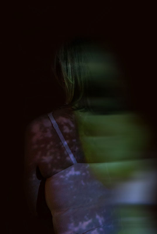
This links to reflection as i isolate people through the projection of light.
What went well was i experimented with the shutter speed, where i wanted enough brightness, but not too much to remove shadows needed for the vignette effect. Additionally, i took into account composition which allowed the image to demonstrate more than just the person. I was able to isolate the person entirely which links to Anthony Cassel's idea of isolation from the world.
However, it could be better if, i reduced noise to remove the grain from the photographs. Moreover, if i used different glasses of colour with a torch, it can emphasise more and different features. Additionally, it does not fully fit tt
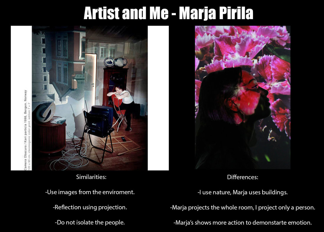
Strand 3 - Interior/Exterior
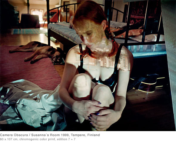
Marja Pirila

''I have been working intensely with camera obscura technique since 1996. Besides my oldest and still on going project "Interior/Exterior" (1996–). I graduated as a photographer and as a biologist (ecological zoology) In 1986. In the course of my master’s thesis of biology I became immersed for days on end in the world of flies and their metamorphoses.''
Pirilä’s oeuvre is dedicated to the camera obscura and its miniature form - the pinhole camera. The artist explores the possibilities of the medium in her works, focusing her attention not only on the images she creates, but also on the construction of these viewing machines. Together with photographer Petri Nuutinen, Pirilä has built numerous cameras obscura, which can be found on display in both museums and public spaces. The principles of optics, recognized since antiquity, served as an aid to the renaissance painters who sought to portray perspective.
Pirilä’s oeuvre is dedicated to the camera obscura and its miniature form - the pinhole camera. The artist explores the possibilities of the medium in her works, focusing her attention not only on the images she creates, but also on the construction of these viewing machines. Together with photographer Petri Nuutinen, Pirilä has built numerous cameras obscura, which can be found on display in both museums and public spaces. The principles of optics, recognized since antiquity, served as an aid to the renaissance painters who sought to portray perspective.
|

|
Draft
Creation Process
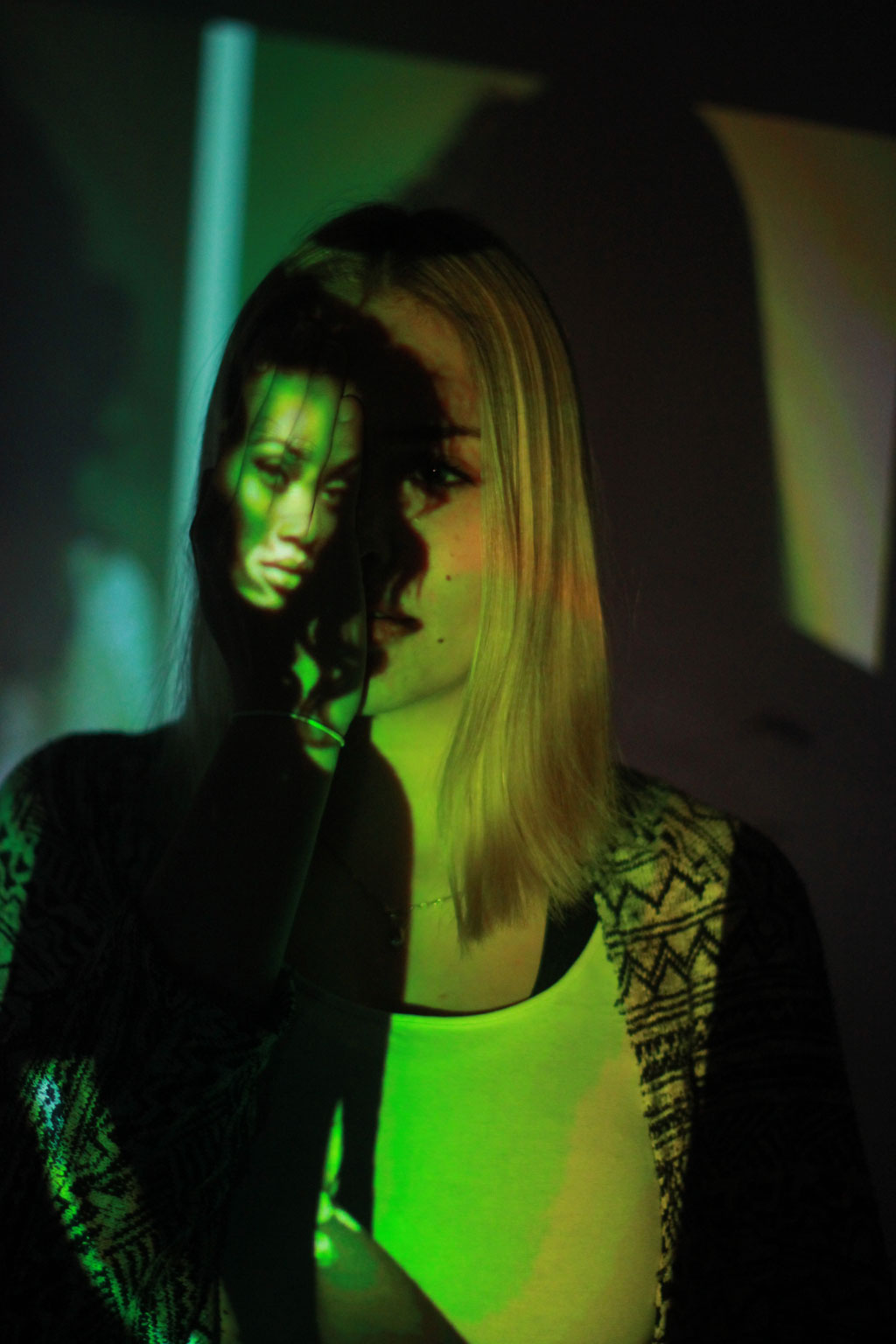
Response to Interior/Exterior
What went well was i used a dramatic contrast of colour between images projected. I realised with duller and darker colours, the camera does not pic up the model as well and less details are displayed. Therefore, for my next project for my potential development, i will take the colours into consideration.
However, it could be better if i took into account composition, different angles, and different distances, to achieve other effects.
However, it could be better if i took into account composition, different angles, and different distances, to achieve other effects.
|
|

|
Development
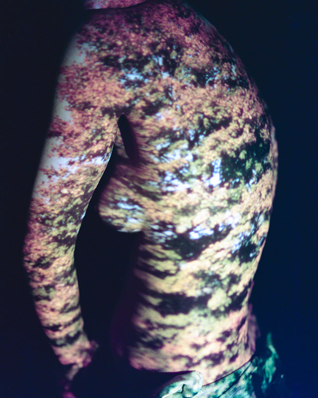
Development 1 - Time Travel
Link to Davis Ayer

|
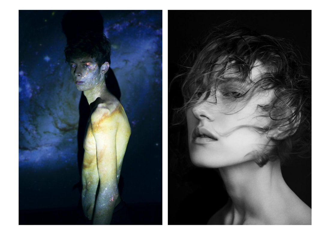
Known for his dreamy creations, Davis Ayer comes back with a magnificent, surreal series called ‘Time Travel’, where the LA-based photographer illuminates the memories on nude bodies. Compressing emotions, time and consciousness, Ayer creates hazy photographs of vintage images projected on naked bodies. Trees blowing in the summer breeze, the impressions of big cities and blurry traces of the past create a map of personal experience. However, while exploring our connection with memories, the photographer does something unexpected: the memories illuminated on the body are not necessarily identified with this person’s life. Playing with concepts, the artist studies how much we can emphasize with other people’s experience and with past in general.


|
Draft
Creation Process
Response to Time Travel
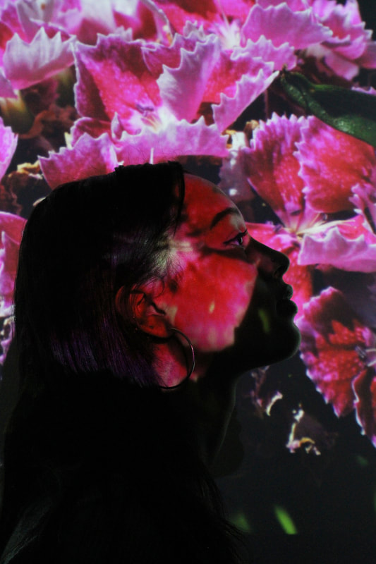
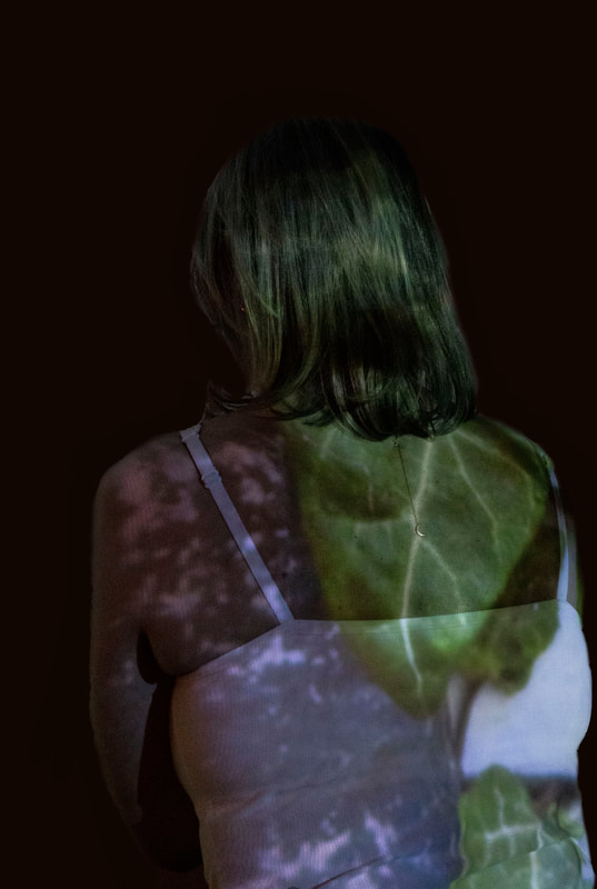
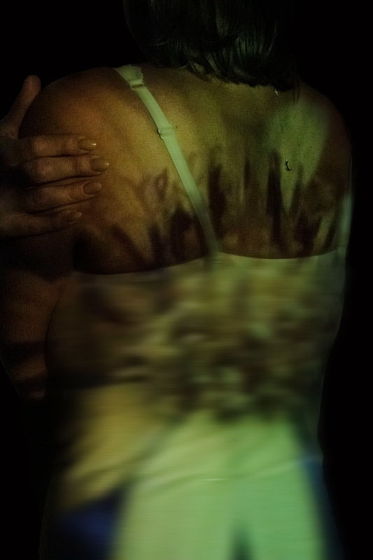
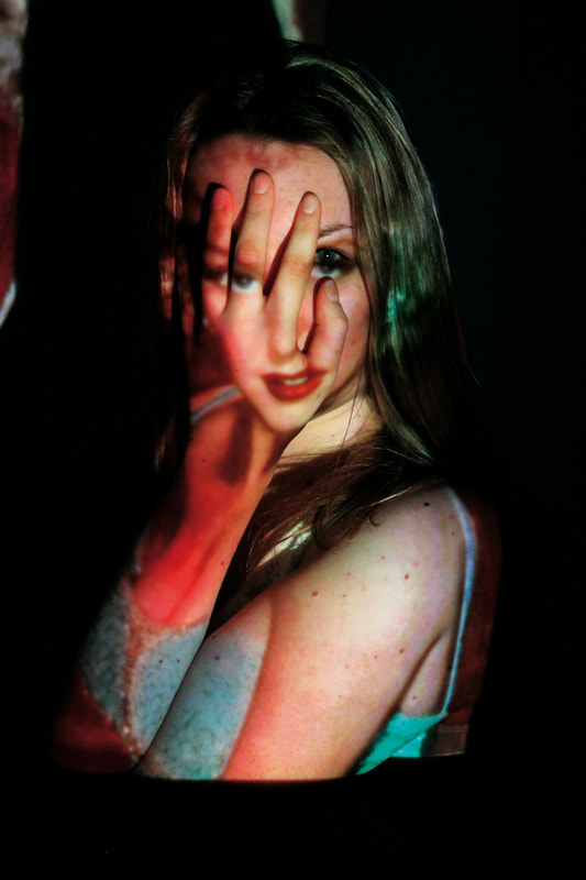
This links to reflection as i reflect nature onto people through projection.
What went well was i increased the shutter speed and ISO so dark projected images details can be seen more, adding more texture and shadow, which creates a contrast. Additionally, some of the images blended into the model's body which created the sense of realism.
However, it could be better if i incorporated more composition with the model of projected image to appeal better. Lastly, if i were to darken the images slightly, the model would blend further into the background. I would like to experiment with photographing more body parts instead of the back and face, to challenge myself.
|
|
|
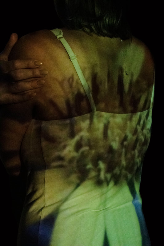
Development 2
Link to Nick Fancher
|
Nick Fancher is a photographer, author, and educator who specializes in creating in-camera effects, often employing the use of bold colors and dramatic lighting. He is particularly known for his efficient method of working, which is with the use of minimal gear and often in unconventional locations. Nick graduated from Ohio State University with a BFA in photography in 2005 and has authored several books on his techniques including Studio Anywhere 1 & 2 and Chroma. While he is especially known for his editorial portraiture and work in the music industry, his client work includes architectural photography, photojournalism, ecommerce (product, on-figure, and flat-lay), stock and food photography, corporate, lifestyle, fashion, and video. Nick Fancher is based in Columbus and Los Angeles and is available for photo commissions worldwide.

|

|

|

|
Draft
Creation Process
Response to the Nick Fancher
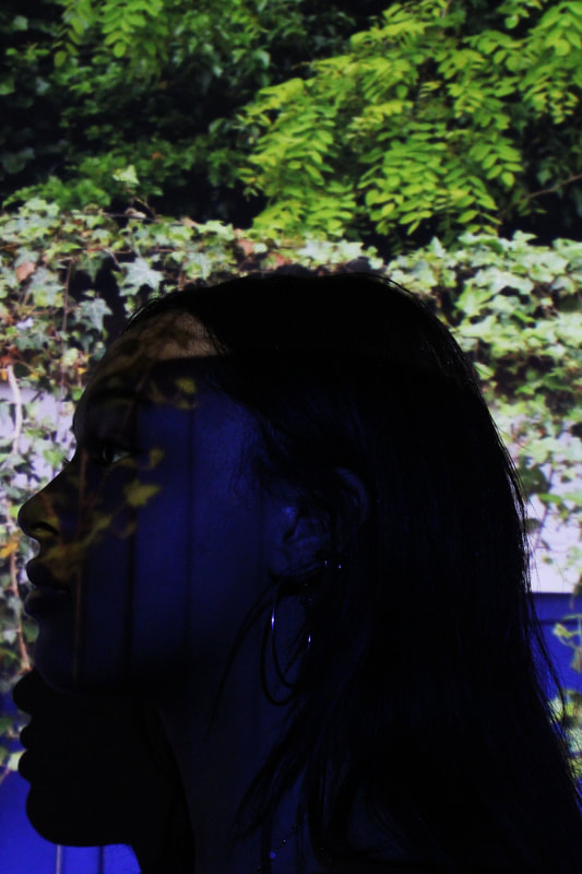
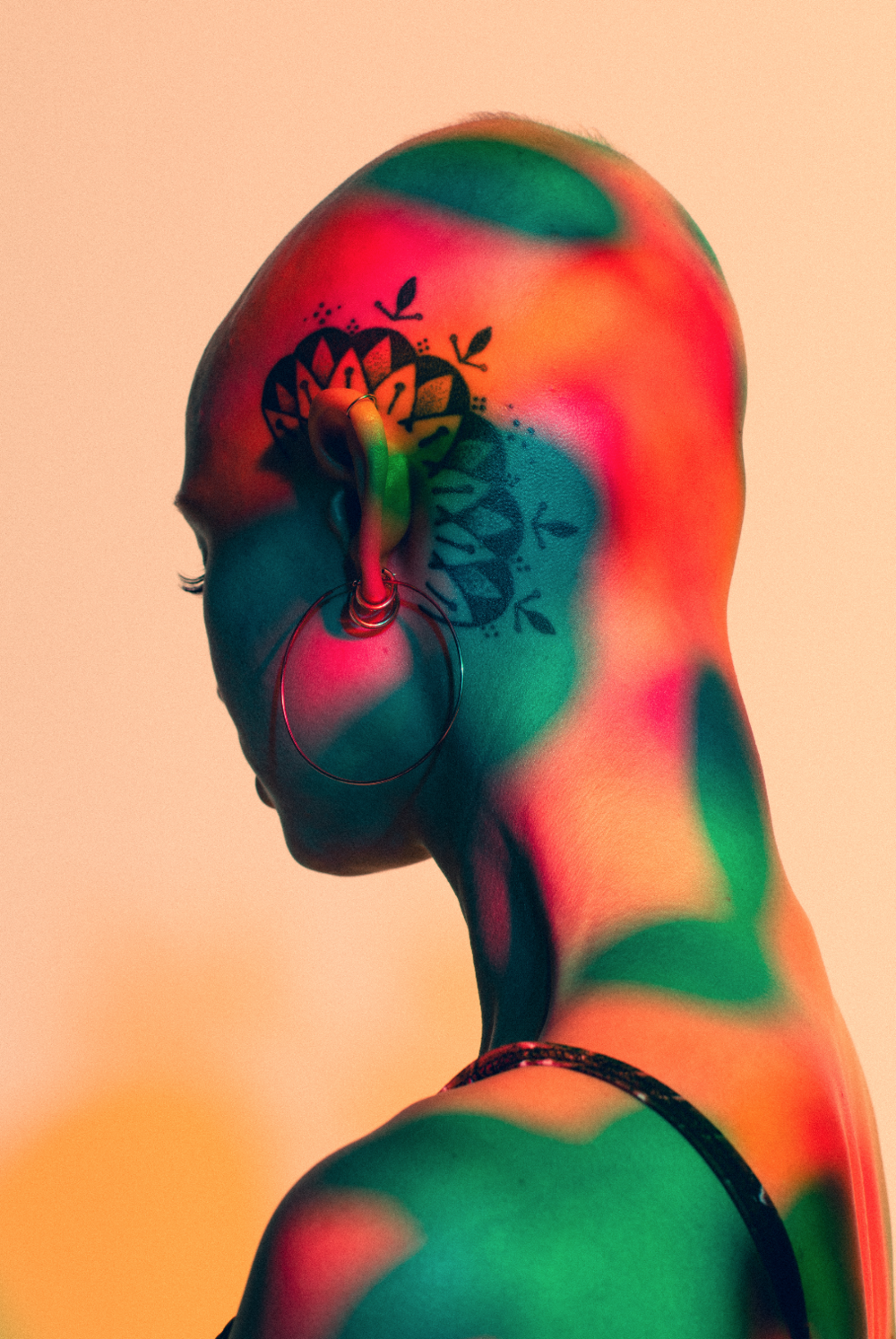
This links to reflection as i start to incorporate movement into the reflection of nature onto people.
What went well, was the distortion blended into the original picture . Moreover, i softened and burned around the model so it blends more into the background so she stands out less.
However, it could be better if i blurred the projection with the colours to add to the effect. Additionally, if i were to use more face images, i could experiment more with shapes to blur. Lastly, i were to use a larger range of colour but keeping it realistic to the colours of nature.
|
|
|
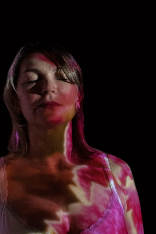
Development 3
Link to Johanna Reich
Johanna Reich creates digital collages: girls and young women are asked to select their favourite idol. The participants are portrayed in motion and still image, while the idol they chose is projected onto their faces. In addition to this Johanna Reich recorded interviews with women between 30 and 95 years and draws thereby a contemporary image of women in our society. At the same time the project is tracing the change of female roles from 1945 to 2015.
|
|
Draft
Creation Process
Response to Johanna Reich
This links to reflection as i reflect baby pictures of people onto their older self.
What went well was that i used contrasting colours from the colour wheel. Furthermore, i used brightness and contrast to emphasise the shadows for the contrasting colours. Additionally, i burnt the sides of the person so they blend more with the black background than stand out.
It could be better if i were able to blend out the projector render lines. Moreover, if i were to use more extreme and different contrasting colour.


|


|
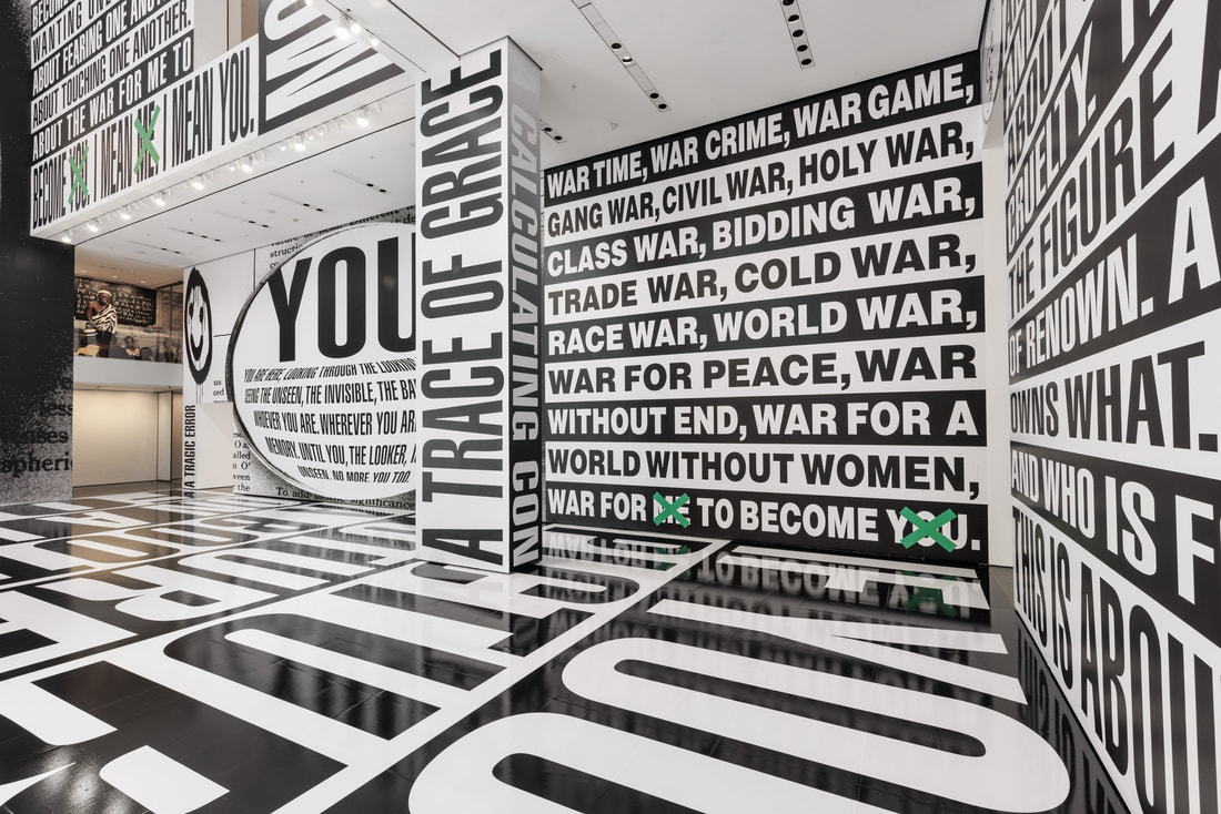
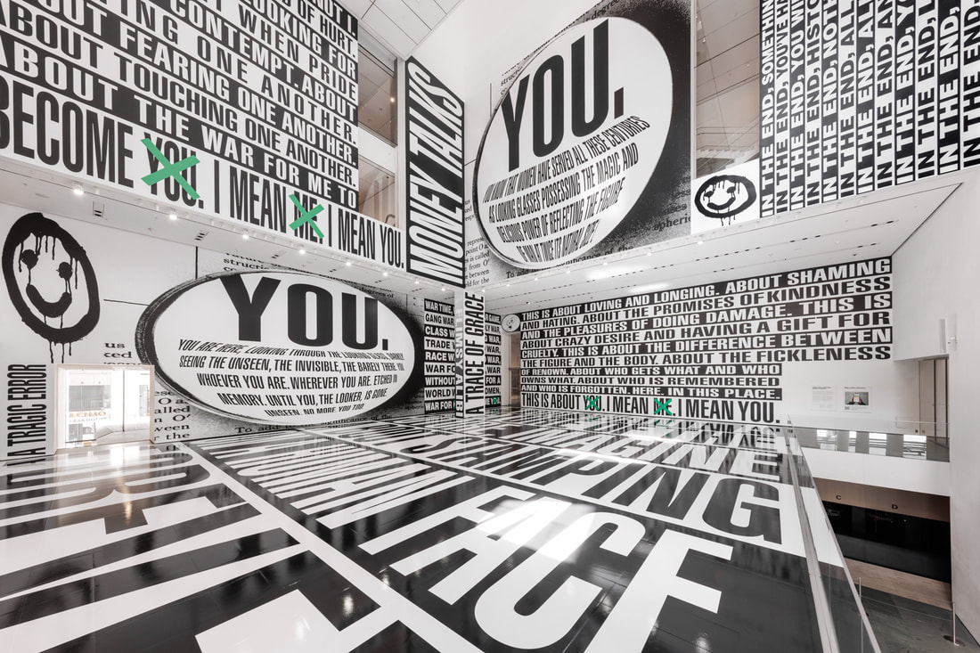
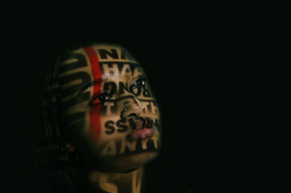
Development 4 - Thinking of You. I Mean Me. I Mean You
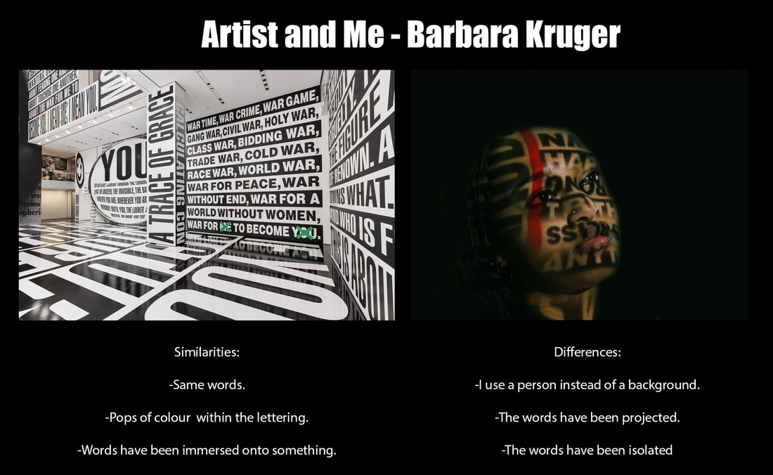
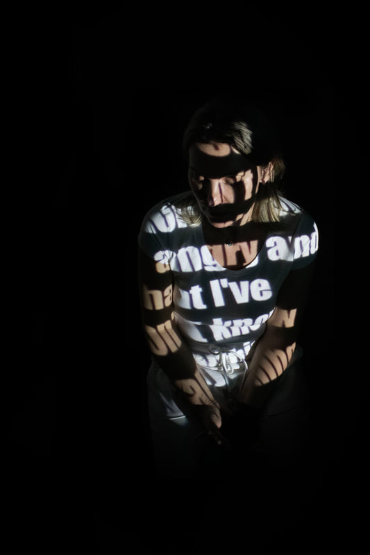
Link to Barbara Kruger
Barbara Kruger’s work speaks directly to us. Using pronouns like “I,” “You,” and “We” and bold declarative statements, Kruger’s work prompts us to question what we see and hear in mainstream media, and to contemplate how these messages shape our identities and society. About the impetus of her practice, Kruger has said, “I try to make work that joins the seductions of wishful thinking with the criticality of knowing better.”1 Through a canny combination of imagery and text appropriated from magazines, television, video, and newspapers, Kruger's practice, spanning more than four decades, challenges how we assign meaning to visual signifiers of faith, morality, and power.
Thinking of You. I Mean Me. I Mean You. drawn from mass-media photographs with provocatively concise language, Kruger has been creating explorations of social relationships imbued with her distinctive sense of urgency and humor for more than 40 years. MoMA’s installation will tap into the artist’s long-standing interest in architecture to immerse viewers in a thought-provoking environment, offering multiple points of entry and perspective. With characteristic force, the work will explore the ways that relationships between spatial and political power invariably relate to considerations of inclusion and exclusion, dominance and agency.
Thinking of You. I Mean Me. I Mean You. drawn from mass-media photographs with provocatively concise language, Kruger has been creating explorations of social relationships imbued with her distinctive sense of urgency and humor for more than 40 years. MoMA’s installation will tap into the artist’s long-standing interest in architecture to immerse viewers in a thought-provoking environment, offering multiple points of entry and perspective. With characteristic force, the work will explore the ways that relationships between spatial and political power invariably relate to considerations of inclusion and exclusion, dominance and agency.
|
|
Draft
Creation Process
Response to Thinking of You. I Mean Me. I Mean You
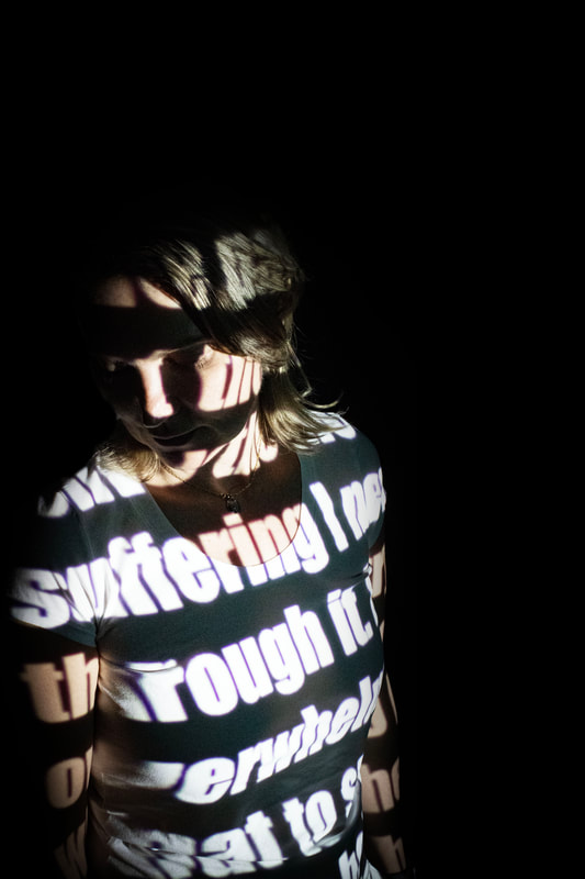
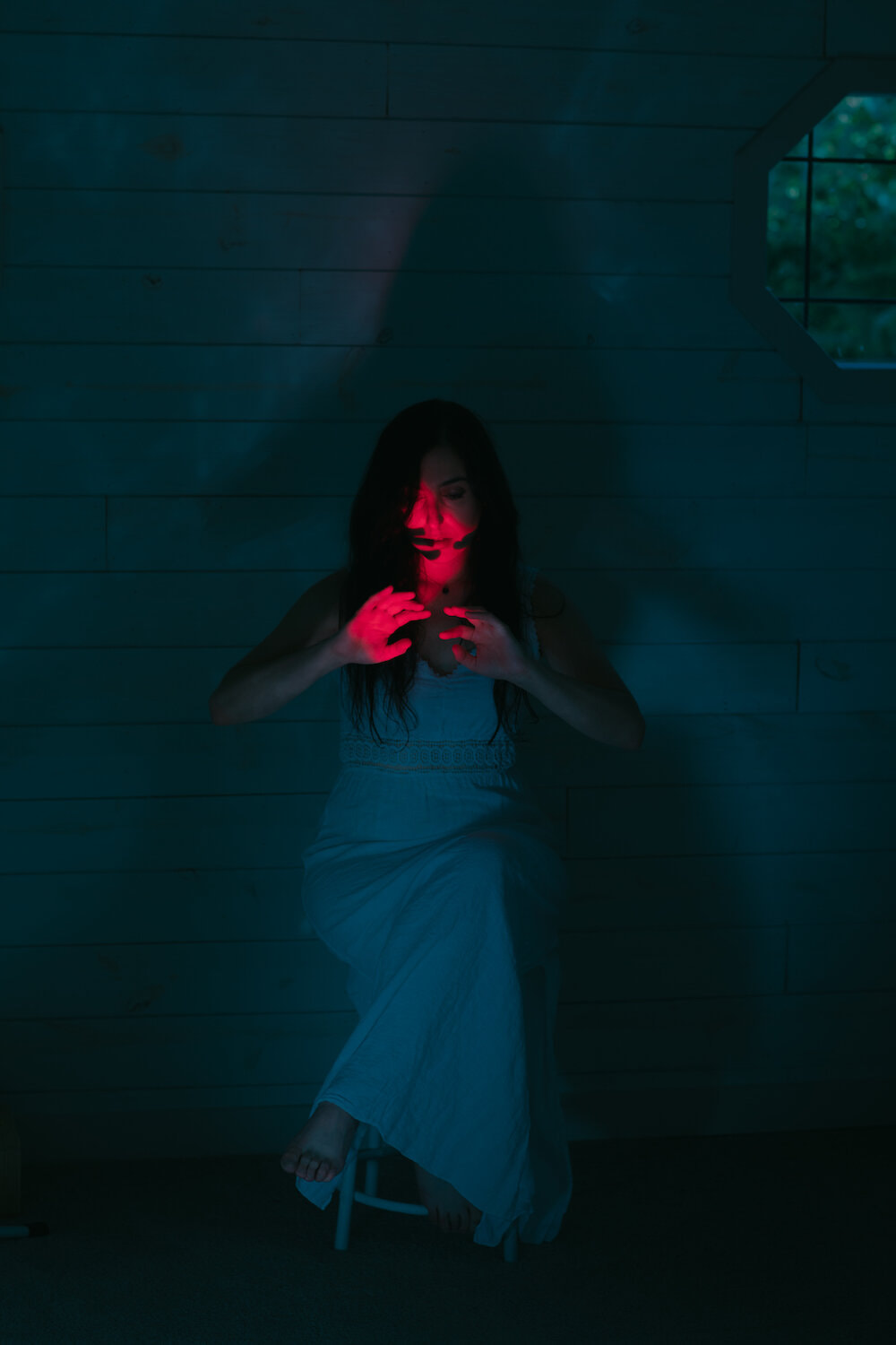
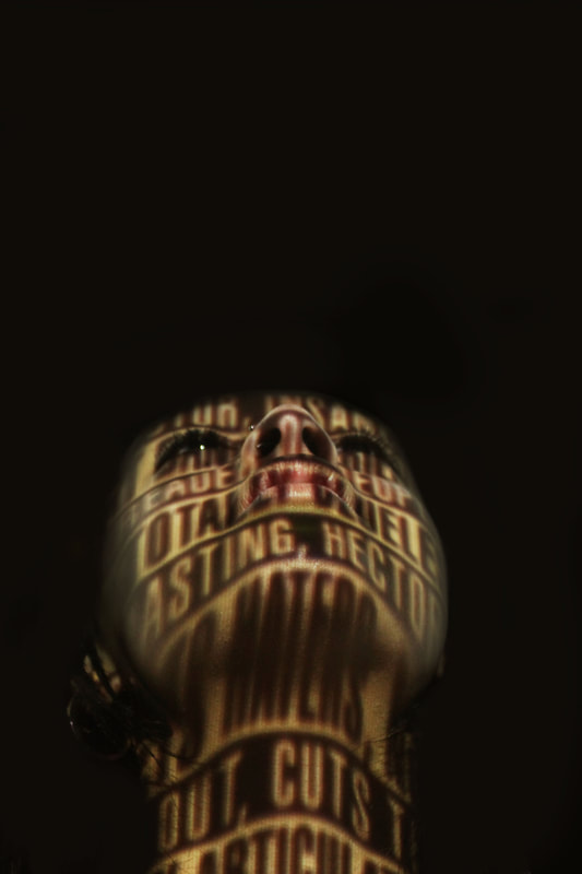
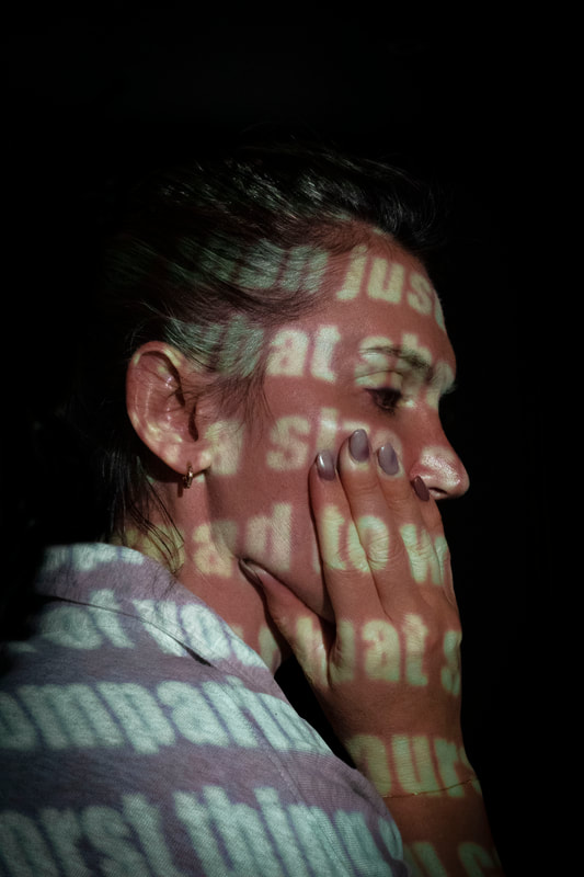
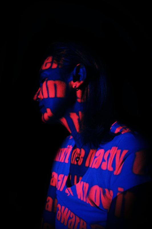
This links to reflection as i start to project hatred messages onto people in black and white.
What went well i isolated the models face to make it seem realistic as if her face was only projected. Additionally, i used colour balance to change the colour of the black projection, so it's not just black. This went well in the image which incorporated red as i used contrasting colours on the colour wheel.
Even better if i added a vignette around the model, it could look more realistic. Additionally, if the image projection was more clear, you could see the writing more clearer and it could look somewhat life like than a projection.

|

|
|
|
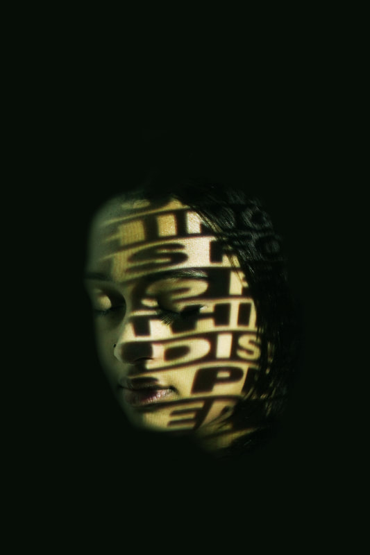
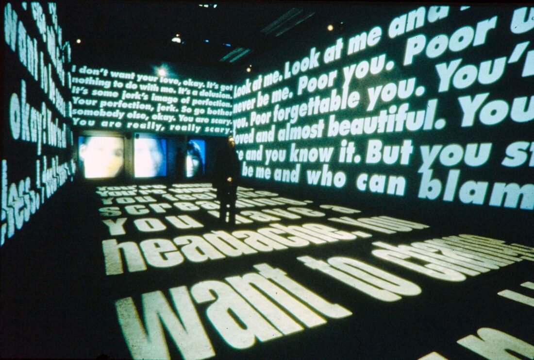
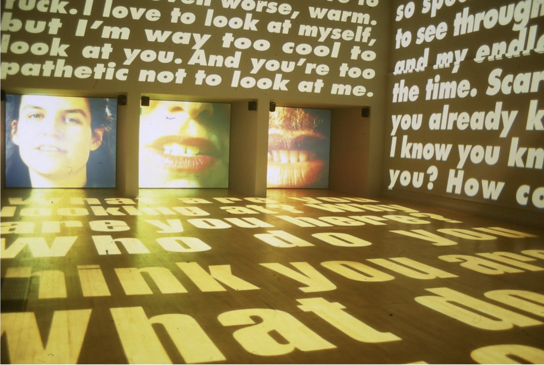
Development 5 - Power Pleasure Desire Disgust
Link to Barbara Kruger
Power Pleasure Desire Disgust was an all black-and-white multi-media installation in which Kruger incorporated audio and moving pictures, so that visitors were bombarded with constantly shifting text, images, and sounds of peoples experiences of love and power. After entering the gallery, the viewer encountered images and words projected onto the floors and walls, changing every eight seconds in intervals of twelve. Kruger placed three video close-ups of talking heads on monitors at the end of three separate twenty-two foot-long tunnels. The heads were clearly visible from the gallery entrance, but the voices only became clearer as the viewer approached the passageways, where they were speaking about love, hate, power, and sex. The installation was meant to be overwhelming and was a powerful way of representing people's experiences of love.
|
|
Draft
Creation Process
Response to Power Pleasure Desire Disgust
|
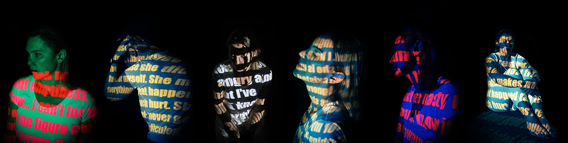
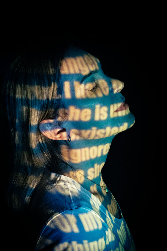
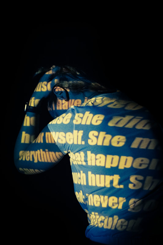
This links to reflection as i project self hatred poems in simple colours onto people.
What went well was i used a projector which removed the projector rendering. Additionally, i used contrasting colours of the background gradient to add colour. Furthermore, i used darker colours with yellow writing to make them seem to glow. However, it could be better if used use darker colours to make them glow even more. As well, if i were to use smaller lettering and more simpler poses, so you can see the littering more clearly. Lastly, if i were to do more close up, i could zoom in on my details and show off the writing. 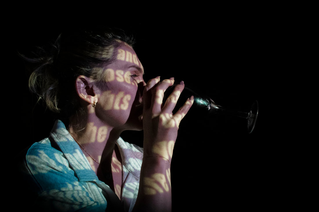
|

|
Final Development
Body Image
Link to Marthe Sobczak
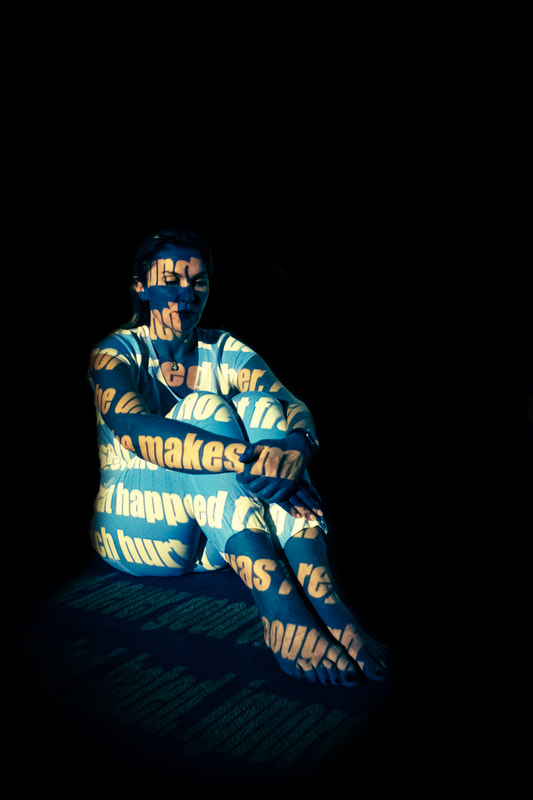
Marthe Sobczak is a French-Polish photographer who was drawn to photography because of her love of painting, colors and shapes. She worked previously as a model, an experience that has made her especially perceptive when photographing bodies. Her series of portraits called ‘Projection’ focuses mainly on bodies, as pictures are projected onto the skin of her models. The models are essentially canvases for the projected colours or designs, creating a set of portraits that are half painting, half photo. Sobczak mostly uses images in her projections however I am going to use text, but I was inspired by her use of projections to highlight the body and I want to incorporate this into my shoot.
|
|
Draft
Creation Process
Representation on Body Image

|
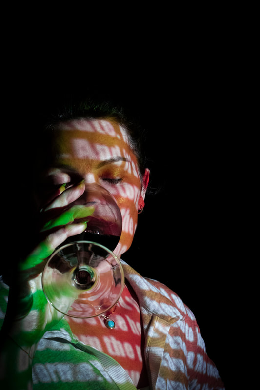
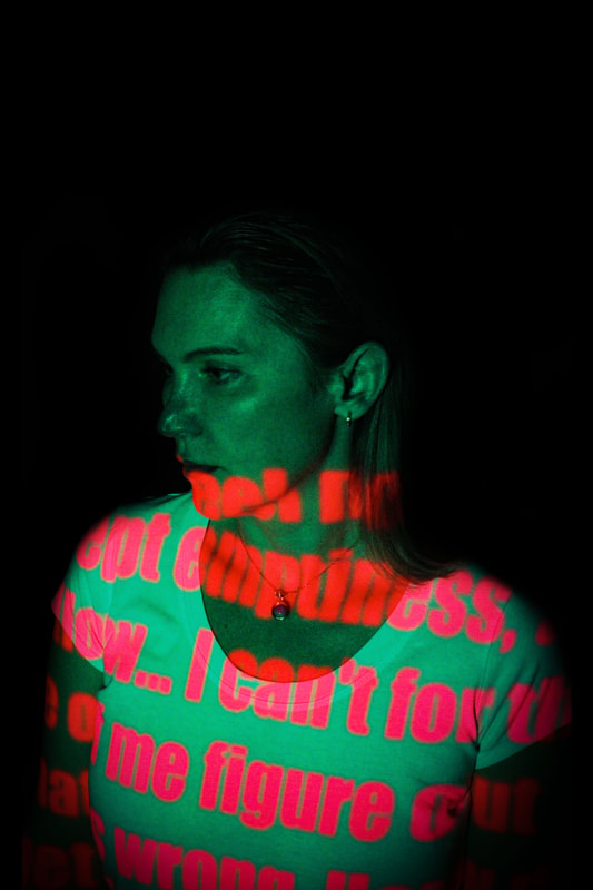
This links to reflection as I project self hatred poems onto someone.
What went well was that i used contrasting colours to make them pop from each other. I added de-haze and texture to make the lettering more clear. I also did this by using smaller lettering and using poses which expose more surface are so more words are picked up in the projection. Furthermore, i used the full body to experiment with more poses. Additionally, i've used different angles to get different perspectives from the person. It could be better if i were to do more close ups on the person to add more texture. As well, if i were to experiment with more contrasting colours, it could develop it more from my last development. Additionally, i could develop the idea of self hatred if i used harsher lettering, so the idea is more clear. Moreover, if i made the person do more poses, it could further convey the idea of the project of self hatred. I enjoyed this development of reflection as i developed responses from Anthony Cassel of isolating the people and Marja Pirila of projection photography. I found it easy as i have access to a projector and the photoshop wasn't difficult, but the responses were well done. |
|
|
|
|
|
|